Taming Large File Sizes in Photoshop

Working with high megapixel files in Photoshop can be a pain. It seems I’m routinely working on files that are close to a GB in size when I start adding layers to my 42MP 16 bit captures. New 61MP and larger cameras are just going to make that worse. 

While Photoshop can deal with these files, the disk space taken up by multiple versions of them, as well as for backup, plus save times can get to be a real drag. So how do we make it easier?

Well, this problem is nothing new. In my early days as a printmaker, working on 300 MB scans was a huge challenge. I remember when it took an hour just to do a 90 degree rotation, which gave me plenty of time to roam outside my cabin in Yosemite, but wasn’t very efficient. So I came up with a solution that I think you might find useful today. 

Here’s how it works. When starting with a large source file, like a 1GB scan or high MP capture, I make a copy of it and size it down to a reasonable size, say 8×10 inches @300ppi, which is a good size for proofing. Then I do all my processing on adjustment layers in Photoshop. This keeps the files small and quick to work on. 

When, and if, I need a larger version of the file, there is a simple process to transfer all those layers over to the high resolution original. 

My printmakers and I used this process on thousands upon thousands of files in my days at West Coast Imaging, and I even made a youtube video that demonstrates the process. One of these days I want to re-record these videos in beautiful HD (or 4k!), but I thought it was worth sharing the old videos because the process works the same, even on the ancient version of Photoshop depicted. 

Take a look and see if it’s a trick that can help in your toolbox. 

Creating the Classic Black and White Look with Digital Tools

Bridal Veil Fall and Snow, Yosemite National Park

September 12, 2019 6:30PM
The Brentwood Library
8109 Concord Rd, Brentwood, TN 37027

I’m really looking forward to my September 12th mini clinic with Brentwood Photo Group because I get to talk about one of my favorite subjects, black and white photography. 

The focus of this clinic is on what I call “Classic” black and white. 

What is “Classic” black and white? I’d consider the work of photographers like Ansel Adams, Edward Weston, John Sexton, Alan Ross all good examples. Its roots are based in the best of what analog printmaking can do. The work of these photographers and others in this school focus on rich, vibrant, full tonal range prints. It’s a distinctly different look that you see in HDR photos, or that created by heavy use of slider based tools.

Creating the classic black and white starts with a vision of what the final print should look like, and then using the tools in a manner that achieves that vision. The are no magic presets or filters. It’s an exercise in manual control of the variables to bring them together into a harmonious whole. 

This mini-clinic will focus on learning to see with the classic black and white look. I’ll cover topics from exposure, RGB conversion, the importance of local contrast, using brushing for creative control, and more. 

This event is at the Brentwood Library . Looking forward to seeing you there!

The Lasting Connection of Prints

When someone has a print on the wall, it creates a lasting connection between the viewer and the photographer. A print on display is unique because it exists in the viewers space on a daily basis. It becomes more than just a quick glance on the bottomless social media feed, or even the impulsive “like” that drives the algorithms. A print becomes part of the viewer’s life, and a point of continued dialog between the photographer and the viewer.  

Like many photographers, I’ve collected prints over the years from friends and artists I admire. Even after seeing them every day for years, they continue to bring me joy, and I can discover new things within them. But they also bring me back to the moment I connected with the photograph, and the photographer. 

That ability to connect is what makes a print so powerful. If an artist or a story moved me enough to put it on my wall, the print serves as a portal to reconnect to that artist and their story over and over again. It’s built a relationship in the way reading a good book does, or a fine conversation with friends. It’s a mile marker, a touchstone. It makes me, as the viewer, somehow more invested in the artist, and every time I view it, renews that investment.  

It’s this “viewer investment” that begs us to give more consideration to sharing our work as prints. What photographer doesn’t want a more invested audience in an era of visual saturation?

At its simplest, that investment is in the photographer’s story and vision, whatever that may be. And a photographer’s story and vision can do powerful things. 

I’ve seen it save the last un-fished ocean, stop destructive mining, bring attention to threatened species, bring back memories of a long lost family member, and so many other things. 

Photography has an ability to connect us to current and historical events, people, places, and things like no other art form. It makes the sharing of that story between photographer and viewer a more personal connection. And it turns that connection into a long term conversation. It’s not gone in three seconds like an Instagram post at crappy resolution, it’s not on a shelf like a book that rarely is viewed. It’s on bold display for all who pass, sharing it’s story over and over again. 

That is why the effort to make prints, sell prints, and display prints is worth being part of a photographers endeavors, and why I, as a photographer and printmaker, am so passionate about making well crafted, expressive prints.

Adobe Enhance Details

Does the new Enhanced Detail feature in Photoshop and Lightroom really work? It does, at least for me. 

Heres an example of the same RAW file processed with Enhance Details on, and with it off. This is a screen shot at about 400% magnification. 

Normal Raw Processing
Processed using Enhance Details

You might have to zoom in to see this on your device, but when viewed at full resolution, I can clearly see that all the lines of the branches, and even the edges of the flowers are smoother and more refined. With it off, there is much more aliasing, very blocky in-fact. 

Enhanced Details may work better with some sensors than others. I’m hearing from photographers that see no effect, but I’ve seen plenty of examples where it does work. So you’ll have to try it yourself. 

For my Sony A7RII, it clearly does work, and this refinement of detail will allow me more options when applying unsharp mask, as well as resolving finer detail.  It’s now my default processing option. I just wish Adobe would integrate it better into the workflow instead of the current requirement to export to a DNG first. 

Printing Re-Imagined

Recent improvements in printing technology should have you reconsidering how you print your photographs.

If you’re printing with a lab, you’ve probably been making C-prints. C-prints are made on Kodak or Fuji paper C-print is the name given to the chemical process used in the paper, an abbreviation of longer name “chromogenic print”. Sometimes they are referred to by their surface, such as E-surface, or Luster, but that is not always a precise identifier. 

What defines a C-print is that it’s made on a light sensitive paper which exposes a negative image with light (LED or laser light for digital prints,) then is processed in RA-4 chemicals. 

C-print papers came from the pre-digital age, and were designed to make prints from color negatives easy and affordable for mass production of color photography. Your family photo albums are likely stuffed with C-prints.

When the first “digital enlargers” came on the scene around 1997, they most commonly used these same C-print papers, which offered great ease of use, quality, and price. Printing on a “negative” paper was no problem for a digital device that could easily convert a digital file into the data needed by the printer. 

I saw my first LightJet digital C-prints around 1996/7 when I was working at The Ansel Adams Gallery. They were nothing short of amazing.  At that time I was trying to perfect my own photographic skills, looking to find the best methods for color printing, so I was constantly studying prints. I was very fortunate that my position as Assistant Curator brought me in contact with some of the world’s best prints daily.  

What those first digital C-prints represented was a paradigm shift. Finally there was a way to turn digital files into a true fine art quality print that was as good as they very best darkroom prints I had seen. This was a huge accomplishment and changed the way we print forever. 

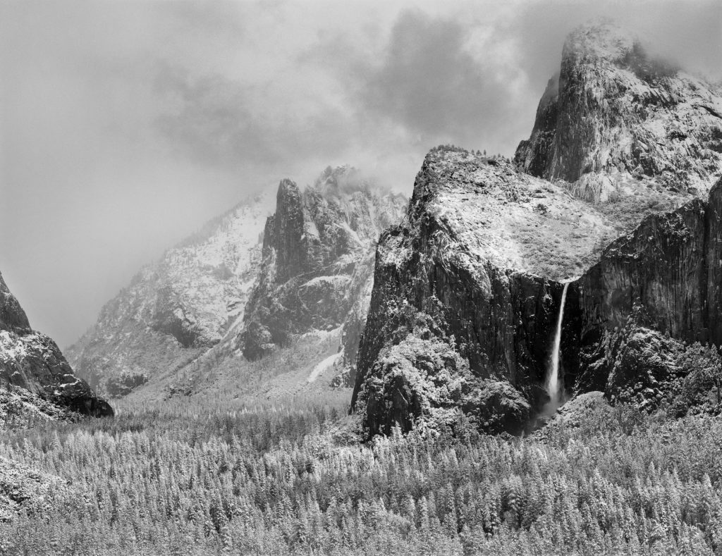
To say the prints were a hit is an understatement. The process was championed early on by several of the gallery’s photographers including Charlie Cramer and William Neill, and all of the Yosemite photo community quickly jumped on board. As a curator, I was able to sell more work than ever from our artists because of the ease of producing duplicate prints in quantity that exactly matched the previous batches, and at any size. Suddenly it was relatively easy to gat a 30×40 print made once a file had been perfected.  I had an incredible run with one photograph in particular by Charlie Cramer, selling somewhere near 100 copies. (I have a copy of that print on my desk that still looks as good as it did when I first saw it. )

Digital C-prints quickly became the dominant form of color printing in museums, galleries, and were also embraced by advanced amateurs and  hobbyists. 

While the technology was readily available, the knowledge to use it to make true fine art quality prints was still quite difficult. To help solve that, I started my first print studio, West Coast Imaging, with a focus on making gallery quality prints using my knowledge to great digital prints that didn’t feel “digital” but retained the inherent qualities of fine art photography.  

 In my time running WCI, I printed the first digital exhibitions for Galen Rowell, Jack Dykinga, Robert Glenn Ketchum, and many others, and used hundreds of thousands feet of Fuji C-print material. So it would be fair to say I know C-prints very well. I’ve been committed to it over the years for my personal as well as my professional work. And alongside it, I’ve used about every generation of Epson inkjet printer since about 1999/2000, as well as several Canon Pro printers. 

For a long time, C-prints were better than inkjet prints when printing on similar surface papers.

But recently that has changed. 

When I started testing my Canon PRO-4000 printer, I noticed something was different, and better. Much better. 

As I compared my calibrated test sheets from the Canon PRO-4000 to my reference digital C-print, something about the Canon print made the C-print look dead and lifeless. Perhaps it’s better explained that the Canon print had a depth, a brilliance, a dimensionality that I could never recall seeing before. 

I was taken off guard because I didn’t recall seeing this big a difference a few years earlier comparing the previous generation Canon or Epson inks to C-prints. So I dug in to my archive of calibrated test prints to try and confirm what I was seeing. What I saw surprised me. 

The wider color gamut and darker blacks (D-Max) of the new Canon printer really did make a difference. The new Canon prints bested every print I had made before. And not only were they “better”, they were magical. I realized I was seeing things in the prints I never thought would be possible. It was the same “ah-ha” moment I had when I saw my first  digital C-print at the Ansel Adams Gallery a few years later. These new print set a high water mark, one that allows photographers to express themselves in ways not possible before.

It became clear that this was the process I wanted to use to print my personal photographs, as well as the work of my clients. While C-prints are still a legitimate medium for fine art, the qualities of these new prints are too exciting to overlook. With this new process, I’m making the best prints of my career, and expressing qualities I never thought were possible in a print. It’s taken a long time to reach this level of quality, but now that we have, I’m excited to switch from C-prints to inkjet and explore all the new possibilities!

New Name – Make Better Prints is now Crafting Photographs

As this blog and my ideas for it have grown, I realized that it’s about more than just making prints. Photography is an encompassing process, that starts the moment we click the shutter. Making better prints requires working backward through the process to the moment you click the shutter, and working forward from the shutter click to the final output. Everything that happens between those to moments decides how good your final photograph will be. 

A large part of making better prints is making better exposures and learning to process precisely. So if I want to help you make better prints, I need to talk about the whole process. 

I’m realizing that “printing” is one of those loaded words that can have multiple meanings. To some it means literally just hitting command P and the settings you use on the printer. But to me, printing is this encompassing process that starts even before I take my camera out and click the shutter. So I want to ditch that loaded word to avoid confusion. 

The irony is, I went back and forth in naming this blog between “Make Better Prints” and “Crafting Photographs” as I’ve blogged before under the Crafting Photographs name. I went with Make Better Prints in the hopes it would let me stand out in a very crowded blog and youtube community by emphasizing a skill I’m well known for. But in the process, I believe I limited the audience despite the fact the content is applicable to any photographer. 

Crafting Photographs has always been a good expression of my approach to photography. In setting out to make work that captured the beauty I saw in the work of other photographers I admire, I learned that photographs are carefully crafted through hard work, study of the craft, understanding of the materials, and application of them through inspiration to achieve photographs that evoked uncommon levels of awe and wonder.  The goal of this blog has always been to help share that knowledge and appreciation, and that’s better reflected in the new name. It’s about more than just making better prints, it’s about learning how to use your tools and materials to express yourself as clearly as possible to tell your stories. 

With that bit of housekeeping done, the only thing left to do is start putting up new posts. I hope you continue to enjoy the blog as much, and more than before. 

Rich

Pattern Noise in new Fujifilm GFX100

Clean, smooth tones are one of the hallmarks of an extraordinary print. Particularly in landscape photos, smooth tones in skies are essential. Pattern noise in a digital sensor can destroy those smooth tones, and there is no post processing trick to remove it. So I’m really discouraged to see Lloyd Chambers’ report that the new Fujifilm GFX100 is having problems with this due to the inclusion of Phase Detect Auto Focus pixels on the sensor. Check it out at:

Fujifilm GFX100: those PDAF Pixels Make Me Wish I Could have a GFX100 Without Them

I hope Fuji can find a fix for this because it could be a amazing camera for landscape photography with new 4×5 quality.

It seems to be limited to the new 100MP camera. I have a couple clients using the 50MP Fuji and haven’t seen or heard of in in those cameras. The 50MP cameras are excellent, and make beautifully detailed prints.

We Choose To Go To The Moon…

I’m pretty excited about the 50th anniversary today of Neil and Buzz taking those first steps on the moon ,so I want to share some of my photos of the space program. 

I grew up vacationing in Cocoa Beach, right next to the launch site of Apollo 11. Some of my earliest memories are of visiting Kennedy Space Center and seeing the rockets at the visitors center. It’s always given me a sense of being able to touch history to visit there, and made what I saw in childhood picture books “real.” 

That fascination has carried over into adult hood. For about a decade, I’ve been working on a project to capture the rockets and other artifacts of spaceflight with the expressive qualities and clarity that is possible in a fine art photograph. 

The anniversary celebrations today seem  an opportune time to share some of this work with a little more context.  I hope you enjoy it and that it captures some of the wonder of that amazing adventure we started so many years ago. 

First stage of the Saturn V rocket that took us to the moon with its enormous F1 engines.
Launch Pad 39A where Apollo 11 launched from on July 16, 1969.
Forest of Technology, F1 Engines, Saturn V S-IC.
Apollo Command and Service Module.

Sony A7RIV – Megapixel Size Chart

How much print resolution will you gain using the new Sony A7RIV? This chart will give you an idea. Print height and width are listed across the top, and the columns show the ppi file possible from a specific megapixel sensor.

A quick look shows us The 61MP sensor of the Sony A7RIV lets you make a 20×30 with 316.8 ppi of data, a 51 ppi increase over a 42MP sensor at 265.8 ppi, or about a 19% increase. Both will make exceptional 20×30 prints, but the 61MP sensor will resolve more fine detail.

Spots Left for July 13 Workshop

A few spots left for my printmaking workshop this weekend if you waited till the last minute. Sign up and learn how to make your prints with more depth, more tonality, and more richness. Watching youtube just shows you where the controls are, I’ll show you want to do with them to make your prints sing!