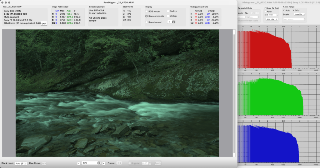

Can you tell me exactly where all your RAW files are, right now, and can you access every one of them without having to think about it or ask a search engine how? If the answer is no, then we need to add some skills to your toolbox to make sure they are safe and useable.
Storing your files is just one of the burdens digital has put on photographers, and one that will cause us problems if we don’t actively manage it.
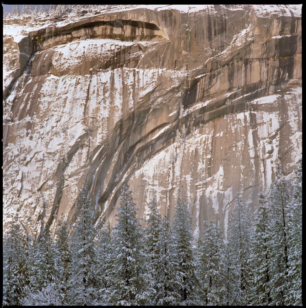
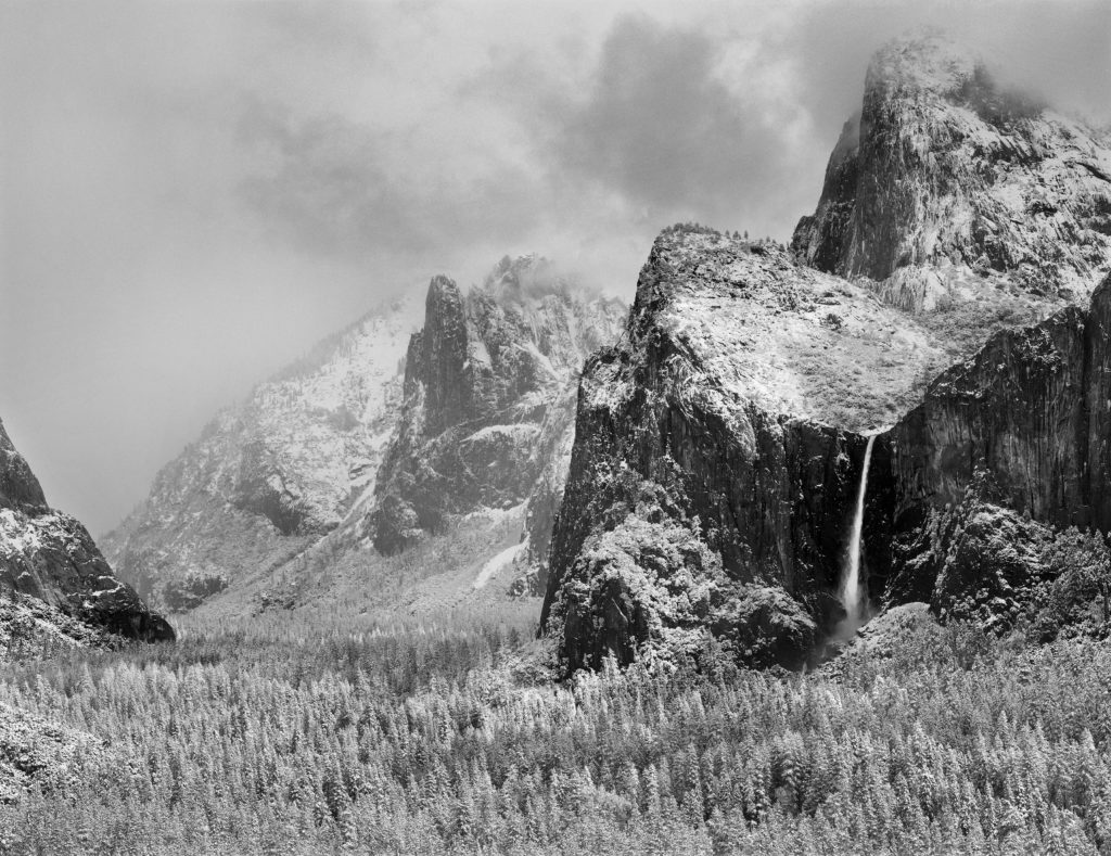
In the film era, we could just put our processed negatives or slides in a box and they were easy to find and sort because it was a tactile, analog process. It was so easy! It didn’t require computer knowledge and it worked pretty well for most people.
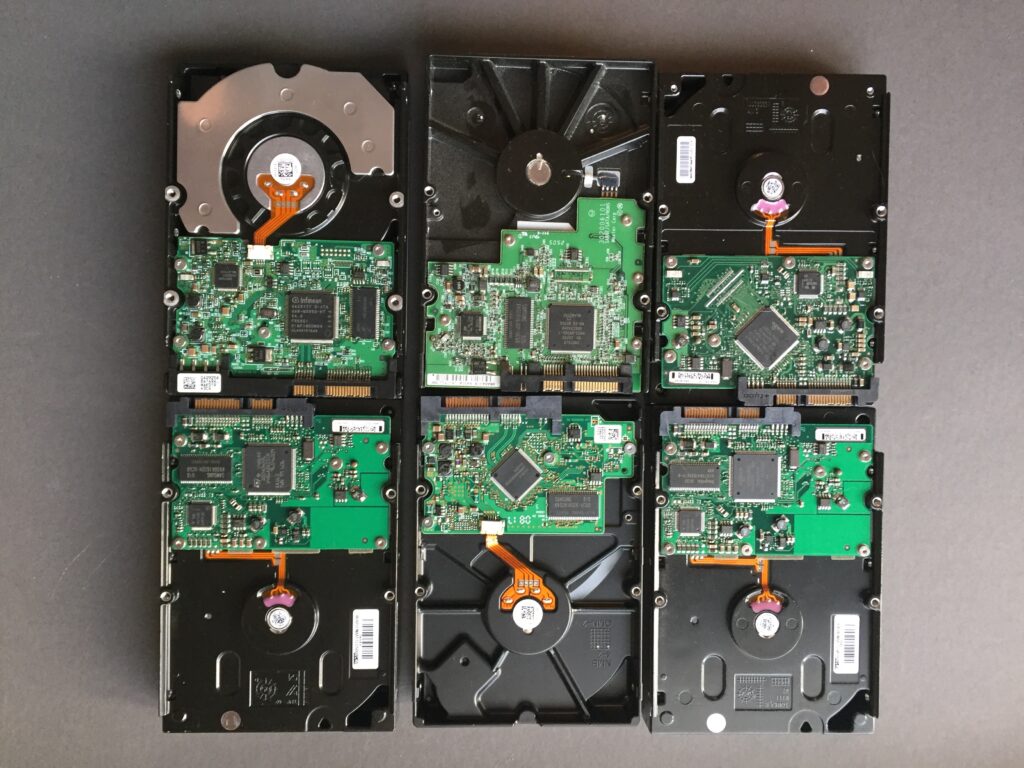
Digital changed that. Now our files are stored somewhere on our SSD or hard drives. Do you know where? Is the computer between you and your photos?
If your workflow was set up with you deciding where your RAWs are imported, then you are already on the right path. You challenges are making sure they keep importing to the right folder or directory, and that the drive they are on is being backed up with the 3-2-1 strategy.
And if you aren’t backing up to the cloud, you should add it immediately as your offsite/alternate media. I recommend Backblaze for cloud backup based on years of following them, and as a user of their service. For a flat rate, you can do unlimited backup, even of external drives. (Disclaimer, I am an affiliate and may receive payment if you use the link.)
But if you haven’t made a conscious decision about where your photos are stored, and are relying on an app to do it for you, then it’s time to take more control.
Your photo app might be part of the problem. If you are using an app like Apple Photos, it might be handling all the importing and storage for you. In that case, I bet you don’t know where your files are because you are just letting the app handle it. Sooner or later that will workflow will break, so it’s part of your workflow you should consider improving immediately before it breaks.
First of all, Apple Photos imports your files onto your boot drive, which will eventually fill up and force you to take action to free up storage space. But also makes your files hard to get to, which crops up on my workshops when I ask students to send in RAW files. Apple Photos hides the files inside your “Photo Library” and limits your access to them through the app which causes issues when you want to extract a RAW file to use in a different processing software.
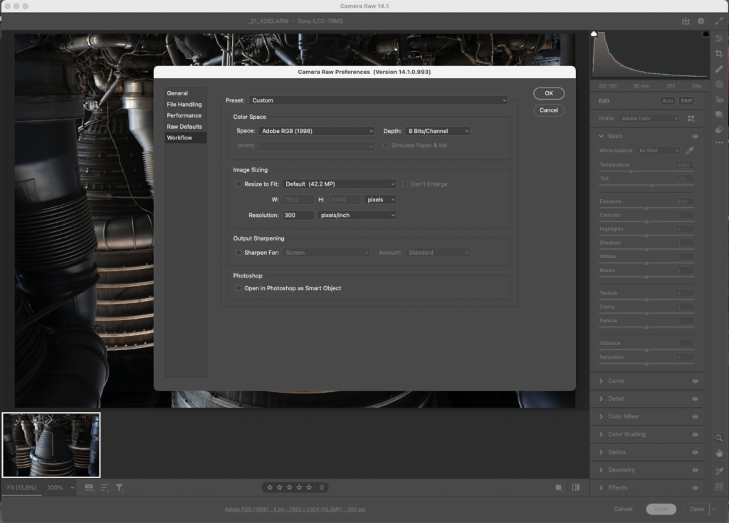
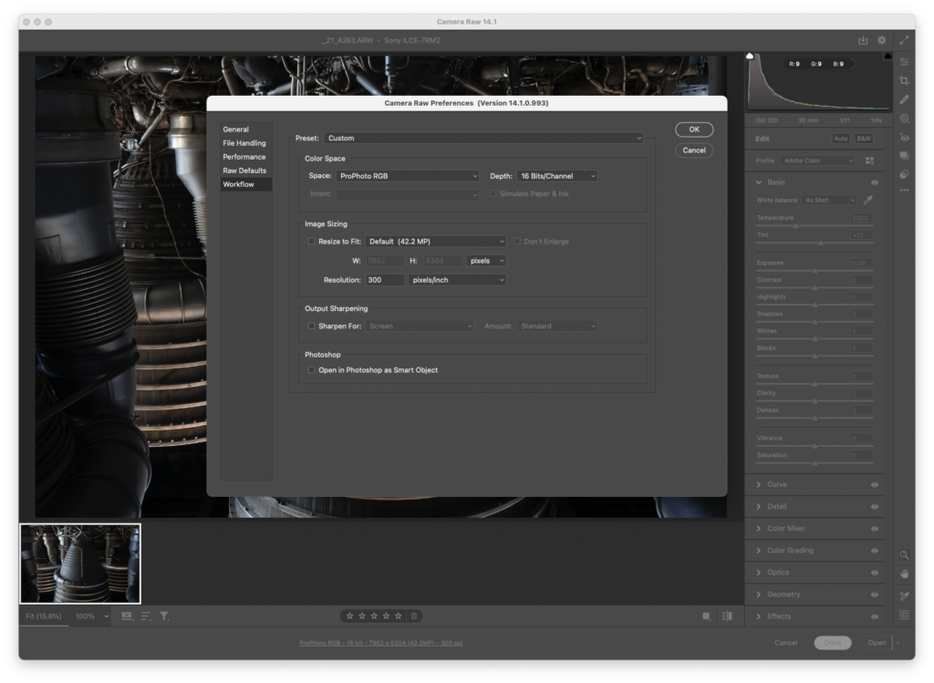
The approach Apple Photos uses is a good choice for the home user capturing family memories, but if you are embracing the RAW workflow, it’s going to limit you. And it will make a lot more work for you when you want to get at the RAW files. You need to learn how to access those files (heres a article to get you started on that https://www.macintoshhowto.com/software/how-to-access-your-iphoto-library-without-iphoto.html) But once you know where your RAWs are and how to access them, I think you’ll find it much easier if you upgrade to a package like Lightroom to import and manage your files. It will let you decide where photos are imported to, will give you easier access to your RAWs, and more powerful editing tools.
Knowing where your RAWs are, and that they are backed up is a foundational level skill for a digital photographer. If you don’t have it, you risk losing the photos you worked so hard to make. Don’t leave it to chance. Upgrade your knowledge and skill so you can preserve and access your photos for years to come.