I’ll be teaching a Mini-Clinic for Brentwood Photo Groupmembers on March 14. This clinic is a members only even and free to BPG members.
Musicians expect that middle C will sound the same on any piano in the world. Photographer should have a similar expectation of a properly tuned instrument when they make prints. This is achieved through color management. I’ll talk about what color management is, and how to use it properly. A key part of this clinic will be looking at prints to see what is correct calibration, and learning to see what is in-tune and out-of-tune. We’ll look at how to evaluate canned profiles as well as prints from labs. I’ll have samples of “in-tune” prints, and will encourage participants to print my test file to bring and evaluate their printer or lab. Participants will leave with a new understanding of the level of accuracy and repeatability possible with color management that will make their prints “sound” their best.
Will your prints match the next time you print them? Can you take the same file and obtain the same results using a different printer, ink, and paper? I can, and so can you.
For twenty years, I’ve been printing client photos, and my own, over and over again with a very exact match, using different printers including LightJet, Chromira, multiple generations of Epson printers, Canon Printers, and even Metal…and on dozens of different papers. It is still a little mind-blowing for me to realize that this is even possible; That I’ve been printmaking for that long, and with so many different processes.
Accuracy, control, and repeatability are what first made digital printing interesting to film photographers, long before there were viable DSLRs. For a photographer who sells prints, having the print they deliver match the one the client saw on the wall, regardless of size, was (and still is) a huge deal. With darkroom printing using an enlarger, this kind of matching was virtually impossible and caused many frustrations. My earliest clients were mostly photographers with galleries who needed to be able to deliver prints that matched on demand, at any time, and at any size. They moved to digital to make that a reality.
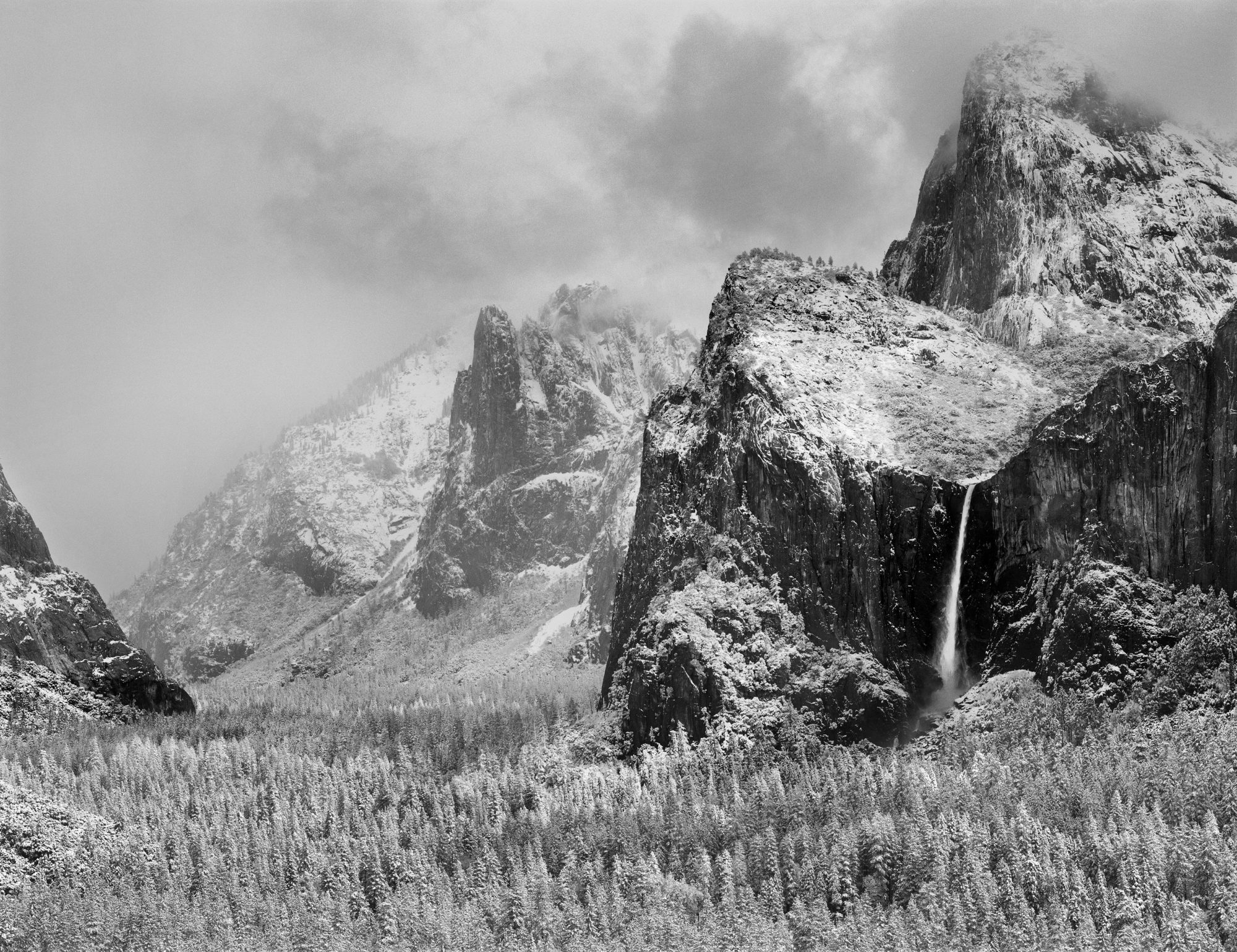
That requirement, to match the original print at any point in the future, makes how I set up my printer the most important step in my workflow. I absolutely need to print the file as accurately as possible so it will match the previous print. My pro clients can see the smallest differences in color, density, and contrast. They know their subjects, and their photos, inside and out. They immediately see if something is off. Some of them can even explain the scientific process that produces a certain shade of color in an animal’s feathers; or a geologic feature; or the ocean in a certain part of the world. Achieving this exacting level of color matching is one of the reasons they keep working with me, and drives every step of my process.
The key to this is color management; using ICC profiles to characterize a paper/printer/ink combination. With an accurate ICC profile, if you do all of the printing steps the same, you will enjoy the same result, time after time, even if you change printers or papers.
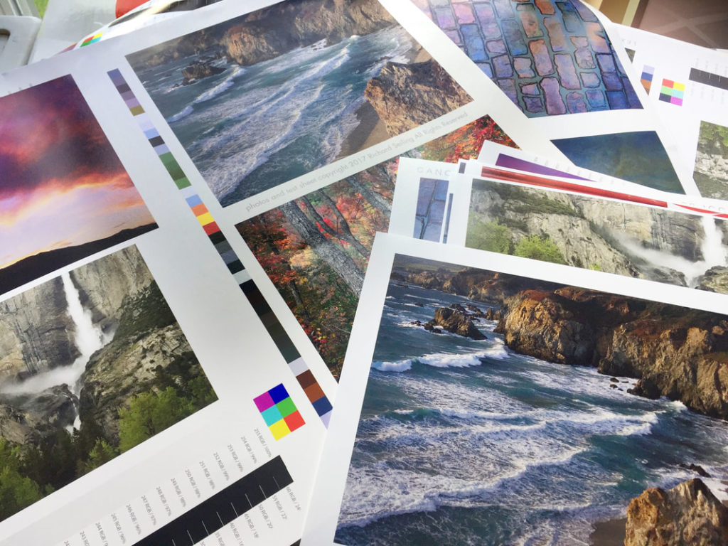
That’s why I take profiling very seriously. Every profile I use has been carefully tested by printing a test image, and comparing it to my library of previous test prints to see if they match. These test prints let me evaluate accuracy, but they also let me evaluate differences between printers, inks, and papers. Obviously, not all printers, papers, and inks can produce the same aesthetic feel, and the definition of “match” needs to include these factors. It also lets me see improvements to the printing process. When a manufacturer makes a blacker black ink, you can see it in the test prints, and see how it affects the image.
Matching also means that what I see on my printer looks like what I see on my $1,000 reference-grade monitor. Being able to make a very good screen-to-print match on the first print not only makes me efficient when working on client files, but it also lets me work more intuitively on my own photos, which I believe lets me bring more out of the process. It allows me to be more expressive because I’m not fighting the file, but can work with it fluently and easily.
How accurate do you need to be?
That’s something only you can answer. While very high accuracy is a vital part of my personal expression, and of my business printing for other photographers, a photographer printing for themselves has more leeway to say “good enough.” The public-at-large viewing your photographs are not trained to see the small differences in color and density that a photographer is. They don’t know what you saw in your mind’s eye when you clicked the shutter. They only know what they see on the print, and whether they like it or not.
Even if you don’t have the world’s best profile, you can make prints that “match” themselves as long as you use the exact same file, printer, paper, and settings. Of course, if you change any of those factors, then your prints will no longer match. When (not if) that happens, your only solution is to decide that the difference between how it printed before, and how it prints now, is acceptable…or go back and make new adjustments to make a better match.
My personal expectations, and those of my clients, don’t give me this kind of leeway. But when you are the one doing the printing, you set the expectation for how well your prints will match the next time you print them. Your bar is going to be set by your needs, expectations, and how well your eye is trained. When getting the prints you want becomes frustrating; when you’ve spend hours working on a photo in image processing software to make it look exactly the way you want it, only to have it print differently; then it’s time to learn to become more accurate.
But I encourage you to seek that high bar of accuracy even before you need it. The ability to see, and control, small differences in color and density will help you make better decisions when processing your photos, and make you a better photographer. (Plus, your prints will look the same 20 years from now!)