The Value of Looking at Prints

For me, looking at a finely crafted print is one of the most enjoyable experiences photography has to offer. But It’s wasn’t something I understood intuitively when I first started in photography, it’s an appreciation that developed from my experiences. And one experience in particular was a major turning point on that journey. 

When I was just 20 years old, I took a workshop with John Sexton and Philip Hyde in Yosemite National Park, two superb photographers and masters of the craft. 

During the evening sessions, we looked at prints. Lots of them. And not just quantity, but quality. The prints Sexton and Hyde showed were mind blowing, transcendent, of which I have insufficient superlatives to express. Prints where you have to settle with that knowing look and head nod that can be shared by two people who have a similar refined knowledge and appreciation for fine printmaking of just how amazing they were because they are beyond words.

It was a life changing experiences, and that may be an understatement. 

But why was this so profound? I’d seen their work in books before, but my real life exposure to truly fine printing was limited to what I’d seen at a couple museum exhibitions of vintage prints from other artists. 

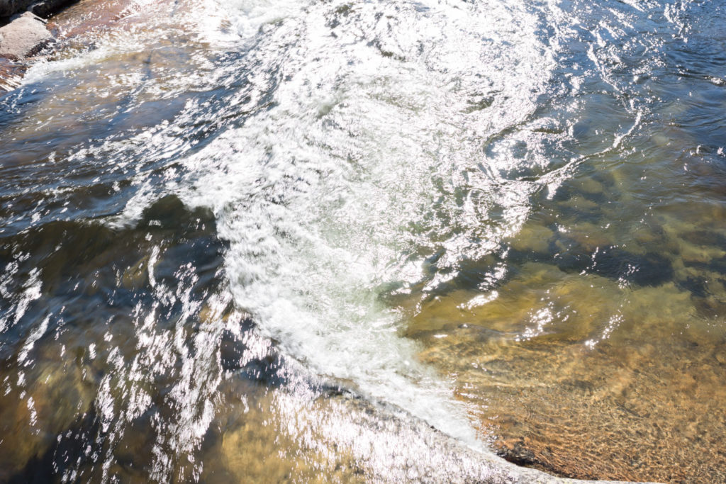
What was striking was how much more expression was revealed in the actual prints than could be shown by the reproductions made by ink on paper. Reproductions are never as good as the original, and that still hold true today. 

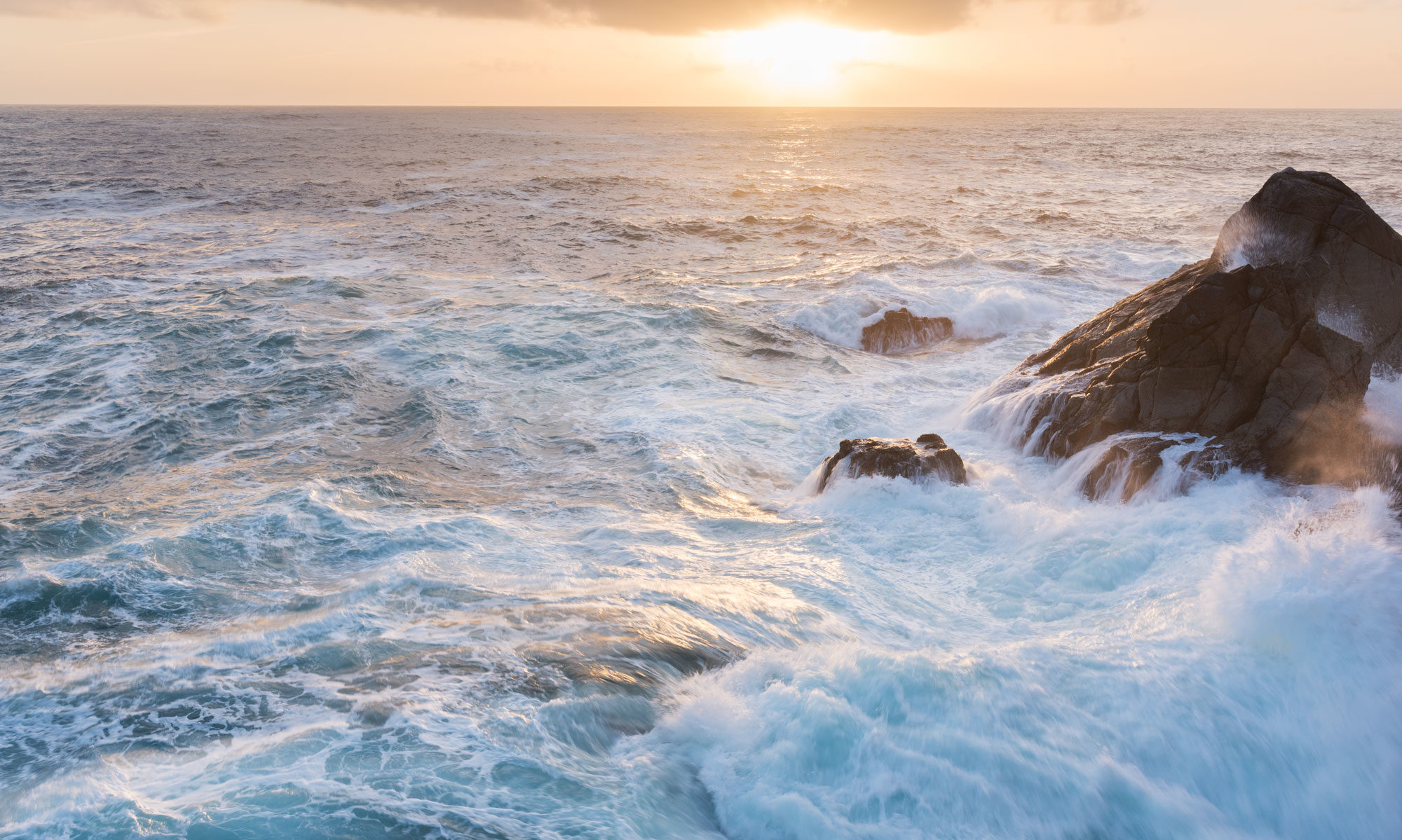
Chances are the only way you’ve seen photographs from your friends and favorite photographers is on a screen, and maybe just your tiny phone. 

I’d like you to consider that you’ve seen just a dull glimmer of what these photos are really like, because the screen is not capable of conveying all that a print can.Our screens and devices have allowed us to be exposed to more photography than ever before, but what we’ve gained in breadth, we’ve sacrificed for depth. 

Just looking at a picture of a dish from a restaurant I want to visit isn’t the same as actually eating it. The picture is devoid of all the layers, flavors, smells, and complexities of the real thing. 

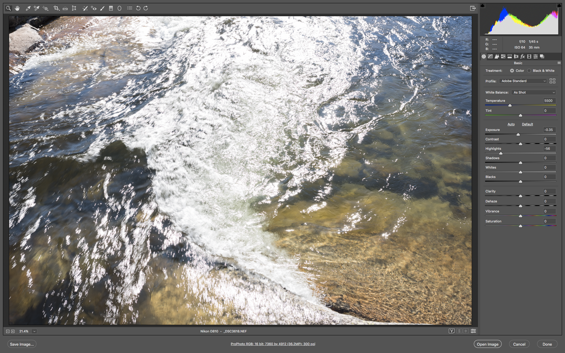
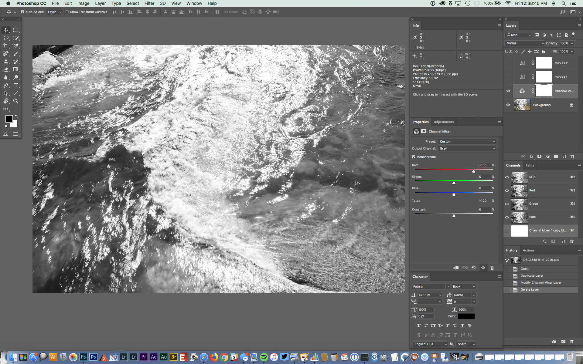
And honestly, seeing a photo on a screen is lacking the same way to me. Now granted, my experiences have made me a bit biased. In my time as a curator at The Ansel Adams Gallery, I was exposed to the finest printing the 20th century had to offer. And as a fine art printmaker, I’ve been able to make museum quality prints for many photographers who’s work I greatly admire. I’ve seen a lot, and that my expectations are based on that. 

But you don’t have to have the same experiences as me to appreciate this, and that is the whole point.

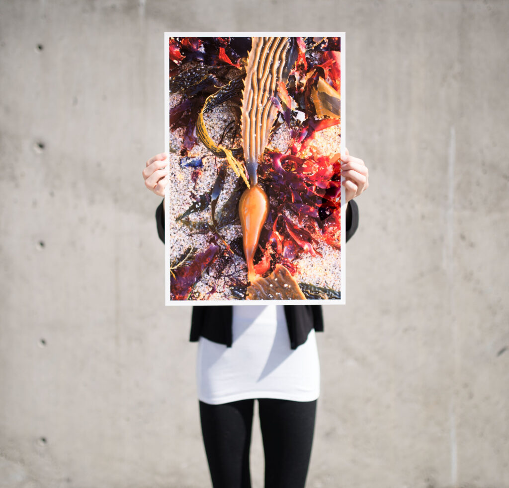
There is a much deeper layer of photography you can experience by looking at prints. There is a value in making your own prints, and taking the time to track down prints made by photographers who you’ve only admired in a instagram post. There is a whole world to discover beyond the screen, and all it requires is realizing this experience exists and taking the time to visit galleries, museums, and exhibitions to see real prints.  If you don’t, then you are really missing out on one of the best parts of photography. So what are you waiting for. 

Processing for Print Instead of for Screen

When you process your photos, are you trying to make them look good for screen or are you thinking about how they will print? And why is this even a question? 

Well if you’ve ever made a print and had it come back looking nothing like your screen, you’ve experienced why this matters. 

And not only do screens look different from prints, every screen looks different! 

Every.Single.One.

If you don’t believe me, next time you walk into Costco, look at all the giant flat screen TVs and see how different every one looks. 

The harsh reality is that when it comes to displaying our photos on a phone, tablet, or computer, It’s going to look different on every device. Throw in what instagram or facebook is doing to your photos and the same photo may even look different on the same device!

Trying to adjust to this every moving target is just chasing your tail. Great Rich, thanks for that little nugget of wisdom, but what do I do about it?

The answer lies in picking a more consistent standard, and for me that standard is prints. 

With the right workflow, prints allow a higher degree of control and consistency. So instead of processing something to look good on my screen when I know it will look different on your screen, my goal is to process the file so that it will make a good print. 

That’s a great goal, but what are some practical steps to achieve it. 

Well, first, I have to know my monitor well enough to get past the screen to print differences I talked about earlier. I do that with a mix of experience, knowing what a certain result on screen will produce on print.  I also use the info tool to read the pixel values ( “the numbers” ) so that I can make precise adjustments beyond what the screen can show me. 

Learning to understand what how the screen will translate to print is what I call an “mental calibration” as you are training your vision to compensate for differences between the two. It’s a learnable skill, but it does take practice. 

You can improve the process by “calibrating” your display with a device like the x-rite color monkey, and by using special reference monitors designed for screen to print matching ( I use a NEC MultiSync PA242W which you can read about in a previous article.)

Using that process, the processing decisions I make lead me to a file that I think will print the way I want. And if it will print the way I want, then this is the “most accurate” version of the file. 

So when I share this file on the web or social media, I’m starting with the best possible source. Since I know it’s being viewed on countless devices I have no control over, I know that at least I was feeding in the best original I could. 

So what happens if you work the opposite way? Making it look good for the screen with no regard for the print?

If you never print, that is a perfectly valid way to work. But it builds in a “gotcha” if you decide to print one of those files, chances are it will look nothing like your screen. 

It’s really easy to push a file so far in such a way that still looks good on screen but moves outside the realm of what can ever be produced in a print. That doesn’t mean screens are better…in fact quite the opposite. What it means is that a screen is imprecise enough that it can hide a lot of bad processing decisions that become glaringly obvious on print. 

There is a saying in the music world that if you can’t play well, then play loud. Screens are kinda like that. 

You can get so used to hearing your photo “loud” on screen that when you switch to prints, which are capable of so much more depth and subtlety, that you can’t make the two meet. By processing my file for print, I don’t run into this problem.

Because I never expect the print to look just like it does on screen, I’m setting up a different expectation in my mind than that held by a photographer who seldom prints. Furthermore, I never expect that when I share my photo on the internet that it will look exactly the way it does on my precisely color managed monitor at home. It all comes down choosing a set of expectations that meet your particular needs, and using a workflow that helps you consistently achieve those expectations.  

Growing Through Goals

Dragon Ice, Merced River, Wawona, Yosemite National Park
4×5 film, 135mm Nikkor lens, Fuji Film

Growth seems easier when you are striving for a goal. I know that is the case in my own photography. 

Starting at about age seventeen, I got a taste of how beautiful a photograph could be when I made a very small print of my girlfriend (and future wife!) to put in the “film reminder” slot of my Nikon camera. Printing a 35mm frame at near contact print size brought out tones I had never seen in the 5×7 sized prints I usually made, and a breakthrough happened, where i saw a higher level of communication and beauty that could be achieved in a photograph. 

That passion for high quality prints was fed again a year later when I discovered Ansel Adams, and then his assistant John Sexton. I chance encounter with a large Cibachrome print by Joseph Homes at a Nature Company store showed me that the same quality was possible with color photography. 

These experiences led me to a Yosemite workshop with John Sexton and Philip Hyde, where my twenty year old mind was blown away after seeing what seemed like hundreds of prints from these two masters, as well as the fine prints at The Ansel Adams Gallery where the workshop was being hosted. 

To say that workshop experience was life changing might be an understatement. I was changed forever.  It kindled in me a burning drive to learn the craft of photography so that I could express my vision with that degree of beauty, clarity, and impact I saw in the work of these masters.

That passion helped defined the next two decades of my adult life with West Coast Imaging, the fine art lab I founded to let me buy the then expensive tools of digital photograph like drum scanners and Chromira digital enlargers. Learning how to get the most from these tools, as well as working personally with photographers like Galen Rowell, Chip Hooper, Jack Dykinga, Michael Forsberg, Robert Glen Ketchum, stretched me even further as I had to meet their standards as well as my own. 

Striving for a goal with great focus and intensity has grown me immensely as a photographer. My craft and “seeing” have both grown as a result of chasing this illusive goal of making the best prints possible. There is always more to learn, but by just following my passion, I’ve learned so much, and prepared myself to learn more. 

So what goals in photography are driving you? Are you striving for a goal or are you feeling stuck? What’s your passion in photography? What do you want to say and who do you want to say it to?

As we head into a new year, I encourage you to set a year long goal for your photography and work intently at it. See how far you can get. Don’t be indecisive…just pick something…anything! A years worth of effort in any direction of photography will bear fruit and take you down paths you never expected.

Need some ideas?

How about a cohesive 8×10 print portfolio of your very best work? A new body of work of a new subject or location? Learning a new technique? Telling a story that is immensely important to you? Improving your printing? Improving your seeing?

What it is doesn’t matter as much as just doing it. Follow a passion, or try to work through a barrier or a fear.  Pick something you want to give your all to for a season and then see what happens. If you do, I’m confident you’ll look back at 2020 as the year you sharpened your vision. 

Processing Makes the Difference in Prints

Reflections, Tuolumne Meadows, Yosemite National Park

Not sure why your prints aren’t coming our the way you want? Want better prints? Then it’s time to look at how you process. 

Processing is where we take creative control over what a print will look like. 

The printer (output device) is supposed to be the dumb part of the process. It’s not supposed to interpret, fix, or change your processing decisions. It’s just supposed to render the processing accurately. 

A printer should be like a player piano. You put in a piano roll, and assuming the piano is in tune, you hear the music as the musician intended. 

Our file is the piano roll, and processing is where we decide what notes should be played, when, and for how long. 

Processing is where the really important stuff happens. Processing creates a file that tells the output device what to do; what colors to print, how dark and how light, how saturated, and what color balance. The output device isn’t supposed to be deciding those things, YOU ARE!

One of the challenges you may be facing is that making something look “good” on a screen is easier than making it look good in print. 

Screens are more forgiving because they they can’t display the same subtle variations of color, highlight, and shadow that a print can. They hide small (and sometimes not so small) differences in processing. This is especially true of phone and tablet size screens. 

If you are processing for web and social media, the screen becomes your final output device, and you can see it instantly in its final form. But not so with prints. 

There is always a screen to print translation as we switch from transmitted light (screen) to reflected light with ink on paper (print.) 

Prints are less forgiving of processing errors. Things that will hide on screen become glaringly evident on the print. The “pop” of a screen isn’t there to mask these processing errors. 

So when we’re printing, we need to learn how to “read” the monitor and anticipate what it will look like on the print. Like any art, that means practicing, gaining experience, and refining our techniques. 

Printing is sensitive to very small changes. If you can see the difference between a one point slider move on screen, assume you’ll be able to see the difference in print. 

So instead of trying to see if 50 contrast is better than 30, try and see if 34 contrast is better than 35. Or instead of deciding between a 5000k and a 4950k white balance how about trying a 4975k setting?

It may sounds like splitting hairs, but these very refined changes is where you bring out the magic in a print. I often spend half my processing time on an image going back and forth between small changes to asses their effect. I’m looking for the “perfect” setting that matches my artistic vision.

This fine tuning is really noticeable in highlights and shadows because  those tonal areas simply do not display accurately on screen.  So I rely on the info tool to read the numbers. This gives me a mathematic measure of what the print will show instead of the visual measure our eyes give us. For shadows and highlights, the numbers are more accurate than our monitor or eyes. 

Processing for print is a culmination of all your photographic experience and knowledge to express your vision. The more you grow your skills, the more you gain experience, the more satisfied you’ll be with your results. Next time you don’t get the print you were expecting, go back to your processing to make it better. 

Visualization

Celestial Cascade, Tuolumne River, Yosemite, California
Nikon D810 with Sigma Art 35mm f/1.4
1/45 sec, f/10, ISO 64

Photographs aren’t just about what we see, but about what we feel, what we believe. 

Visualization is one of my most important tools in that lofty goal when I’m trying to “see” and make a photograph.  Put simply, before I even take out the camera, I see in my mind’s eye what I want the final image to look like, and I use that visualization to direct all the creative choices in exposing and processing the photo. 

This may seem unimportant when a digital camera can give us a instant preview after we click the shutter, but visualization goes beyond that. That little camera LCD screen can’t show us all the possible processing choices we might make, nor can it match the range and depth of a final print. The visualization a skilled photographer makes goes way beyond what the camera can display. 

I find this to be particularly true in black and white, and by learning to visualize better, it opens our eyes to new possibilities. It can enable us to “see” better, both what is in front of the camera, and what is in the mind of the photographer. 

Take for example the photograph above, Celestial Cascade, Tuolumne River, Yosemite, California.   

Since this photograph is in black and white, what you see above is not what my eye saw. To the naked eye, it looked like this:

As part of a short hike with my family, we stopped to enjoy a favorite section of river and the coolness of this mountain stream. As my kids played with the rocks and waded, I had a few moments of quiet. The time of day didn’t seem conductive to making photographs, with high sun and contrasty light. But as I watched the water and contemplated the beauty of the scene, I found myself enjoying the patterns made as the water surged under the bridge and built into a wave, with the patterns of white foam it produced, and the play of sunlight reflecting as a million stars on the ever changing surface. The patterns reminded me of my friend David Ashcraft’s photograph “Universe Expanding”, and I knew if I just looked more deeply, I could express what I was seeing and feeling. I wanted to turn this little patch of the Tuolumne river into a proxy for the the infinite sea of stars in the night sky, and into the deeper realities of that infinite nature for which words are hard for me to find. 

At this point, my camera is still in the bag, but my mind is fully awake. The color was not interesting to me, so I decided that this should be in black and white. Once I switched that switch in my mind, things started to become clearer. I wanted the photograph to focus on the water and the patterns of sunlight and motion. Contrast would let me do that, and then all of a sudden, I saw in my mind exactly what I wanted the print to look like. It was at that moment that I went for the camera bag, and worked through the settings that I thought would give me what I saw in my minds eye. I was without a tripod and trying to work more freely, so I had to work within the shutter speeds that would let me hand hold the camera. I wanted some blurring of the water, but the light was so bright that even at ISO 64 and f/10 I was still at 1/45 of a second, but that happened to work out well for what I wanted to show. 

The thing about visualization is that it makes processing easier to a degree because you already know the look you want before you even open the file. That visualization guides your steps and choices of tools. 

RAW processing was pretty minimal. I just brought down the exposure and the highlights a little to try and hold detail in the foamy water. 

The Photoshop adjustments are all global changes. First I used Channel Mixer to convert the image to black & white using the red channel, as I liked how it allowed some of the shapes of the underlying rocks to come through. 

Then I added a simple one point curve that darkened the image overall, but by the placement of the point, biased that darkening to the shadows and midtones. This is one of the reasons I really like curves. They give me the instantaneous ability to exercise very precise control over how and where changes to density and contrast is applied. Instead of the linear “more or less” of a slider, I can move the points in both the x and y dimensions, as well as decide how many points to use. Points create inflection points that change how the curve works up and down slope, and those inflections are where I find the control to achieve what I envision. 

The file shows I played with a second curve as I looked at some alternative tonal relationships, but rejected that for my original curve. 

I want to draw attention to how simple this was to process. A single frame camera exposure, two minor moves in RAW, a simple conversion to black and white, and one curve with one point. This is an exercise in working with the materials, and seeing “through” them to how they can work at their most fundamental level. I’m not opposed to greater complexity in processing, but the more you work “with” the process, the easier making a photograph can become and the more you free your vision. 

My final step for this photo was cropping. Cropping is a creative decision for me, and I usually play with crops on every photographI make in attempt to find the composition that best draws attention to the subject. The goal is to eliminate as much distracting information as possible. Also, I’m not fond of the 2:3 ration, and I prefer the more squarish 4:5, and as well as the 1:1 square. I often find the 2:3 just includes too much and makes it hard to create the tension I like in a composition. 

For this photograph I settled on a 1:1 square crop, which I mark using the cyan “guide” lines, which are saved in the file so I know how to crop the Master File when making targeted files for screen or printing. In many things, Photoshop provides multiple paths to the same solution. I’ve been using this for crops since before Photoshop added a way to preserve crops, so it’s what works for me. 

The end result is something I wanted to say, but for which I had no words. Through visualization and applying the craft of photography, I was able to give voice to that vision, and in this case, the result is an expression of something I felt, more than what I saw before the camera.