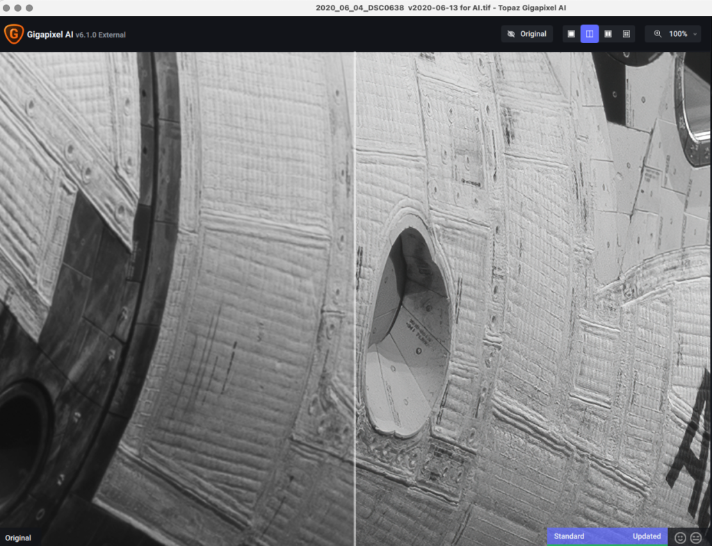
Feeds:
Posts
Comments

Archive for the ‘Uncategorized’ Category

Digital photography has created a huge problem. Most of us no longer know what our photographs look like, because we aren’t using color-accurate display systems to view our photographs on screen.

Sure, most people think their systems are accurate, and expect their prints to match their monitor, until they hit a bump that tells them something is awry. In my experience running two photo labs and teaching photography, there are few photographers who have a rock-solid, color-accurate display solution in place.  The best thing you can do is read on, and it will become readily apparent where you fall in this regard.

This problem exists because computers and displays aren’t accurate out of the box. They only are made to be accurate by YOU carefully selecting hardware and properly setting up your software.

Read that again and let it sink in. I know most people assume that they have a “good” system, but “good” does not mean accurate.

Color accuracy doesn’t happen by accident. It is only by an intentional application of hardware and software by the photographer that monitors display an image that could be called “accurate” by industry standards.

At Aspen Creek Photo, we most often see this when a photographers discovers that their expectations exceed the limitations of their equipment or their knowledge of color management and how to apply it successfully. This is a common occurrence in photography, and it’s how we grow in the craft. Making an expressive photograph is all about having a pre-visualized expectation…then learning how to achieve it.

Usually the discovery of expectations exceeding these limitations comes in the form of an email declaring, “My Prints are Dark!”

The good news is that obtaining accurate color from a monitor is an achievable goal. The catch is that you’ll probably have to make some purchases, buying the very specific equipment color accuracy requires.

When we run into issues that we suspect are calibration related we have a set of troubleshooting questions that quickly identify the areas that need corrective action.

▪ What is the system software (10.5, XP, Windows 7)?

▪ What photo editing software is being used?

▪ Monitor model number and brand?

▪ Calibration System (Eye-One, Spyder,etc)?

▪ Date of last calibration?

▪ Monitor Luminance Value?

▪ Monitor Whitepoint?

▪ Type of viewing light used to evaluate prints?

Answering these questions correctly will give you a color-accurate system…so let me give you the answer to each question.

System Software (10.5, XP, Windows 7):

This is a diagnostic question for the Aspen Creek staff to help understand a user’s setup, but it’s important because operating systems (OS) handle color management differently. I don’t care what OS you use, as long as you know how to make its color management work for you. I’m a 22-year Mac user, so I can only advise you on how it works on a Mac. For Mac users, you really don’t need to know much because the ICC workflow has been built into Macs for over a decade.

What you do need to know is where profiles go, where your monitor profile is stored, how to ensure that your OS is using that monitor profile to display images, and communicating that information to your photo editing programs

Photo Editing Software being used

If you are using a somewhat current version of Photoshop, Lightroom, or Aperture, this shouldn’t be an issue. If you are using different software, you’ll have to investigate to see if it works with ICC profiles, and if you need to do any setup to make it work properly.

Monitor model number and brand

Without a color-accurate monitor, forget about trusting your screen.

Sit in a room with candles for an hour and meditate on this fact until it sinks in.

Most monitors aren’t made for the needs of photographers to display images accurately. There is a simple way to tell if it is. Don’t look at price, brightness, millions of colors, or pixel resolution.

Color-Accurate displays are marketed by telling how much of AdobeRGB they display. Not sRGB, but AdobeRGB. If a monitor displays greater than 69% of AdobeRGB, it’s adequate for color-accurate work. If you go to your monitor’s specs on the manufacturer’s site and it mentions nothing about % of AdobeRGB, odds are you don’t have a color-accurate monitor.

Most color-accurate displays are going to cost you close to $1,000 and use IPS style LCD panels. NEC, LaCie, and EIZO are the big names in color-accurate displays, and most Apple LCDs are color-accurate too (although Apple doesn’t publish their % of AdobeRGB specs, which is strange, given how many professional photographers use their products).

NEC MultiSync LCD2690WUXi2

I’ve been using NEC displays for over 15 years, and they’ve earned my trust. Their SpectraView line of displays is great. Some people like the more expensive displays from LaCie and EIZO, but I’d don’t think the specs justify the added cost, nor do I think they would be meaningfully more accurate.  I’m hesitant to pay more for a small improvement in AdobeRGB numbers. Side-by-side there is little visual difference between a 69% AdobeRGB monitor and a 97% AdobeRGB Monitor, and in printmaking, little practical difference. Only someone doing it every day would see it, and the benefit is very small, on very few photos.  If you want to achieve more accuracy than the ~100% AdobeRGB that today’s displays reproduce, you are going to need to make hard proofs (actual prints).

(Just a note, sometimes you have to dig deep into the spec sheets to find the % of AdobeRGB information. One great NEC display didn’t show it on their website, but did in the PDF of their brochure. )

Calibration System (Eye-One, Spyder, Huey, Munki, etc)

i1Display2

To obtain accurate color you are going to need a calibration system with a puck

that measures your monitor, and software that creates an ICC profile. But not all systems are created equal. I’ve seen the good, the bad and the ugly since I calibrated my first display in 1994. My recommendation is to use the i1 (or eye-one) series from X-Rite, specifically the i1Display 2 or greater. This is one area where I don’t want to be in doubt, and I want to be sure it works. Buy once and buy well. I’ve bought too many bad systems, and made inaccurate prints, to mess with a “bargain.”

Personally, I use one of the >$1,200 i1 setups that uses a spectrophotometer. Work bought it, or else I’d use the i1Display 2. X-Rite has earned my trust with this product, and it will take a lot to make me change.

Besides the hardware, you’ll have to know how the software works with your OS. On the Mac, i1 automatically sets the profiles you make as the system profile. With another OS or calibration package, you may need to do that manually. Yes, you have to read the manuals when seeking accurate color.

Date of Last Calibration

In my experience, a calibration can last a long time–even years, as long as there is not a severe physical change in the display. But, if you are having problems, re-calibrating  is a good place to start. I wouldn’t re-calibrate more than once or twice a year. Doing it every month or two may cause you headaches because you may just get a different calibration than a more accurate one. Once you have a good calibration, stick with it so you can stay tuned into your display with your mental profile. Mental profiles are harder to recreate than ICC profiles.

Monitor Luminance Value

This is another big one. Calibrated displays should be much dimmer than a monitor out of the box. Specifically, we like our LCD displays at 90-100 Cd/M2. This is set in your calibration software, if it allows it (some bargain systems don’t, or you have to activate an “Expert” mode). Brighter than that, and it gives a false impression of tonal value. If it’s dimmer, it muddies the colors and shadow separation.

Monitor Whitepoint

All you need to know here is D65 and you are all-systems-go. Set this in your calibration software. Don’t mess with the color settings in the OSD of your display.

Type of Viewing light Used to Evaluate Prints

If you’ve succeeded in everything right up to here, this is where it can all fall apart. To get your print to “match” your monitor, you have to view the print under color-accurate light. That means a high CRI rating (98 or better) and a color temperature of ~5000K. Normal incandescent bulbs won’t work because they are about 3200-3400K.  Actuall sunlight isn’t good either — it’s a little too blue from the sky, and much too bright.

SoLux 4700K bulb for comparing prints to monitor.

What you need is a 4700K SoLux bulb that works in commonly-available light fixtures. For $20 you can achieve a more accurate solution than the expensive color viewing booths.

If you want to learn more on viewing lights, read my post “Choosing the right light for viewing your prints.”

Wrapup

If you’ve covered all of these bases, chances are you are seeing your photographs as accurately on screen as is currently possible. Of course, any time software and hardware is involved, there may be software errors or configuration errors…but those are usually rare.

If you haven’t covered all of your bases, then you should not trust your monitor, and you have a shopping list that will get you to a place where you can. It’s really as easy as that 99% of the time.

The biggest challenge most photographers face in achieving a color-accurate display is forgoing other accessories to invest in a good monitor and calibration system. But this is a false economy. A good monitor and display system can last for at least five years, in my experience, so a $1500 investment will cost you less than $1 a day. How much do print redos, or dissatisfaction with your work cost you?

I’ve learned the hard way (through experience) that there is no “close enough” monitor if I want my prints to “match” my screen. It’s either color-accurate or it’s not…so I choose to go color-accurate.

Read Full Post »

I love B&W prints. After practicing making B&W prints in the darkroom in my high school years. Seeing the beautiful tonal renditions it is capable of, then being drawn in by the prints of Ansel Adams and Edward Weston, I have been hooked ever since. While many people prefer color photography because it looks more like the eye views a scene, that doesn’t bother me. B&W is fully capable of recording what our heart feels about a scene; the things that transcend measurable physical phenomena.

B&W is an important part of my personal expression, so it’s time we start talking about it on Crafting Photographs, and what better way to do it than with an EXAMPLES video!

This latest video is an overview of my basic techniques and approaches. It covers Photoshop work as well as issues with scanning and understanding how curves create tonal relationships. I hope it starts to demystify B&W printmaking for you!

Read Full Post »


One of the most common mistakes I see on workshops is students making lots of local changes, but ignoring the global changes. When they ask me how I would approach their photo, I typically get it right where they want it with basic global changes and a few local changes.

I’m convinced that making global changes first will have a huge impact on how you print your photographs. I’ve emphasized this in my latest video EXAMPLES – The Making of a Photograph: Mono Lake Sunrise.

In this photograph, it’s the global changes that do 95% of the work, with local changes that refine the photograph. It still needs local changes…but they are easy to make when the heavy lifting has been done by the global changes.

You’ll need to view it in HD to see the numbers in the info palette. Also, the color change I make at the end is very subtle, and it didn’t carry through in the video format, but it’s there in the real file.

Use the blog comments section to ask questions about this video and further the dialog on how and why I made the adjustments I did.

Read Full Post »

Thought of the Day

The fundamentals of photography haven’t changed since the first photograph was made, only the tools with which we achieve them.

Read Full Post »

Making Printing Simple

Big Sur Coast, California

I think any photographer can learn how to make creative adjustments to their photographs so the prints look the way they intend…and I think it’s actually an easy thing to do.

When I look at my printing methodology (which is the same approach we’ve used at West Coast Imaging for tens of thousands of photographs, and the same one I’ve taught to a few hundred students over the years), it looks really simple.

Like a lot of things, it takes a day (or three) to learn the basics, and a lifetime to master the art.

First you need to start with a well exposed photograph. 

This should be the goal every time you click the shutter. It’s a lot easier to make a great photograph from a well exposed original than it is from a poorly exposed image. You will simply get better results.

It’s OK to fix your mistakes, but the basis for your workflow should be to make good exposures, and learn the tools that work for good exposures.

Use basic tools in Photoshop

I’ve found that on well exposed photographs, I can do 99%ish of everything I need to do  with just curves, color balance, hue/saturation, and selective color when coupled with layer masks, the info palette to see the pixel values, and some smart sharpening. Throw in a RAW converter for digital camera files (but I’m a 4×5 film guy, so most of my “RAW” conversion happens on scanner).

Notice there there are a lot of things I don’t use. I don’t use levels, I don’t look at histograms, I don’t soft proof, I don’t look at gamut warnings. I use them so rarely that they are almost nonexistent in my workflow. If you like cooking with those pots and pans, that’s fine, but if you want to take my cooking class to see how I make things taste the way I do, you’ll have to put them on the shelf for a while because they are not part of how I cook. I’ve have a lot of tools and ingredients on the shelf, and I have no problem using them when appropriate, but I really think you can do most of what you need with the simple tools I listed above.

Once you have the right tools, then you have to learn to use them properly. Even the best tool in the world can mess things up when used for the wrong application. Ever try to use a table knife for a screwdriver? I thought so :) Like you, I’ve got the bent table knives and damaged screws to prove I used the wrong tool.

Using the right tools properly is part of what I’m trying to show in the EXAMPLES video I just made. Making a beautiful print can be as simple as a few layers. You can do a lot with a few simple moves. But that’s where the challenge comes in: You have to practice those simple moves over and over again so that you can work on instinct. There is a reason Mr. Miyagi in The Karate Kid had Daniel-san practice “Wax on, Wax off” so many times, and there is a reason every great athlete practices endlessly to get the perfect golf swing, the perfect basketball pass, the perfect swimming stroke. Practice is about developing good habits and eliminating bad ones. Photography is the same way, so you have to practice good habits if you want to be a master and not a hack.

Printing really can be easy. It just takes using the right tools, and lots of practice.  I’ll keep posting to show you how, if you keep reading.

Read Full Post »


What goes into making a great print? How do you work on a file in Photoshop to make it communicate what you want?


The best way I can teach how to make a beautiful print is by showing you. With this in mind, I’ve embarked on making a set of YouTube videos entitled EXAMPLES – The Making of a Photograph that go through the adjustments I made to an actual photograph, step by step.


This time we’ll go through my photograph “Cottonwoods, Autumn, June Lake Loop, California” as it fits the seasonal mood I’m in, with colors all around me as the season changes.


Watch the video (click HD viewing for extra clarity and size), and feel free to use the comment section here at Crafting Photographs to ask questions and further the dialog on how and why I made the adjustments I did.


If you want some explanation on the individual techniques used, like layer masks, watch the video tips from West Coast Imaging.


And don’t forget to get out and make some autumn images! It’s too fleeting to miss!

Read Full Post »


Aspen Trio, Lee Vining, California

Aspen Trio, Lee Vining, California

I am continuing on last week’s theme so I can talk about some more of the unique aspects of the Sierra autumn, to help you get the most from photographing this spectacular display.


Chasing the Color

In the eastern United States, color starts up north and moves south as the season progresses. In the Sierra, color starts at the higher elevations, which experience cooler nights earlier in the season than lower elevations. The Aspen groves above 8000-9000 feet are generally smaller “scrub” and their color display can peak quickly.  It’s quite common for the peak to have passed at 9000 feet, with the leaves off the trees, but still find green trees at lower elevations.


I chase the color by elevation. If the trees down low (~7000 feet) are green, go higher on any of the amazing side roads off Highway 395 and elsewhere that lead to high elevation. If the trees up high are past peak, go to lower elevations.


Color may also change more rapidly depending on how far north or south in the Sierra you are. My experience from north to south is mainly from Conway Summit (just north of Lee Vining) to Bishop, where trees peak fairly close to the same time…but if nothing is happening where you are, drive somewhere else!


As the Aspens peak in the Eastern Sierra, the color is usually starting in the Western Sierra, with incredible Black Oaks and Big Leaf Maples, and wonderful meadows of dried grasses. Many years I’ve photographed the oaks in Yosemite into November.


Fall Color Reports

How do you decide if it’s worth the drive? I’m about three hours from the Aspens in Lee Vining Canyon when Tioga pass is open. It’s a long haul for just a day of photographing, but I’ll do it when I can’t stay longer. But it’s always easier to be motivated to make the drive and take the time if you know you’ll find some good color, not just green trees or blown out trees…so it’s a reasonable idea to check out fall color reports.


The problem with fall color reports is that everyone seems to evaluate the conditions differently. Too many times I’ve read reports that this area or that area was “past peak,” only to go for myself and see that the peak had only just begun. Therefore, I generally don’t trust color reports unless they are from friends who I know and trust. My favorite way to see what’s going on is to view pictures people have posted from recent trips, as this allows me to make my own judgement on whether the color is peaking, or not.


When in doubt, go anyway! Even a bad day of photography is better than the best day at work, and I almost always manage to find something if I just get off my haunches and go out with my camera!


Subtlety

While fall color photography often focuses on the bold colors of the trees, don’t miss the subtlety all around. The understory of the forest is filled with a multitude of plants that are wonderful in their autumn garb. One of my favorite things is walking through the meadows of Yosemite and looking at the multitude of browns, tans, yellows, and other earthy colors. I’m particularly fond of the dead stalks of cow’s parsnip, and the wonderful pods of milkweed as they burst open to release their seeds. Try and throw away your preconceived notions and photograph what you find!


Read Full Post »


Autumn Cottonwoods, June Lake Loop, California

Autumn Cottonwoods, June Lake Loop, California

I love autumn, and always have. When autumn color begins, the world looks and feels different, and it makes me very happy at a level I can’t easily describe. 

It should be no small surprise then, that autumn is one of my favorite times to be out in creation making photographs. Photographs let me share that joy with others in a way I can’t with words.


If you are looking to photograph the Sierra autumn, there are many things that make it an exciting time to photograph.


Lighting
Here in the Central Sierra, the sun is at a low angle for most of the day, which creates dramatic shadows and reveals texture that is significantly different than the summer sun.


The light also changes more quickly, as the sun changes position faster as a result of the low angle. This means that when working in one area in mid to late afternoon you can see very different light over a course of even half an hour, and as sunset approaches, things change very fast. These conditions can be challenging to work in because you have to choose your subject and photograph it quickly. You don’t have much time to drive and chase the light, but it is very rewarding to work at a furious pace in the last hour of light.


Clouds
Summer is full of cloudless blue-sky days with little “atmosphere” to create drama and colorful sunsets. Autumn still has its share of blue-sky days, but it also brings days with great clouds as the Sierra heads into the start of the rainy season. High, wispy cirrus clouds complement the crisp autumn air, and you are more likely to see a stunning sunset in Yosemite than in summer. 


Weather

Clouds usually mean something is happening with the weather, and I find weather creates exciting photographic conditions. It might be as simple as a cloudy backdrop, or it could be the wonderful light of a overcast day, or overcast with a light drizzle which makes the colors come alive. And if you are really lucky, you may experience an early snow while the trees still have autumn leaves.


The colors don’t last
The fleeting nature of autumn also creates excitement for me as I photograph. Like a symphony or fireworks show building up to a grand finale, the tapestry of every moment seems richer and richer until all of a sudden the leaves are gone and it’s over, leaving me exuberant and breathless at the same time, overwhelmed by the beauty of it all. It is a singular expedience that you can only have for a brief period of time each year, and it’s never the same twice. 


I hope you’ll make the time this autumn, wherever you live, to go out and experience this incredible spectacle, and that your experience will lead to making photographs that are meaningful to you. It won’t last long, so go get busy!

Read Full Post »

Making hard proofs (a proof on the same paper and device you will use for final prints) is a central part of my approach to fine printmaking. Therefore, the light sources I use to view proofs are also very important, because not all light sources are accurate for my needs. If I can’t view the print accurately, then I can’t use them as guides for making changes to improve my prints.


To choose a good viewing light for your proofs, you need to understand there is no light source that will make your prints perfectly match your monitor. I know this is contrary to many marketing claims. You can get really close, but a perfect match to your monitor is impossible because of the monitor itself, and the light sources. Like most things, the differences can only be bridged by experience, not technology (or money!)


Since I can’t have a perfect light source for every purpose, what I have to settle for is a light source that is a good simulation of a given environment.


In my world, there are two separate environments I’m interested in simulating: the monitor, and gallery lighting. Each one of these environments needs a different light source to achieve my goals.


Simulating a Monitor:

To simulate the monitor, I use SoLux 4700K bulbs. SoLux bulbs provide what I believe to be the most accurate color for monitor simulation, and they also happen to be the least expensive solution. A 4700K SoLux MR16 bulb costs just $7.95 each and works in standard track lighting fixtures. 


I believe these bulbs are far more accurate for comparing prints to a monitor than any other light source. I base this belief on their spectral distribution curves. My experience is that the fluorescent proofing lights used in the offset printing world (costing thousands of dollars) are not as accurate as SoLux bulbs. But you don’t have to take my word for it, as SoLux bulbs are used by a long list of major galleries and manufacturing companies for evaluating critical color.


At West Coast Imaging, it’s very important for us to be able to simulate the monitor, since we are often matching prints to chromes and original artwork. We also need to critically evaluate color tests of new papers and profiles, and SoLux 4700K bulbs perform this function better than any other light source. Using SoLux bulbs lets us have confidence that we are viewing accurate color from our prints, and lets us evaluate if our monitors are doing the same thing. Not using an accurate viewing light is one of the most common causes of customers thinking their prints don’t match their monitor.


Simulating a gallery environment:

In my personal work I emphasize the simulation of a gallery environment more than I do matching the monitor. (This assumes that I have an accurate and well profiled monitor as a starting point.)  When I look at a proof of my own work, I really don’t care if it matches my monitor. I care if it will express my artistic intent on the gallery wall, which means I need to use lighting that simulates the gallery environment where my work will be shown.


Why is this so important?


It’s because there is a vast difference in the way prints look in 4700K light, and the way they look in the 3000K-3200K light that is used in most galleries. Gallery light is warmer, and that affects how colors in a print are perceived. Warmer light tends to make warm colors richer, and cool colors less vibrant and less cool. For example, reds, yellows and oranges may have more depth and vibrancy in gallery lighting, while rich blues will be dulled by the “yellow” quality of the light. 


The color temperature of the light also affects very light colors and paper white. This is especially evident in B&W prints, which look substantially different under 3200K light than they do under 4700K light. The warmer gallery light will always make light colors and paper white look warmer than it does under cooler light.


Therefore, my methodology when I am evaluating a proof, is to look at it in gallery lighting conditions, since that is the lighting my audience will see it in. I want to make printing decisions so the print looks “right” in that light.  I don’t care if it matches the monitor if it doesn’t convey my message in light used in galleries and homes.


The good news is that if you make a print look as good as it can under 4700K light, or on a D65 calibrated monitor, it generally looks as good as it can under 3200K light, and vice versa. But there can still be differences, so I choose to use 3200K to evaluate my proofs, and I save the 4700K light for special occasions when I need to check the performance of my monitor, or evaluate color tests.


For gallery lighting, you don’t need to get any specific make or model of bulb. The standard MR16 bulbs sold at the big box home improvement stores are the best simulant of galleries because that is the same light they are using. They probably even buy their bulbs there, too!


What about different lighting situations? 


If I’m viewing proofs in light that is not one of these carefully chosen light sources, I don’t try to make critical color decisions, and I am very suspect of my perceptions. This is especially true of the fluorescent lights used in businesses and homes for task lighting. Typical fluorescent light is the worst light imaginable for judging color, and can show huge magenta or green shifts! 


Setting up accurate lighting to evaluate your proofs and prints isn’t hard, but it is a very important part of crafting expressive photographs.  Just remember, friends don’t let friends view prints in bad fluorescent light!


Read Full Post »

There is an idea out there amongst some teachers and students of photography that the method of making a great photograph can be reduced to a formula. It’s an easy trap to fall into, because a lot of teachers and students actually believe in this fairy tale. It sneaks in to our consciousness because large amounts of photographic education happen through articles just like this one you are reading, which is by nature a one sided conversation that often leaves out many important thoughts and ideas. Articles have to be so condensed that the full depth of a photographer’s approach is difficult to communicate.


But what’s so what’s wrong with formulas?


The problem with formulas for making photographs is that they are not really formulas…they are recipes. 


A formula is something that, when followed exactly, produces the same results every time, and assumes a controlled environment. Formulas work great for chemistry, for making the drugs that heal us and developing solutions to process our film (at least for those of us who still use film :) …but not so much for the dynamic nature of photography.


Making photographs and making prints is much more chaotic than what a formula can fully encompass. In crafting creative expressions, following the same formula will not produce the same results every time because the conditions are never the same, and every file or scan always needs something different to bring out its full expression. What we need are not formulas but recipes.


Recipes are great for making photographs, as long as you don’t treat them as formulas. Why? Have you every tried to make your grandmother’s famous recipe, and had it come out tasting completely different than the way she made it? The reason is that there was some small change (or series of small changes) that completely altered the final result.  The small change may have been an assumption on the cook’s part, or a methodology, or the necessity to use a certain stove or pot, or any number of different physical conditions that needed to be replicated exactly to achieve the same result.


But the most important part that is left out is us, and what we bring to the making of the  dish. When we cook, or when we make photographs, there is a part of us that we bring to the process that is involved in the making and expression of the ingredients that can’t be distilled into 2 cups of this, a tablespoon of that, and 350 degrees for so long.


That’s why recipes sometimes don’t work right, and they never work if you think they are a formula.  We need to understand that we must bring a part of ourselves to the process…that in fact we are the most vital part of the process of expressing ourselves, and in making a dish worth eating. The missing ingredient is always YOU, and if you don’t add yourself in, the dish will fall flat.


It’s why we can’t turn another photographer’s recipe into a formula because we do not bring their experiences to our cooking. But by looking at and trying their recipes, we can learn about their approach, and learn about the universal qualities of our materials so we can combine those ingredients with our experience to make our unique expression. That’s vital, because in the end, it will be our expression that will stand or fall based on our efforts, not on the strength of the person who wrote the cookbook we used.


We may end up not liking another photographer’s recipes, or the results they produce, or we may not be able to replicate them, but that’s okay. What matters in the end is that you are growing in your understanding of the expressive qualities of the materials that are the ingredients in photography. That knowledge allows you to write your own recipes for each photograph and print, and to create results that satisfy you. That approach isn’t a magic potion that instantly makes you the photographer you want to be, and it isn’t easily bottled and sold, but where in life is their such a potion? It means you have to get in the kitchen and start cooking, make mistakes, and throw away a lot of bad dishes. I can’t think of many things more exciting!

Read Full Post »

Older Posts »

Follow

Get every new post delivered to your Inbox.

Join 98 other followers