Photoshop Upgrade Issues – Adobe Camera Raw

If you’ve upgraded to Photoshop 2022, make sure Adobe didn’t wack your Adobe Camera Raw preferences or you could be wasting hours of work.

Adobe is allowing a critical problem to occur when you upgrade Photoshop by defaulting the Adobe Camera Raw settings from the user’s custom settings to their default “Adobe RGB” in 8-bit.

This is one of those things that is very easy to overlook and can lead to hours of lost work if not corrected immediately.

Here’s what my recent install of Photoshop 2022 did to my Adobe Camera RAW settings:

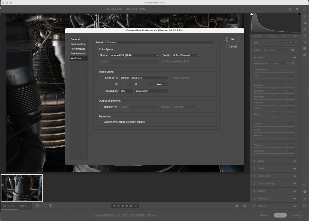
Yuck! Adobe RGB in 8-bit is the last settings I’d want to use. What it should have done is import my settings from Photoshop 2021 to what’s shown below:

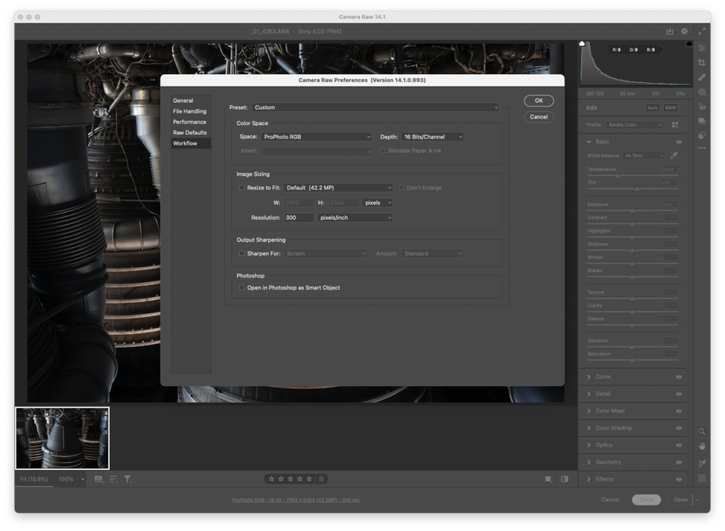
ProPhoto and 16bits/channel is my recommended setting to get the most out of your RAW files. It’s the default for experienced users, and should be Adobe’s default too.

AdobeRGB was a bad choice in 1998 and it is a bad choice now. In the embryonic days of color management when we were all figuring it out, I did a lot of work in SMPTE 240, a very similar space to AdobeRGB. That is until I learned it’s problems and found better colorspaces. Adobe should keep up with the times and ditch the vanity nameplate colorspace.

One of the hassles of updating mission critical software is making sure all your preferences and presets are configured correctly. It’s why I find upgrades painful even if they offer new features as they create downtime. I get joy from working up new photos, not solving software issues. So these things really frustrate me.

Grizzly Bear Processing Video

Capturing the feel of a large, wet, and hungry grizzly bear just a few dozen yards away can be challenging. In this video, I’ll show you some of my processing techniques that reveal the characteristics of the animal while holding the viewer’s attention.

I’ve processed many photos of grizzlies over the years, and every time I’m amazed at these huge creatures and the power they have.

My goal with wildlife photos is to help people experience what the photographer saw, and the many qualities of the animal that have to translate into the 2D medium of photography.

Thanks to Dan Brown for letting me show you how I processed his photo.

Black and White Digital Processing Workshop – January 25th

Bridal Veil Fall and Snow, Yosemite National Park

The beauty and elegance of classic black and white photography has captivated viewers for over a century. This series of workshops teaches the tools and techniques used to create this beauty using digital tools. 

In Part 1, we’ll introduce the “look” we are going for by looking at prints and discussing the characteristics and intent that create the classic look.  

We’ll then cover the three primary elements in creating this look. First, We’ll learn to apply the “classic” intent to RAW files to create a base for further processing. Second, converting our color digital files to B&W with a creative vision will be explored through various tools and techniques. Third, we’ll learn the foundational approaches to creating contrast in our photographs that creates form, volume, beauty, and visual tension. These three pieces are inextricably linked. How you use any one of them directly affects your ability to use the others to achieve your desired result. 

Throughout the workshop, we’ll be making small 8×10 proof prints to test our work and get around the limitations for monitors to display the full beauty of the B&W image. 

This workshop is limited to four students to maximize learning potential of the one day format. We’ll be working in Photoshop, taking advantage of some of its unique properties that are difficult to replicate in other software. You do not need to be a fluent Photoshop user, but you should be comfortable using editing software with intermediate experience in file processing. 

Saturday January 25, 10am—4pm
Technology Engagement Center
306 Minerva DriveMurfreesboro, TN

Fee – $150 per student

Signup online at Eventbright:

https://www.eventbrite.com/e/photo-workshop-processing-for-the-classic-black-and-white-look-part-1-tickets-86390754071

Inkjet Printing Through Photoshop – Macintosh

Using printer profiles correctly when printing is essential to getting accurate color from your printer. The challenge is that you have a bunch of settings that have to be set up exactly right, every time, for it to work. That is further complicated because every editing software, OS, and printer driver has it’s own settings and names for those settings.

You’d think that there should be some good information out there on how do do all this, but even the paper manufacturers don’t have good guides. One of my favorite companies has German language screenshots in their English language document, and they note that their instructions don’t work for every setup. Uggg!!!! It makes you want to pull your hair out.

I’m going to make my attempt to solve this problem by sharing the settings I use with Photoshop on the Mac. These settings have been tested and verified to print my Color Test Sheets correctly.

The settings for Lightroom on the Mac are quite similar to these, so you should be able to translate them over. Understanding what each setting does may also help you translate this for other editing programs and setups. As time allows, I plan to make more of these, but the easiest place to start was with the software I print through.

download the PDF here:
Inkjet Printing Through Photoshop – Macintosh.pdf

Simple Tools – Complicated Results

Simple tools can be used to create very complicated results in Photoshop. This video shows how I use three of my primary tools in Photoshop. I’ve had some comments recently that viewers had not considered that multiple layers could be used like this, so it may be an interesting view into my problem solving approach with Photoshop.

My techniques are based upon what I learned in the darkroom in my early years in photography, and applying those techniques to Photoshop. My study of Ansel Adams’ Zone System and printing workshops I’ve taken with John Sexton, have been among the biggest influences of what I think a “fine print” should look like. My style is based very much in the West Coast / ƒ64 school of photography, and while I use digital tools, the look I strive for is in that tradition.

Targeted File Outline of Steps

Prints are only a good as the file that made them, so the more we refine our files, the better our prints will become. 

One of the ways to do this is to start making Target Files. Targeted Files are copies of the Master File that have been prepared for output or display on a specific device at a specific size. 

I make a targeted file every time I make a print or post a file online. 

My checklist for targeting goes like this:

1. Copy the Master File

2. Flatten all layers (Photoshop)

3. Size to height, width, and dpi as needed for the output / display device

4. Sharpen to taste

5. Dustbust at 100% magnification

6. Add border as necessary

7. Trim marks as necessary

8. Remove any alpha channels (Photoshop)

9. Save as copy with size in name. Use TIFF format when possible. 

Once complete, the targeted file is the one that is printed, sent to the lab, or uploaded to the web. 

Each one of these steps gives you an opportunity to take control of a parameter that can improve the final print. 

Every software handles these steps a little differently, but it should be possible to follow this workflow with any well made imaging program. 

It’s important to do these in order because weird things can happen if you don’t. For example, if you sharpen the image after adding borders, you’ll probably get a faint halo around the image instead of a nice clean line. They are in order for a reason that will become apparent as you learn the targeting process. 

Using Multiple Curve Adjustment Layers with Masks in Photoshop

A lot of people ask me why I use Photoshop instead of Lightroom, so I made this video to try and answer that. This image is a great example because of it’s extensive use of masking and individual adjustments for each layer. Photoshop’s masks let me take control of any area with great precision and make it very easy to modify my masks should I change my mind. Being able to use a different curve with each mask lets me carefully control contrast. And it’s very easy to make layers and masks work together and not against each other. Once you learn how to do this, it’s a quick, easy, and fluid process. I find that important because the ease helps me express my creativity with less effort which makes it easier to be more creative. Do you know how to make changes like this in your photo software of choice? Tell me what you think!