How bright should a calibrated monitor be?

Reader question:

 I use a SpiderMunki to calibrate my monitors. The software recommends that the luminescence value be 120.  I watched a video on printing and the presenter stated that the monitor should be no brighter than 80.  I wanted to get your thoughts about the appropriate settings.

Great question! Here are my thoughts:

First let’s answer why we are turning the brightens on our monitor down so far. These standards are driven by creating a good screen to print match. There are industry standard viewing lights  for printed materials that cost about $1,000, and are used in the prepress and lab industry to match color to professional standards. A accurate screen to print match requires a similar illumination of both screen and print. 

Dynamic range also has to be considered. Anytime you can make the highlights “brighter” you increase dynamic range and contrast. Normally we want that, but in the case of screen to print matching, it hinders matching the transmissive light monitor to the reflective light print. Lowering the brightness of the monitor makes a better match, and also makes it easier to see subtle tones and detail in the monitor that would be hidden with higher dynamic range/contrast. 

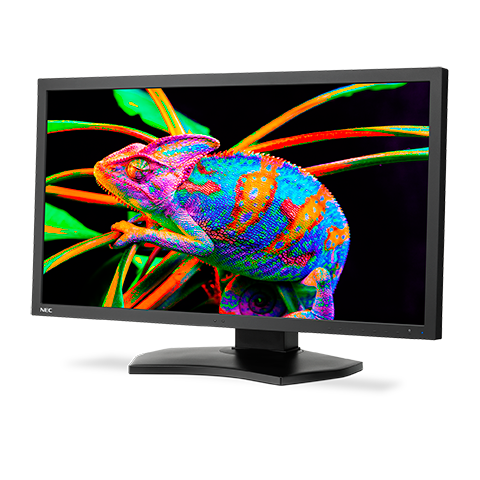
So now that we’ve explored a little of the why, let’s answer is 80, 120 or some other number correct. Traditionally 100 c/m2 has been the accepted value. I’ve been on calibrated monitors since the ~1994 and that was the value recommended with my first x-rite calibrator. It’s the brightness I’ve used for countless files, prints, and CMYK book/press reproductions for pro photographers. It’s also what my team of printermakers and scanning masters used at West Coast Imaging, so it is a rock solid, tested, proven number. 

The reality is there is a range of numbers that can work. The difference between 80 and 120 c/m2 is not that large. About a 20% variance from the 100 value I consider standard. In my early years I would work with CRT monitors, and as these aged, they dimmed, so that you could no longer achieve 100 c/m2, so I’ve worked with lower ranges too. It worked to a point, but for my taste once you get around 80, things start to get a little murky. 

At some point IIRC,  x-rite started recommending 120 c/m2 in their software. No idea why, they just did. So people started using that. I tried 120 it and decided I still liked 100 cd/m2 better. 

You also have to take into account that there is some mental translation in screen to print match. So some people may feel they get a better match with their lights and their monitor at one setting over another. 
So which value is right? I think you could make it work with a range of values from 80-120, but I know 100 c/m2 works so I stick with that if my monitor can achieve it. 

Monitor Recommendations November 2019

A friend’s long used Apple Cinema Display is dying and asked if the recommendations I made earlier this year for color accurate displays still hold true. His expectations are similar to mine, which is very high, as the work he does is for fine art prints, books, and magazine publication. Here’s what I shared with him.

Here’s my current recommended color accurate displays:

PA271Q-BK-SV  27 inch model for ~$1450 from newegg, BH, or Adorama
PA243W-BK-SV  24 inch model for $899 at Amazon and Newegg

What about that new 31 inch display?

NEC replaced their previous color accurate 31 inch display with the new PA331D. Based on my past experience with NEC, I am confident the color will be great . What gives me pause is it’s pixel pitch of 149 pixels per inch on screen. The other NEC displays I recommend have a pixel pitch of about 100 ppi. Higher ppi on a display makes it more difficult to judge images at 100% Actual Pixels Magnification. This means it could be more challenging to preview sharpening effects as they will be hidden by the higher resolution. Maybe it’s just a matter of finding a new methodology to view the image at a higher magnification, but it’s a bridge I haven’t had to cross yet.

I’ve also recently had the chance to preview the quality of one of the Eizo line. From my brief examination, it seemed incredibly accurate. But I still don’t have enough personal experience with it to say which model will produce the results that I’m used to.

I’m fighting a flu that has taken down my whole family, so I’ll cut and paste what I shared with my friend about buying a color accurate display:

There is a 31 inch model that is quite a bit more. For imaging I think 24 inches is a good fit, and larger can get overwhelming, but the extra screen resolution and size of the 27 inch makes it great for working on two documents side by side and other layout/non photoshop type products.  Even with the 24 inch, I cover up have the screen when dust busting at 100% because it’s just too much screen to take in all at once. 

Make sure to get the exact model listed as the PA243W-BK doesn’t contain the calibrator that the PA243W-BK-SV does. You should buy the calibrator as it allows you to use the NEC calibration software that calibrates at 16 bits and it really does let you resolve more tones than other systems. The technology has advanced sufficiently that i’s time to upgrade whatever calibration system you have. 

Figure this monitor will like last 7-10 years based on my past experience with NEC displays. 

These are a pain to buy from Amazon because their listings often don’t include enough information to make sure you are getting the right model. No idea why but that’s been the case for years. 

Sharpening and USM

A quick post on sharpening drawn from advice I gave a print client today. Sharpening is one of the the places I see photographers have the least confidence in.  

The challenge is every image is different and requires different settings. Getting the “correct” settings requires developing an understanding of what you see on screen and what that produces on print. It’s possible to make something that looks too sharp on screen, but looks perfect on the print  because a typical screen displays the image at about 93 pixels per inch, but the print can be of much higher resolution, so what you see on screen is in essence “magnified”. 

A couple quick tips:

  1. Always view the image at 100% magnification, or actual pixels. This will make sure that one pixel in your image equals one pixel in your screen. When you view your file at some other magnification, what you see on screen is some average of the pixels and can disguise the effects. 


2. Don’t use a 4x or 5k monitor like those found on newer iMacs. You need a monitor with a pixel resolution of ~72-110 pixels per inch, or a pixel pitch of around .23-.27mm.  In contrast a 4K 24” display has a pixel pitch of ~0.13725mm and resolution of ~180 pixels per inch, which makes the pixels too small to evaluate sharpening easily. 

3. Smart Sharpen is not a magic fix. There are many flavors of sharpening. Sharpening is an ingredient, and how, and where you apply it is all preference.

Looking forward to turing this into a expanded tutorial at some point. Until then, experiment!

Color Accurate Monitor ~$1,200?

A reader emailed me for a recommendation on a color accurate monitor around $1,200 for print work. Here’s my reply:

I’ve used the NEC line aimed at color professionals for about 20 years and find them excellent. Eizo is also supposed to be great, but they are more expensive and I have yet to compare side by side. 

The PA line are the NEC monitors for print accuracy. They use a different backlight that lets you get a more accurate white point. Other displays can advertise similar specs, but in real life are too blue and don’t work. 

I’m currently using the PA242W and find it is the most accurate monitor I’ve ever used.. I’ve also used the larger PA272W which is just as accurate but offers more screen space to work on. The PA242W is still available but looks like it is being replaced with the PA243W, and they are in the process of replacing the PA272W with the PA271Q for about $1350. I was trying to be thrifty when I got the PA242W, but I wish I would have spent a little more on the 27” because it is not just larger, but has higher resolution, which makes it easier to do non-photo work like have two documents or a word processor and a web browser open side by side which more than makes up for the difference in price. For photo work, either works just as well. Lifespan on a NEC display in daily use should be in the 7-10 year range form my experience, so I don’t hesitate to use it as a main display. 

On the model number you’ll see something like this: 
PA242W-BK-SV

BK means the color of the monitor, they offer black finish or white finish. I go for black so that there is as littler interference with my vision when judging critical color. The SV is an option that includes the Spectraview calibrator, which is a good option unless you are planning on buying a higher end x-rite package.

With an iMac, I’d just use the imac as the pallet monitor, and unfortunately even when calibrated, the most recent imac monitors are’t very accurate. Also, the 5k resolution does not allow good judging of sharpening because they are just too high res.