Lightroom vs Photoshop: Do I need Both?

Photographers get pretty dogmatic about what processing software to use. We do that with camera brands too, but that’s a story for another day. Often these dogmatic positions are based on emotions rather than a thorough understanding of both the tool and the result we wish to achieve, and that stops us from growing as photographers.

I’m going to suggest that your toolkit shouldn’t be either Lightroom or Photoshop, but both. 

Most photographers I meet primarily use Lightroom for processing. That’s no surprise, because Lightroom took most of the things that were hard about Photoshop and made them easier to access and harder to mess up. So right from the start, Lightroom and Photoshop were designed to use different methods to achieve a satisfyingly processed photo. Different means different, that that means we’ll usually get different results too. 

If computers generally frustrate you, Lightroom is the better choice. It is going to hide a lot of the process from you so that you can’t mess up your files as easily, and with many photos it is possible to make pleasing results. 

But the more serious you get about your photography, the more time you spend at it, the more you should consider learning Photoshop and the added tools it gives you. You can do it…It’s just another tool like many you have mastered in your lifetime from driving a car in city traffic to the expertise that allow you to be successful in your profession. 

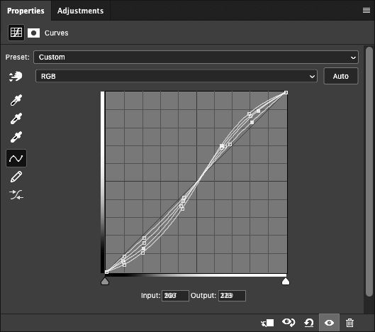
Photoshop has a reputation for being hard, and honestly there are way more ways to mess things up in Photoshop if you don’t have a solid workflow. But once you get a good foundation, Photoshop becomes easier to work in that Lightroom in many ways, and lets you achieve a higher level of precision and exert more control over the process. 

The thing is, all those things you need to learn to understand Photoshop, the things hidden in Lightroom, are things you need to learn to take more control over your photographs. There are a lot of ways Lightroom can bite you hard too. I know experienced photographers who have lost entire catalogs of photos because of one wrong click in Lightroom because they were lulled into a false sense of security. Lightroom isn’t perfect and neither is Photoshop. It’s always up to you to know how they work and make sure they are doing what you want them to do and not do things that are destructive to your photo archive. 

The fact is, if you want to grow as a photographer, you have to become more versed in all aspects of the process. It’s not about which software you use, but about how you think about the problems you need to solve, and understanding which tool lets you solve those problems to your satisfaction. 

The honeymoon phase of photography is when you like everything you do and it seems easy. But the real fun starts when you start to see beyond your current experience, and feel that drive to get more from your photos. That’s when the real learning starts, and when things get really rewarding. 

So I’d encourage you to make this the year you start using Lightroom AND Photoshop, and break through the barriers that are keeping you from using one or the other. In the process you’ll gain some new skills, and feel more confident in whatever processing choice you make.

Classic Black and White Digital Processing Class

Are you ready to start processing your black and white photographs like a master?

In the last year, I’ve helped hundreds of photographers improve their B&W processing through my talks and workshops, and I’d like to help you, too. Wednesday, January 12, I’ll be starting another round of my popular four-session Zoom class, Classic Black and White Digital Processing.

My talk at the B&H Photo Event Space provides a great (and free!) introduction to the workshop. It touches on many of the subjects this class will explore in greater depth. 

Every time I teach this class, it’s rewarding to see how the participants improve their photography and processing skills each week. Here’s what my students have to say about the class:

I have found the class to be outstanding, not only for learning techniques that are new to me in creating a B&W image, but also the creative ideas to draw the viewer into the scene.
– Brad K.


I want to thank you for your classes and all the extra effort you’re devoting to your students. The information is worth far more than than the price of admission.
– Al H.


This class has introduced me to new tools for vastly improving my images.
– Dennis W.

We’ll meet for four online sessions, each Tuesday through February 2. Each session lasts two hours. The first hour is live instruction, where I teach the techniques I use. During the second hour, I show how I apply those techniques to YOUR photographs, providing insight and critique that will help you learn and grow. 

Each session will be available to re-watch online for two weeks after the class, allowing you to go over the content again, or watch at a different time if you have a schedule conflict. 

Sign up today, then keep chasing the light!

Grizzly Bear Processing Video

Capturing the feel of a large, wet, and hungry grizzly bear just a few dozen yards away can be challenging. In this video, I’ll show you some of my processing techniques that reveal the characteristics of the animal while holding the viewer’s attention.

I’ve processed many photos of grizzlies over the years, and every time I’m amazed at these huge creatures and the power they have.

My goal with wildlife photos is to help people experience what the photographer saw, and the many qualities of the animal that have to translate into the 2D medium of photography.

Thanks to Dan Brown for letting me show you how I processed his photo.

Color Processing and Printing Workshop – Part 1

Saturday February 29, 10am—4pm
Technology Engagement Center
306 Minerva Drive
Murfreesboro, TN

Fee – $150 per student

This workshop is designed to teach you the processing tools and techniques that have allowed me to make beautiful prints for myself and for my professional clients in over twenty years of fine art printmaking. To maximize the learning potential, this class is limited to four participants. 

This is part one of a series of workshops. We’ll start the day with an overview of the tools and techniques we’ll be working with, and then spend the rest of the day applying those techniques as you process and print your own images. Working hands-on allows us to solve your problems with your images, working towards achieving professional quality results. 

We’ll be working in Photoshop, taking advantage of some of its unique properties that are difficult to replicate in other software. You do not need to be a fluent Photoshop user, but you should be comfortable using editing software and have some experience in file processing. This class is meant to teach foundations, so you don’t need to be an expert! The tools are actually very easy. Learning to “see” how to use them is the hard part, and the aspect we will focus most on. 

https://www.eventbrite.com/e/color-processing-and-printing-workshop-part-1-tickets-92033102487

Limitations of the Contrast Slider in Adobe Camera Raw

Curve equivalents of Contrast Slider in Adobe Camera Raw at +25, +50, +75, and +100.

I’m working on an article, and it turns out the Curves slider in Adobe Camera RAW is very limiting. The graphic above shows the curves required to produce the equivalent of +25, +50, +75, and +100 with the curves slider. The most pronounced curve is the +100, and the least pronounced (from the 1:1 slope baseline) is +25.

I’ve been meaning to do this for a long time, and honestly I’m a little shocked by the results. Even at +100, the curves slider is weak sauce, and doesn’t even begin to harness the power of curves.

What I’ve seen so far makes be glad I bypass the contrast slider and go right to curves. I’m looking forward to running some more experiments and developing a more in depth article.

Taming Large File Sizes in Photoshop

Working with high megapixel files in Photoshop can be a pain. It seems I’m routinely working on files that are close to a GB in size when I start adding layers to my 42MP 16 bit captures. New 61MP and larger cameras are just going to make that worse. 

While Photoshop can deal with these files, the disk space taken up by multiple versions of them, as well as for backup, plus save times can get to be a real drag. So how do we make it easier?

Well, this problem is nothing new. In my early days as a printmaker, working on 300 MB scans was a huge challenge. I remember when it took an hour just to do a 90 degree rotation, which gave me plenty of time to roam outside my cabin in Yosemite, but wasn’t very efficient. So I came up with a solution that I think you might find useful today. 

Here’s how it works. When starting with a large source file, like a 1GB scan or high MP capture, I make a copy of it and size it down to a reasonable size, say 8×10 inches @300ppi, which is a good size for proofing. Then I do all my processing on adjustment layers in Photoshop. This keeps the files small and quick to work on. 

When, and if, I need a larger version of the file, there is a simple process to transfer all those layers over to the high resolution original. 

My printmakers and I used this process on thousands upon thousands of files in my days at West Coast Imaging, and I even made a youtube video that demonstrates the process. One of these days I want to re-record these videos in beautiful HD (or 4k!), but I thought it was worth sharing the old videos because the process works the same, even on the ancient version of Photoshop depicted. 

Take a look and see if it’s a trick that can help in your toolbox. 

Adobe Enhance Details

Does the new Enhanced Detail feature in Photoshop and Lightroom really work? It does, at least for me. 

Heres an example of the same RAW file processed with Enhance Details on, and with it off. This is a screen shot at about 400% magnification. 

Normal Raw Processing
Processed using Enhance Details

You might have to zoom in to see this on your device, but when viewed at full resolution, I can clearly see that all the lines of the branches, and even the edges of the flowers are smoother and more refined. With it off, there is much more aliasing, very blocky in-fact. 

Enhanced Details may work better with some sensors than others. I’m hearing from photographers that see no effect, but I’ve seen plenty of examples where it does work. So you’ll have to try it yourself. 

For my Sony A7RII, it clearly does work, and this refinement of detail will allow me more options when applying unsharp mask, as well as resolving finer detail.  It’s now my default processing option. I just wish Adobe would integrate it better into the workflow instead of the current requirement to export to a DNG first. 

Inkjet Printing Through Photoshop – Macintosh

Using printer profiles correctly when printing is essential to getting accurate color from your printer. The challenge is that you have a bunch of settings that have to be set up exactly right, every time, for it to work. That is further complicated because every editing software, OS, and printer driver has it’s own settings and names for those settings.

You’d think that there should be some good information out there on how do do all this, but even the paper manufacturers don’t have good guides. One of my favorite companies has German language screenshots in their English language document, and they note that their instructions don’t work for every setup. Uggg!!!! It makes you want to pull your hair out.

I’m going to make my attempt to solve this problem by sharing the settings I use with Photoshop on the Mac. These settings have been tested and verified to print my Color Test Sheets correctly.

The settings for Lightroom on the Mac are quite similar to these, so you should be able to translate them over. Understanding what each setting does may also help you translate this for other editing programs and setups. As time allows, I plan to make more of these, but the easiest place to start was with the software I print through.

download the PDF here:
Inkjet Printing Through Photoshop – Macintosh.pdf

Glossary of Photo Terms

What does specular highlight mean? Or how about local contrast, d-max, pixel value, or paper white? Do you just nod along when people use these terms? Be honest now!

Photography is full of terms that are completely foreign outside of the medium, but are a necessary part of talking about it. I’ve compiled a brief glossary of terms that I use frequently and I thought could use a little definition.

Some of these are technical, and others are terms in common use among professional photographers and photo printmakers, but all of them bring necessary insight and understanding to the medium. 

This is not an exhaustive list by any means, and is mostly meant to define things that will help understand my articles and workshops. Most of these words and concepts are worthy of in-depth study; a more complete understanding of the what, when, why, and how will grow your skill and abilities. So treat this as a study guide as there will be a test every time you click the shutter, move a slider, or make a print!

Want to add a word? Or have something explained? Ask in the comments and let’s discuss! 

Color Correction

Still Photos – The process of correcting color and density with the objective of correcting errors in camera exposure and color balance

Contrast

Used to describe the difference in tonal values in a photograph, both global and locally. Large differences are described as high contrast, small differences are described as low contrast.  High contrast may also be used to describe a photograph where less than the full range of tones is used.

Contrast – Global

What we normally think of when we hear the word contrast. This is the  overall contrast of the photograph based on the the difference and amount of the brightest areas of a photograph. It can also be defined by the speed at which tones transition from black to white. 

Contrast – Local

Contrast within a specific area of the photograph as opposed to the overall contrast of a photograph.

Cropping

Still Photos – Making a photo fit a specific aspect ratio. May be done for practical purposes to fit a frame or print size. Also done to improve the aesthetics of a photograph by removing unwanted content and or changing the center point of the photograph.

D-Max

The highest density black a material can achieve, i.e. density maximum. Every paper and ink combinations or analog paper produces a different d-max. Higher D-max can be desirable because it creates more dynamic range, and a greater illusion of three dimensionality. Papers with some degree of gloss typically create the highest d-maxes. Matte papers, or artist papers generally have a lower d-max, or softer appearing blacks that produced reduced contrast. 

D-Min

The lightest value a paper can produce. See also paper white.

Interpretation

A set of adjustment to a photograph that produce a specific appearance. The goal of interpretation is to bring forth on paper the image or expression pre-visualised in the photographer’s mind at the moment of exposure.

Pixel Value

The numeric value of a pixel that defines it’s color and or density. Pixel values can be measured with the info tool in Photoshop to previsualize their final appearance on a print. 

Pre-visualization

Seeing what you want the print (or final outcome) to look like before you click the shutter. Pre-visualization guides choices in camera to produce the desired print including exposure, depth of field, motion, etc. Requires learning to see the way the camera and print see. 

Editing

Still photos: A sorting process to find the best photos from a group. 

Paper white

The color and brightness of a paper determine paper white. This in turn affects the color tone of the image. Papers typically fall into warm or cool paper whites. I generally prefer warmer paper bases for black and white photographs as they more closely replicate prints made in the darkroom. 

Specular Highlight

Small areas of extreme brightness caused by reflection of smooth, shiny, or reflective surfaces. Examples include metal, water, polished or glossy surfaces. Specular highlights contain no detail and are typically printed as paper white or the whitest white of the output medium. 

Sharpening and USM

A quick post on sharpening drawn from advice I gave a print client today. Sharpening is one of the the places I see photographers have the least confidence in.  

The challenge is every image is different and requires different settings. Getting the “correct” settings requires developing an understanding of what you see on screen and what that produces on print. It’s possible to make something that looks too sharp on screen, but looks perfect on the print  because a typical screen displays the image at about 93 pixels per inch, but the print can be of much higher resolution, so what you see on screen is in essence “magnified”. 

A couple quick tips:

  1. Always view the image at 100% magnification, or actual pixels. This will make sure that one pixel in your image equals one pixel in your screen. When you view your file at some other magnification, what you see on screen is some average of the pixels and can disguise the effects. 


2. Don’t use a 4x or 5k monitor like those found on newer iMacs. You need a monitor with a pixel resolution of ~72-110 pixels per inch, or a pixel pitch of around .23-.27mm.  In contrast a 4K 24” display has a pixel pitch of ~0.13725mm and resolution of ~180 pixels per inch, which makes the pixels too small to evaluate sharpening easily. 

3. Smart Sharpen is not a magic fix. There are many flavors of sharpening. Sharpening is an ingredient, and how, and where you apply it is all preference.

Looking forward to turing this into a expanded tutorial at some point. Until then, experiment!