Lighting for Screen to Print Match

Lighting is a critical component of achieving a screen to print match. Most importantly, the color of the light needs to be the about the same temperature as your monitor, and it needs to be full spectrum to reveal all the eyes the color can see.  Prepress professionals rely on $1,000+ industry standard D50 viewing booths to compare prints, press sheets, and product samples in consistent and quality light. But there is actually a better option that can fit the budget of any photographer. 

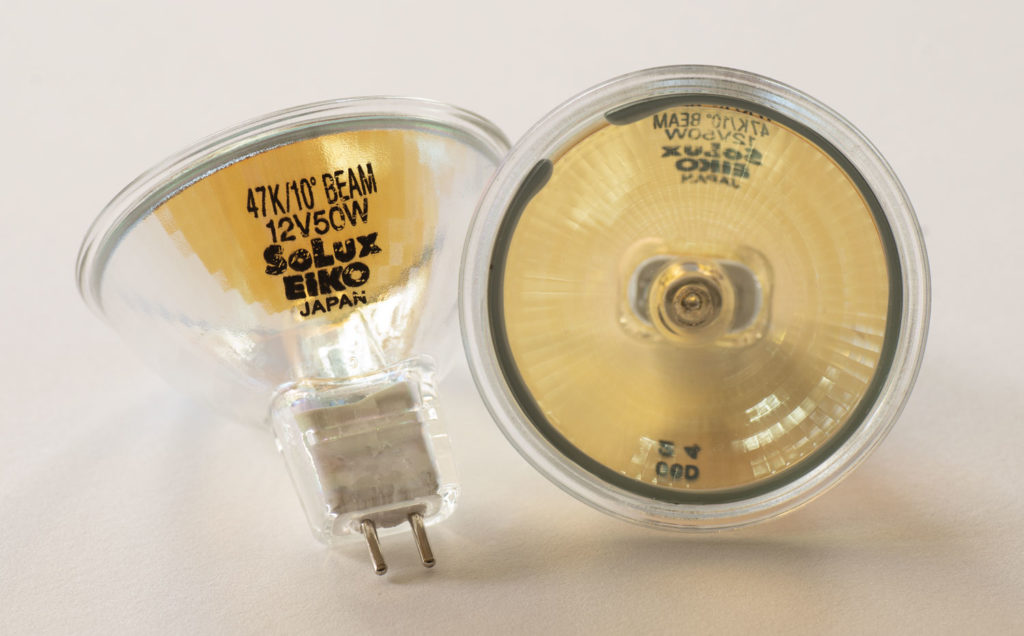
SoLux makes a 4700k full spectrum tungsten halogen bulb that fits in standard track lighting and costs about $15 a bulb. I’ve used these for years at my studio, and they have proven their accuracy again and again when compared to NEC color reference monitors. In fact, I’ve trained myself to not really trust the color unless it’s under a SoLux bulb. 

How does it work? Well, first of all, the 4700K white point is close enough to the 5000k or 6500k most color reference monitors are calibrated to. I’ve used SoLux with both calibrations and can attest that it works equally well with both. 

Of equal importance is it’s accuracy. To see all the colors in a print, you need a full spectrum lamp. If you’ve ever seen ugly office fluorescent lighting, part of the cause was the gaps in the spectrum that didn’t cover the full range of light our eye is sensitive to. This is often measured as CRI or color rendition index. Cheap fluorescent are often a CRI of about 70, although there are higher quality bulbs. Sunlight is a perfect 100. SoLux achieves a CRI of 98, which very good for a $15 bulb, and I know of no better light source in common use.

So what is the difference between SoLux and those thousand dollar viewing booths I mentioned earlier? The viewing booths use special multi phosphor fluorescent tubes to better cover the full visible spectrum, but there are still peaks and irregularities that can limit their accuracy. They are very good, but the SoLux is better in my experience because it’s tungsten halogen bulb emits light smoothly over the entire visible spectrum. And it does it for a lot less money. 

What about LED? Don’t even get me started. LEDs suck for viewing art and they have even damaged prices originals by Van Gogh. They suffer the same issues with spectrum that fluorescent lights do, in addition to putting out more UV light which accelerates fading. LED has it’s place, but not for viewing art in my opinion, and it hasn’t replaced the accuracy of tungsten filament technology. 

While SoLux 4700k lights are my choice for viewing color accuracy, they are not my choice for display lighting. For print display in a home, gallery, or business setting, I recommend standard tungsten halogen bulbs which will average about 2800k to 3200k, give or take. This “warm white” is still full spectrum but I find makes for much more pleasant room lighting. 

SoLux can be purchased from Amazon and other sources and is available in a variety of wattages, spot and flood, as well as different color temperatures. I’ve added a list below to make  purchasing easy. 

Manufacturer website:
http://solux.net/cgi-bin/tlistore/infopages/index.html

50 Watt 4700k
36 Degree Flood
36 Degree Black Back
24 Degree Narrow Flood
17 Degree Spot
17 Degree Black Back
10 Degree Narrow Spot Black Back

35 Watt 4700k
36 Degree Flood
36 Degree Black Back
24 Degree

Color Test Sheets

Testing profiles and printers is an important part of ensuring your printer is “in tune” and maintaining a color managed workflow. To make sure my profiles are in tune, I use a reference print that I created that allows me to visually compare color that I find to be the best way to evaluate. This is the process behind the hundreds of thousands of prints I’ve made for customers.

Below are links for 8×10 sections of my reference print that you can print on your own printer and compare them to my validated reference prints. I bring my reference prints to select workshop, and I also sell them so that you can have a copy for reference.

Purchase a copy of my approved and validated color test sheet.

Download files for testing:

Printing Instructions
Color 1
Color 2
Color 3
B&W 1
B&W 2

I suggest you print these files using your normal workflow as a test of your process. I have found that in addition to color, they can uncover other problems in the printing process that you may not even be aware of.

The files are sized to print at 8×10, and should be printed to that exact size to make the most accurate and useful test. 

You SHOULD NOT do any processing on them. That defeats the purpose of trying to see how the same file prints on different printer/profile/paper combinations. The file is our control to test the variables of printer setups.

How to use these test files in conjunction with my approved test prints:

Make a print on the paper you want to test using your normal printing procedures and profile. 

Write the paper name, date, printing profile, and any other useful settings and data that will help you identify how when and where your test print was made. This will make it more valuable in the future when you want to compare new printers, papers, and profiles to it. 

Use the right light to compare prints. I prefer to use SoLux 4700k bulbs, or if not available, actual daylight. Check out my blog post on SoLux for an explanation of why I use it. 

Compare your print to my print. I like to stack the prints on top of each other so that I can view the colors right next to each other. Compare each image as a whole and then look at specific colors. Look at dmax (black density) and also be sure to consider white points. Warmer paper bases will make the image look warmer overall than color papers, and this warmth or coolness can not be added or subtracted in an imaging editing program as it is inherent to each paper. 

If you are happy with the match, then “approve” your print by signing it and writing “approved” on it.  This is now your known reference to use for your printer, and can be used in the future to test your printer against itself. Keep it in a safe place with the other reference prints you will be making.  Why would you test your printer? If you are getting different results, if something significant changes, like settings, head replacement, three year olds, moving the printer, etc. It also becomes a record of what your printer was producing at a given point in time, and allows you to compare it to other printers, profiles, and papers. 

MAKE YOUR OWN REFERENCE PRINT! Once you have a known and approved printing setup that has been validated with my reference print, pick some of your favorite images and make your own reference print so that you can have your own personal reference that you know is printing right because you validated your process with my reference print.  Choosing a range of colors and densities will help, and you’ll learn over time which colors are most sensitive to changing with different ink sets and paper white points. 

If my reference print was helpful to you, take a picture of your print overlapping mine and share it on social media with a few words on how it helped, and tag me in it so I can re-share it too.

Sharpening and USM

A quick post on sharpening drawn from advice I gave a print client today. Sharpening is one of the the places I see photographers have the least confidence in.  

The challenge is every image is different and requires different settings. Getting the “correct” settings requires developing an understanding of what you see on screen and what that produces on print. It’s possible to make something that looks too sharp on screen, but looks perfect on the print  because a typical screen displays the image at about 93 pixels per inch, but the print can be of much higher resolution, so what you see on screen is in essence “magnified”. 

A couple quick tips:

  1. Always view the image at 100% magnification, or actual pixels. This will make sure that one pixel in your image equals one pixel in your screen. When you view your file at some other magnification, what you see on screen is some average of the pixels and can disguise the effects. 


2. Don’t use a 4x or 5k monitor like those found on newer iMacs. You need a monitor with a pixel resolution of ~72-110 pixels per inch, or a pixel pitch of around .23-.27mm.  In contrast a 4K 24” display has a pixel pitch of ~0.13725mm and resolution of ~180 pixels per inch, which makes the pixels too small to evaluate sharpening easily. 

3. Smart Sharpen is not a magic fix. There are many flavors of sharpening. Sharpening is an ingredient, and how, and where you apply it is all preference.

Looking forward to turing this into a expanded tutorial at some point. Until then, experiment!

Canon PRO-1000 Ink Affiliate Links

To make finding the the exact ink for the Canon PRO-1000 easier, I’ve created this handy reference page with links to all the inks and consumables. I get a small commission every time you use these links, which help me continue to produce this site.

The Canon PRO-1000 printer is a true pro quality printer that allows you to make better than lab quality prints at home up to 17 inches wide. Canon printers have become my preferred choice for many reason including incredible color, deep blacks, ease of print head maintenance, and print longevity.

If you are buying a new Canon printer, you can save signifigant money by waiting for the regular rebates offered by Canon. You should be able to buy the PRO-1000 for about $999 or $1099. It’s worth searching multiple vendors as some rebates are vendor specific.

Most inks last for many prints, but when low ink warning for a color comes on, you should order that ink immediately. Inks are used at different rates, and that changes based on the content of your images. Depending on which papers you use, you’ll likely use Photo or Matte Black the most, along with the Croma Optimizer. If you print a lot of black and white, you’ll use the gray inks more quickly than the color inks.

Genuine Canon Lucia PRO PFI-1000 inks

Photo Cyan PC
Cyan C
Magenta M
Photo Magenta PM
Yellow Y
Photo Gray PGY
Gray GY
Matte Black MBK
Photo Black PBK
Blue B
Croma Optimizer CO
Red R

Waste Ink Tank MC-20

Simple Tools – Complicated Results

Simple tools can be used to create very complicated results in Photoshop. This video shows how I use three of my primary tools in Photoshop. I’ve had some comments recently that viewers had not considered that multiple layers could be used like this, so it may be an interesting view into my problem solving approach with Photoshop.

My techniques are based upon what I learned in the darkroom in my early years in photography, and applying those techniques to Photoshop. My study of Ansel Adams’ Zone System and printing workshops I’ve taken with John Sexton, have been among the biggest influences of what I think a “fine print” should look like. My style is based very much in the West Coast / ƒ64 school of photography, and while I use digital tools, the look I strive for is in that tradition.

Color Accurate Monitor ~$1,200?

A reader emailed me for a recommendation on a color accurate monitor around $1,200 for print work. Here’s my reply:

I’ve used the NEC line aimed at color professionals for about 20 years and find them excellent. Eizo is also supposed to be great, but they are more expensive and I have yet to compare side by side. 

The PA line are the NEC monitors for print accuracy. They use a different backlight that lets you get a more accurate white point. Other displays can advertise similar specs, but in real life are too blue and don’t work. 

I’m currently using the PA242W and find it is the most accurate monitor I’ve ever used.. I’ve also used the larger PA272W which is just as accurate but offers more screen space to work on. The PA242W is still available but looks like it is being replaced with the PA243W, and they are in the process of replacing the PA272W with the PA271Q for about $1350. I was trying to be thrifty when I got the PA242W, but I wish I would have spent a little more on the 27” because it is not just larger, but has higher resolution, which makes it easier to do non-photo work like have two documents or a word processor and a web browser open side by side which more than makes up for the difference in price. For photo work, either works just as well. Lifespan on a NEC display in daily use should be in the 7-10 year range form my experience, so I don’t hesitate to use it as a main display. 

On the model number you’ll see something like this: 
PA242W-BK-SV

BK means the color of the monitor, they offer black finish or white finish. I go for black so that there is as littler interference with my vision when judging critical color. The SV is an option that includes the Spectraview calibrator, which is a good option unless you are planning on buying a higher end x-rite package.

With an iMac, I’d just use the imac as the pallet monitor, and unfortunately even when calibrated, the most recent imac monitors are’t very accurate. Also, the 5k resolution does not allow good judging of sharpening because they are just too high res. 

WHAT is the BEST DPI to PRINT at?

What’s the best DPI to print at? Breaking the rules led me to a discovery that can give you the best digital prints I’ve ever seen. Printing at resolutions higher than 300 dpi lead to a significant quality gain with the Canon PRO series printers. I lay it all out in this video.