Printing Issues After Software Update

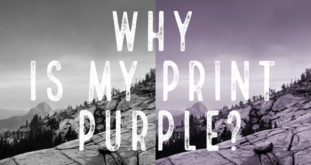
When your prints come out looking completely different than last time, it makes for a frustrating morning. 

This morning I tried to print with my MacBook Pro fresh of an update to Catalina, the latest software it can run. The first print came out looking odd. So I compared it to a previous print, and my color memory was correct, it did not print properly. 

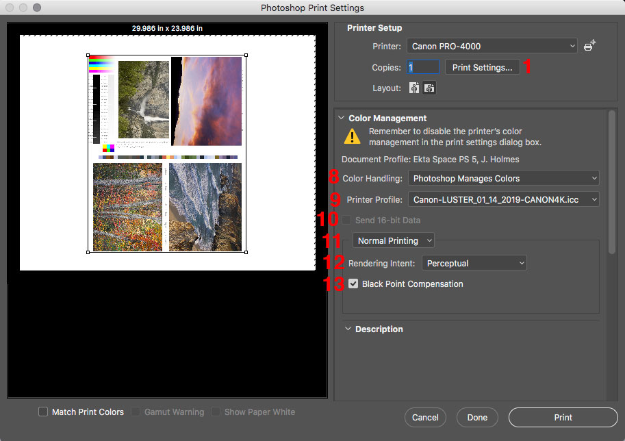
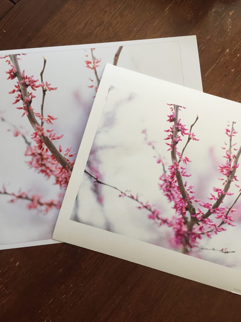
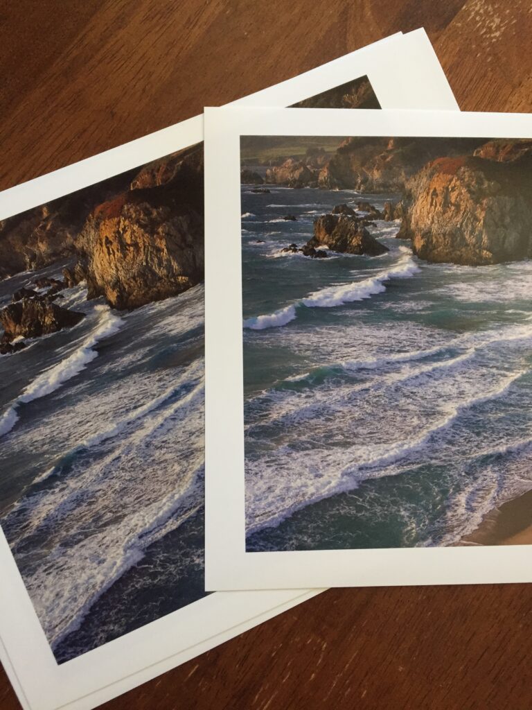
Time to start troubleshooting. I picked a second photo and printing it, triple checking that I chose all the correct settings.  Same problem. So I print it again with a different profile to see if the profile is the problem. Still wrong. SO I try it on a completely different paper and profile. Still wrong. Possible root causes are going through my mind this whole time. 

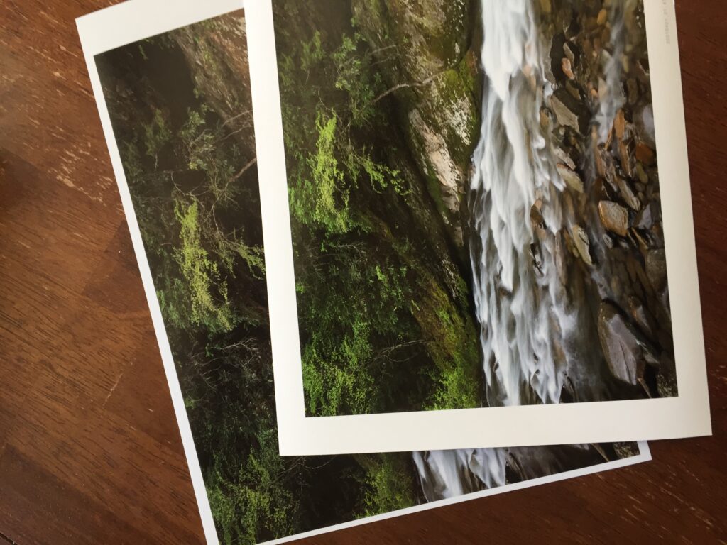
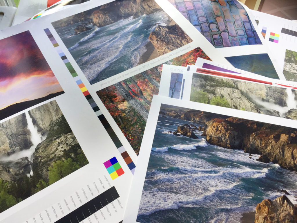
Maybe it’s the ink starvation issue I had when this printer was new that caused one of the colors to drop out? So I pulled out the special test sheet made specifically for this purpose. The colors didn’t match, but they all printed. So probably not that. Another sheet of paper burned with no fix. 

I’m about six sheets of paper in at this point, and that is always frustrating because I hate wasting paper and money. But burning paper is part of troubleshooting a printer so I fordge ahead. And my heart rate is going up as I think about at best spending the next day or so remaking profiles, or at worst dropping $800+ on a new print head and the ink needed to install it. 

With this latest piece of data, I realize I’m chasing my tail, and before I go down the road of more involved solutions, I need to try printing from a different computer to isolate if this is software or hardware related. Time to fire up the mac mini that I had validated last week as “working.”

Eureka! That fixed it. My heart rate goes down, no need to buy an expensive print head to fix it, or reprofile all my papers.

So what happened? Likely a software issue when I updated my MacBook Pro, probably the print driver. A reinstall of the print driver with the latest version should fix it. But that can wait for another day when I’m not trying to make Christmas presents. 

Today’s difficulties are one of the reasons I am very cautious about major updates to my computers. Updates cause issues and deviations from the carefully controlled environment needed to make consistent, accurate prints. 

Furthermore, my printer and monitor rely on third party apps to work correctly, and it’s common  for vendors to take months after a major software update to write new ones that are compatible. NEC had to write the Spectraview app I use to calibrate my monitor, and IIRC it was months after OS 11 came out. Not good…I couldn’t go without my calibrated monitor for even a few days. 

So some takeaways from this. 

1. Software changes and or updates can cause changes to how your printer prints color, so only update when you have time to troubleshoot the problems it can cause. Expect problems and the need to revalidate your printing setup after updating system software or print drivers. In general, it is best to wait at least six months after a major system software update to upgrade to give time for the bugs to be worked out. Identify all mission critical software and ensure it works properly with the OS you are updating to. And it helps to have a way to be able to “roll back” to your old system software if the new version doesn’t work. 

2. Diagnosing problems is much easier if you have test prints that validate previous printer settings so you can compare your new setup to your previous approved setup. I find few people do this, but it’s a vital part of my workflow. And a reminder that I need to finish the curriculum for my color management workshop. 

3.It’s helpful to have two different computers you can print from to test if a problem is printer or computer related. This also helps during software updates because it gives you a way to continue printing from a known setup while troubleshooting issues. This helped save my bacon today. 

Had I not had a second computer to print from, I might have started more invasive fixes that still wouldn’t have worked because I’m working from a fault tree that is in my head. So maybe my next step is to create a printed fault tree to help me solve these problems instead of having to tease out the answer every time and risk missing a critical fault finding step.

How bright should a calibrated monitor be?

Reader question:

 I use a SpiderMunki to calibrate my monitors. The software recommends that the luminescence value be 120.  I watched a video on printing and the presenter stated that the monitor should be no brighter than 80.  I wanted to get your thoughts about the appropriate settings.

Great question! Here are my thoughts:

First let’s answer why we are turning the brightens on our monitor down so far. These standards are driven by creating a good screen to print match. There are industry standard viewing lights  for printed materials that cost about $1,000, and are used in the prepress and lab industry to match color to professional standards. A accurate screen to print match requires a similar illumination of both screen and print. 

Dynamic range also has to be considered. Anytime you can make the highlights “brighter” you increase dynamic range and contrast. Normally we want that, but in the case of screen to print matching, it hinders matching the transmissive light monitor to the reflective light print. Lowering the brightness of the monitor makes a better match, and also makes it easier to see subtle tones and detail in the monitor that would be hidden with higher dynamic range/contrast. 

So now that we’ve explored a little of the why, let’s answer is 80, 120 or some other number correct. Traditionally 100 c/m2 has been the accepted value. I’ve been on calibrated monitors since the ~1994 and that was the value recommended with my first x-rite calibrator. It’s the brightness I’ve used for countless files, prints, and CMYK book/press reproductions for pro photographers. It’s also what my team of printermakers and scanning masters used at West Coast Imaging, so it is a rock solid, tested, proven number. 

The reality is there is a range of numbers that can work. The difference between 80 and 120 c/m2 is not that large. About a 20% variance from the 100 value I consider standard. In my early years I would work with CRT monitors, and as these aged, they dimmed, so that you could no longer achieve 100 c/m2, so I’ve worked with lower ranges too. It worked to a point, but for my taste once you get around 80, things start to get a little murky. 

At some point IIRC,  x-rite started recommending 120 c/m2 in their software. No idea why, they just did. So people started using that. I tried 120 it and decided I still liked 100 cd/m2 better. 

You also have to take into account that there is some mental translation in screen to print match. So some people may feel they get a better match with their lights and their monitor at one setting over another. 
So which value is right? I think you could make it work with a range of values from 80-120, but I know 100 c/m2 works so I stick with that if my monitor can achieve it. 

Test your Color Vision

What can you score on the Xrite Hue Test? Take it at the link below and post your scores:

https://www.xrite.com/hue-test

Here’s mine first try:

It’s interesting that they note that your score on this test is influenced by the lighting around you, the background colors at your desk area, your level of tiredness, your gender, and even your age. My personal experience is that these and many other things including blood sugar levels affect your sensitivity and creativity when printing, and that there is a limited window each day for doing the most exacting work. This squares with the experience of other printmakers whom I respect.

I would think that the monitor you are using could affect this as well. I did mine on a NEC PA242W which is very accurate. I’ve seen evidence to suggest that average monitors will make it more difficult to get a perfect score.

I see this as a tool not to measure yourself agains others, but rather a tool to help you find your current limitations fo color perception so that you can work to improve them. I don’t think most people are born looking at color precisely, although I am sure there are exceptions. I know it took me a lot of time and effort to learn.

So go ahead, take the test, and share your score!

Monitor Recommendations November 2019

A friend’s long used Apple Cinema Display is dying and asked if the recommendations I made earlier this year for color accurate displays still hold true. His expectations are similar to mine, which is very high, as the work he does is for fine art prints, books, and magazine publication. Here’s what I shared with him.

Here’s my current recommended color accurate displays:

PA271Q-BK-SV  27 inch model for ~$1450 from newegg, BH, or Adorama
PA243W-BK-SV  24 inch model for $899 at Amazon and Newegg

What about that new 31 inch display?

NEC replaced their previous color accurate 31 inch display with the new PA331D. Based on my past experience with NEC, I am confident the color will be great . What gives me pause is it’s pixel pitch of 149 pixels per inch on screen. The other NEC displays I recommend have a pixel pitch of about 100 ppi. Higher ppi on a display makes it more difficult to judge images at 100% Actual Pixels Magnification. This means it could be more challenging to preview sharpening effects as they will be hidden by the higher resolution. Maybe it’s just a matter of finding a new methodology to view the image at a higher magnification, but it’s a bridge I haven’t had to cross yet.

I’ve also recently had the chance to preview the quality of one of the Eizo line. From my brief examination, it seemed incredibly accurate. But I still don’t have enough personal experience with it to say which model will produce the results that I’m used to.

I’m fighting a flu that has taken down my whole family, so I’ll cut and paste what I shared with my friend about buying a color accurate display:

There is a 31 inch model that is quite a bit more. For imaging I think 24 inches is a good fit, and larger can get overwhelming, but the extra screen resolution and size of the 27 inch makes it great for working on two documents side by side and other layout/non photoshop type products.  Even with the 24 inch, I cover up have the screen when dust busting at 100% because it’s just too much screen to take in all at once. 

Make sure to get the exact model listed as the PA243W-BK doesn’t contain the calibrator that the PA243W-BK-SV does. You should buy the calibrator as it allows you to use the NEC calibration software that calibrates at 16 bits and it really does let you resolve more tones than other systems. The technology has advanced sufficiently that i’s time to upgrade whatever calibration system you have. 

Figure this monitor will like last 7-10 years based on my past experience with NEC displays. 

These are a pain to buy from Amazon because their listings often don’t include enough information to make sure you are getting the right model. No idea why but that’s been the case for years. 

Why are my B&W prints Purple?

That’s the problem one of my workshop participants was having and asked what could be causing it. This is actually a pretty common problem, but it can be easy to miss until you’ve trained your eyes to see it. 

The prints in question were made with the Epson Stylus Photo R1900, which lacks the Light Gray and Light Light Gray found in some other Epson models. That means when it prints a B&W photo, most shades of gray are being made up from the color inks. 

It’s very difficult to make a neutral gray from color inks, hence the color cast. The 24 and 44 inch epson and Canon printers, as well as some smaller printers, use two shades of light gray in addition to black to solve this. 

Yet even with those extra shades of gray, profiles can be to blame.  You need an accurate profile to get neutral color, and canned profiles (the ones that came with your printer or you downloaded from the paper manufacturer) rarely achieve perfect neutrality. 

In the case of the Epson R1900, if the photographer wants a better result, they will have to print on a printer that has gray inks and a decent profile. 

Inkjet Printing Through Photoshop – Macintosh

Using printer profiles correctly when printing is essential to getting accurate color from your printer. The challenge is that you have a bunch of settings that have to be set up exactly right, every time, for it to work. That is further complicated because every editing software, OS, and printer driver has it’s own settings and names for those settings.

You’d think that there should be some good information out there on how do do all this, but even the paper manufacturers don’t have good guides. One of my favorite companies has German language screenshots in their English language document, and they note that their instructions don’t work for every setup. Uggg!!!! It makes you want to pull your hair out.

I’m going to make my attempt to solve this problem by sharing the settings I use with Photoshop on the Mac. These settings have been tested and verified to print my Color Test Sheets correctly.

The settings for Lightroom on the Mac are quite similar to these, so you should be able to translate them over. Understanding what each setting does may also help you translate this for other editing programs and setups. As time allows, I plan to make more of these, but the easiest place to start was with the software I print through.

download the PDF here:
Inkjet Printing Through Photoshop – Macintosh.pdf

Clinic – Better Photo Prints through Printer Tuning

Most photographers I talk with are not satisfied with the results from their home inkjet printers. That leads to frustration, and holds many back from a fuller enjoyment of the process of making prints.

If that sounds like where you are at, my April 6 Printer Tuning Clinic is for you. I’ll teach you straightforward solutions that will help you get more quality and consistency out of your printer, how to evaluate canned and custom profiles, and help you set good expectations for accuracy.

The process I’ll show you is the same one I’ve used in my professional printing business. The potential in unlocks in students once they grasp it is incredible.

Reserve your spot today at https://www.eventbrite.com/e/better-photo-prints-through-printer-tuning-tickets-58116173038

Lighting for Screen to Print Match

Lighting is a critical component of achieving a screen to print match. Most importantly, the color of the light needs to be the about the same temperature as your monitor, and it needs to be full spectrum to reveal all the eyes the color can see.  Prepress professionals rely on $1,000+ industry standard D50 viewing booths to compare prints, press sheets, and product samples in consistent and quality light. But there is actually a better option that can fit the budget of any photographer. 

SoLux makes a 4700k full spectrum tungsten halogen bulb that fits in standard track lighting and costs about $15 a bulb. I’ve used these for years at my studio, and they have proven their accuracy again and again when compared to NEC color reference monitors. In fact, I’ve trained myself to not really trust the color unless it’s under a SoLux bulb. 

How does it work? Well, first of all, the 4700K white point is close enough to the 5000k or 6500k most color reference monitors are calibrated to. I’ve used SoLux with both calibrations and can attest that it works equally well with both. 

Of equal importance is it’s accuracy. To see all the colors in a print, you need a full spectrum lamp. If you’ve ever seen ugly office fluorescent lighting, part of the cause was the gaps in the spectrum that didn’t cover the full range of light our eye is sensitive to. This is often measured as CRI or color rendition index. Cheap fluorescent are often a CRI of about 70, although there are higher quality bulbs. Sunlight is a perfect 100. SoLux achieves a CRI of 98, which very good for a $15 bulb, and I know of no better light source in common use.

So what is the difference between SoLux and those thousand dollar viewing booths I mentioned earlier? The viewing booths use special multi phosphor fluorescent tubes to better cover the full visible spectrum, but there are still peaks and irregularities that can limit their accuracy. They are very good, but the SoLux is better in my experience because it’s tungsten halogen bulb emits light smoothly over the entire visible spectrum. And it does it for a lot less money. 

What about LED? Don’t even get me started. LEDs suck for viewing art and they have even damaged prices originals by Van Gogh. They suffer the same issues with spectrum that fluorescent lights do, in addition to putting out more UV light which accelerates fading. LED has it’s place, but not for viewing art in my opinion, and it hasn’t replaced the accuracy of tungsten filament technology. 

While SoLux 4700k lights are my choice for viewing color accuracy, they are not my choice for display lighting. For print display in a home, gallery, or business setting, I recommend standard tungsten halogen bulbs which will average about 2800k to 3200k, give or take. This “warm white” is still full spectrum but I find makes for much more pleasant room lighting. 

SoLux can be purchased from Amazon and other sources and is available in a variety of wattages, spot and flood, as well as different color temperatures. I’ve added a list below to make  purchasing easy. 

Manufacturer website:
http://solux.net/cgi-bin/tlistore/infopages/index.html

50 Watt 4700k
36 Degree Flood
36 Degree Black Back
24 Degree Narrow Flood
17 Degree Spot
17 Degree Black Back
10 Degree Narrow Spot Black Back

35 Watt 4700k
36 Degree Flood
36 Degree Black Back
24 Degree

Color Test Sheets

Testing profiles and printers is an important part of ensuring your printer is “in tune” and maintaining a color managed workflow. To make sure my profiles are in tune, I use a reference print that I created that allows me to visually compare color that I find to be the best way to evaluate. This is the process behind the hundreds of thousands of prints I’ve made for customers.

Below are links for 8×10 sections of my reference print that you can print on your own printer and compare them to my validated reference prints. I bring my reference prints to select workshop, and I also sell them so that you can have a copy for reference.

Purchase a copy of my approved and validated color test sheet.

Download files for testing:

Printing Instructions
Color 1
Color 2
Color 3
B&W 1
B&W 2

I suggest you print these files using your normal workflow as a test of your process. I have found that in addition to color, they can uncover other problems in the printing process that you may not even be aware of.

The files are sized to print at 8×10, and should be printed to that exact size to make the most accurate and useful test. 

You SHOULD NOT do any processing on them. That defeats the purpose of trying to see how the same file prints on different printer/profile/paper combinations. The file is our control to test the variables of printer setups.

How to use these test files in conjunction with my approved test prints:

Make a print on the paper you want to test using your normal printing procedures and profile. 

Write the paper name, date, printing profile, and any other useful settings and data that will help you identify how when and where your test print was made. This will make it more valuable in the future when you want to compare new printers, papers, and profiles to it. 

Use the right light to compare prints. I prefer to use SoLux 4700k bulbs, or if not available, actual daylight. Check out my blog post on SoLux for an explanation of why I use it. 

Compare your print to my print. I like to stack the prints on top of each other so that I can view the colors right next to each other. Compare each image as a whole and then look at specific colors. Look at dmax (black density) and also be sure to consider white points. Warmer paper bases will make the image look warmer overall than color papers, and this warmth or coolness can not be added or subtracted in an imaging editing program as it is inherent to each paper. 

If you are happy with the match, then “approve” your print by signing it and writing “approved” on it.  This is now your known reference to use for your printer, and can be used in the future to test your printer against itself. Keep it in a safe place with the other reference prints you will be making.  Why would you test your printer? If you are getting different results, if something significant changes, like settings, head replacement, three year olds, moving the printer, etc. It also becomes a record of what your printer was producing at a given point in time, and allows you to compare it to other printers, profiles, and papers. 

MAKE YOUR OWN REFERENCE PRINT! Once you have a known and approved printing setup that has been validated with my reference print, pick some of your favorite images and make your own reference print so that you can have your own personal reference that you know is printing right because you validated your process with my reference print.  Choosing a range of colors and densities will help, and you’ll learn over time which colors are most sensitive to changing with different ink sets and paper white points. 

If my reference print was helpful to you, take a picture of your print overlapping mine and share it on social media with a few words on how it helped, and tag me in it so I can re-share it too.

Color Accurate Monitor ~$1,200?

A reader emailed me for a recommendation on a color accurate monitor around $1,200 for print work. Here’s my reply:

I’ve used the NEC line aimed at color professionals for about 20 years and find them excellent. Eizo is also supposed to be great, but they are more expensive and I have yet to compare side by side. 

The PA line are the NEC monitors for print accuracy. They use a different backlight that lets you get a more accurate white point. Other displays can advertise similar specs, but in real life are too blue and don’t work. 

I’m currently using the PA242W and find it is the most accurate monitor I’ve ever used.. I’ve also used the larger PA272W which is just as accurate but offers more screen space to work on. The PA242W is still available but looks like it is being replaced with the PA243W, and they are in the process of replacing the PA272W with the PA271Q for about $1350. I was trying to be thrifty when I got the PA242W, but I wish I would have spent a little more on the 27” because it is not just larger, but has higher resolution, which makes it easier to do non-photo work like have two documents or a word processor and a web browser open side by side which more than makes up for the difference in price. For photo work, either works just as well. Lifespan on a NEC display in daily use should be in the 7-10 year range form my experience, so I don’t hesitate to use it as a main display. 

On the model number you’ll see something like this: 
PA242W-BK-SV

BK means the color of the monitor, they offer black finish or white finish. I go for black so that there is as littler interference with my vision when judging critical color. The SV is an option that includes the Spectraview calibrator, which is a good option unless you are planning on buying a higher end x-rite package.

With an iMac, I’d just use the imac as the pallet monitor, and unfortunately even when calibrated, the most recent imac monitors are’t very accurate. Also, the 5k resolution does not allow good judging of sharpening because they are just too high res.