Monitor Recommendations November 2019

A friend’s long used Apple Cinema Display is dying and asked if the recommendations I made earlier this year for color accurate displays still hold true. His expectations are similar to mine, which is very high, as the work he does is for fine art prints, books, and magazine publication. Here’s what I shared with him.

Here’s my current recommended color accurate displays:

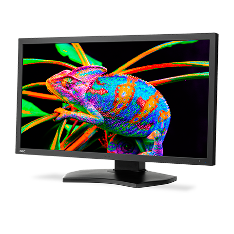
PA271Q-BK-SV  27 inch model for ~$1450 from newegg, BH, or Adorama
PA243W-BK-SV  24 inch model for $899 at Amazon and Newegg

What about that new 31 inch display?

NEC replaced their previous color accurate 31 inch display with the new PA331D. Based on my past experience with NEC, I am confident the color will be great . What gives me pause is it’s pixel pitch of 149 pixels per inch on screen. The other NEC displays I recommend have a pixel pitch of about 100 ppi. Higher ppi on a display makes it more difficult to judge images at 100% Actual Pixels Magnification. This means it could be more challenging to preview sharpening effects as they will be hidden by the higher resolution. Maybe it’s just a matter of finding a new methodology to view the image at a higher magnification, but it’s a bridge I haven’t had to cross yet.

I’ve also recently had the chance to preview the quality of one of the Eizo line. From my brief examination, it seemed incredibly accurate. But I still don’t have enough personal experience with it to say which model will produce the results that I’m used to.

I’m fighting a flu that has taken down my whole family, so I’ll cut and paste what I shared with my friend about buying a color accurate display:

There is a 31 inch model that is quite a bit more. For imaging I think 24 inches is a good fit, and larger can get overwhelming, but the extra screen resolution and size of the 27 inch makes it great for working on two documents side by side and other layout/non photoshop type products.  Even with the 24 inch, I cover up have the screen when dust busting at 100% because it’s just too much screen to take in all at once. 

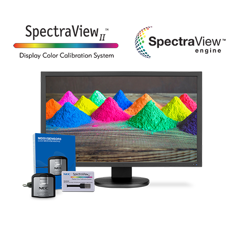
Make sure to get the exact model listed as the PA243W-BK doesn’t contain the calibrator that the PA243W-BK-SV does. You should buy the calibrator as it allows you to use the NEC calibration software that calibrates at 16 bits and it really does let you resolve more tones than other systems. The technology has advanced sufficiently that i’s time to upgrade whatever calibration system you have. 

Figure this monitor will like last 7-10 years based on my past experience with NEC displays. 

These are a pain to buy from Amazon because their listings often don’t include enough information to make sure you are getting the right model. No idea why but that’s been the case for years. 

Inkjet Printing Through Photoshop – Macintosh

Using printer profiles correctly when printing is essential to getting accurate color from your printer. The challenge is that you have a bunch of settings that have to be set up exactly right, every time, for it to work. That is further complicated because every editing software, OS, and printer driver has it’s own settings and names for those settings.

You’d think that there should be some good information out there on how do do all this, but even the paper manufacturers don’t have good guides. One of my favorite companies has German language screenshots in their English language document, and they note that their instructions don’t work for every setup. Uggg!!!! It makes you want to pull your hair out.

I’m going to make my attempt to solve this problem by sharing the settings I use with Photoshop on the Mac. These settings have been tested and verified to print my Color Test Sheets correctly.

The settings for Lightroom on the Mac are quite similar to these, so you should be able to translate them over. Understanding what each setting does may also help you translate this for other editing programs and setups. As time allows, I plan to make more of these, but the easiest place to start was with the software I print through.

download the PDF here:
Inkjet Printing Through Photoshop – Macintosh.pdf

Clinic – Better Photo Prints through Printer Tuning

Most photographers I talk with are not satisfied with the results from their home inkjet printers. That leads to frustration, and holds many back from a fuller enjoyment of the process of making prints.

If that sounds like where you are at, my April 6 Printer Tuning Clinic is for you. I’ll teach you straightforward solutions that will help you get more quality and consistency out of your printer, how to evaluate canned and custom profiles, and help you set good expectations for accuracy.

The process I’ll show you is the same one I’ve used in my professional printing business. The potential in unlocks in students once they grasp it is incredible.

Reserve your spot today at https://www.eventbrite.com/e/better-photo-prints-through-printer-tuning-tickets-58116173038

Color Test Sheets

Testing profiles and printers is an important part of ensuring your printer is “in tune” and maintaining a color managed workflow. To make sure my profiles are in tune, I use a reference print that I created that allows me to visually compare color that I find to be the best way to evaluate. This is the process behind the hundreds of thousands of prints I’ve made for customers.

Below are links for 8×10 sections of my reference print that you can print on your own printer and compare them to my validated reference prints. I bring my reference prints to select workshop, and I also sell them so that you can have a copy for reference.

Purchase a copy of my approved and validated color test sheet.

Download files for testing:

Printing Instructions
Color 1
Color 2
Color 3
B&W 1
B&W 2

I suggest you print these files using your normal workflow as a test of your process. I have found that in addition to color, they can uncover other problems in the printing process that you may not even be aware of.

The files are sized to print at 8×10, and should be printed to that exact size to make the most accurate and useful test. 

You SHOULD NOT do any processing on them. That defeats the purpose of trying to see how the same file prints on different printer/profile/paper combinations. The file is our control to test the variables of printer setups.

How to use these test files in conjunction with my approved test prints:

Make a print on the paper you want to test using your normal printing procedures and profile. 

Write the paper name, date, printing profile, and any other useful settings and data that will help you identify how when and where your test print was made. This will make it more valuable in the future when you want to compare new printers, papers, and profiles to it. 

Use the right light to compare prints. I prefer to use SoLux 4700k bulbs, or if not available, actual daylight. Check out my blog post on SoLux for an explanation of why I use it. 

Compare your print to my print. I like to stack the prints on top of each other so that I can view the colors right next to each other. Compare each image as a whole and then look at specific colors. Look at dmax (black density) and also be sure to consider white points. Warmer paper bases will make the image look warmer overall than color papers, and this warmth or coolness can not be added or subtracted in an imaging editing program as it is inherent to each paper. 

If you are happy with the match, then “approve” your print by signing it and writing “approved” on it.  This is now your known reference to use for your printer, and can be used in the future to test your printer against itself. Keep it in a safe place with the other reference prints you will be making.  Why would you test your printer? If you are getting different results, if something significant changes, like settings, head replacement, three year olds, moving the printer, etc. It also becomes a record of what your printer was producing at a given point in time, and allows you to compare it to other printers, profiles, and papers. 

MAKE YOUR OWN REFERENCE PRINT! Once you have a known and approved printing setup that has been validated with my reference print, pick some of your favorite images and make your own reference print so that you can have your own personal reference that you know is printing right because you validated your process with my reference print.  Choosing a range of colors and densities will help, and you’ll learn over time which colors are most sensitive to changing with different ink sets and paper white points. 

If my reference print was helpful to you, take a picture of your print overlapping mine and share it on social media with a few words on how it helped, and tag me in it so I can re-share it too.

Color Accurate Monitor ~$1,200?

A reader emailed me for a recommendation on a color accurate monitor around $1,200 for print work. Here’s my reply:

I’ve used the NEC line aimed at color professionals for about 20 years and find them excellent. Eizo is also supposed to be great, but they are more expensive and I have yet to compare side by side. 

The PA line are the NEC monitors for print accuracy. They use a different backlight that lets you get a more accurate white point. Other displays can advertise similar specs, but in real life are too blue and don’t work. 

I’m currently using the PA242W and find it is the most accurate monitor I’ve ever used.. I’ve also used the larger PA272W which is just as accurate but offers more screen space to work on. The PA242W is still available but looks like it is being replaced with the PA243W, and they are in the process of replacing the PA272W with the PA271Q for about $1350. I was trying to be thrifty when I got the PA242W, but I wish I would have spent a little more on the 27” because it is not just larger, but has higher resolution, which makes it easier to do non-photo work like have two documents or a word processor and a web browser open side by side which more than makes up for the difference in price. For photo work, either works just as well. Lifespan on a NEC display in daily use should be in the 7-10 year range form my experience, so I don’t hesitate to use it as a main display. 

On the model number you’ll see something like this: 
PA242W-BK-SV

BK means the color of the monitor, they offer black finish or white finish. I go for black so that there is as littler interference with my vision when judging critical color. The SV is an option that includes the Spectraview calibrator, which is a good option unless you are planning on buying a higher end x-rite package.

With an iMac, I’d just use the imac as the pallet monitor, and unfortunately even when calibrated, the most recent imac monitors are’t very accurate. Also, the 5k resolution does not allow good judging of sharpening because they are just too high res. 

Printer Calibration for In-Tune Prints – March 14

I’ll be teaching a Mini-Clinic for Brentwood Photo Groupmembers on March 14. This clinic is a members only even and free to BPG members. 

Musicians expect that middle C will sound the same on any piano in the world. Photographer should have a similar expectation of a properly tuned instrument when they make prints. This is achieved through color management. I’ll talk about what color management is, and how to use it properly. A key part of this clinic will be looking at prints to see what is correct calibration, and learning to see what is in-tune and out-of-tune. We’ll look at how to evaluate canned profiles as well as prints from labs. I’ll have samples of “in-tune” prints, and will encourage participants to print my test file to bring and evaluate their printer or lab. Participants will leave with a new understanding of the level of accuracy and repeatability possible with color management that will make their prints “sound” their best. 

Check out my Blog Post   Will your prints match the next time you print them? 
for a peek at some of what we’ll be covering. 

Will your prints match the next time you print them?

Will your prints match the next time you print them? Can you take the same file and obtain the same results using a different printer, ink, and paper?  I can, and so can you. 

For twenty years, I’ve been printing client photos, and my own, over and over again with a very exact match, using different printers including LightJet, Chromira, multiple generations of Epson printers, Canon Printers, and even Metal…and on dozens of different papers. It is still a little mind-blowing for me to realize that this is even possible; That I’ve been printmaking for that long, and with so many different processes.

Accuracy, control, and repeatability are what first made digital printing interesting to film photographers, long before there were viable DSLRs. For a photographer who sells prints, having the print they deliver match the one the client saw on the wall, regardless of size, was (and still is) a huge deal. With darkroom printing using an enlarger, this kind of matching was virtually impossible and caused many frustrations. My earliest clients were mostly photographers with galleries who needed to be able to deliver prints that matched on demand, at any time, and at any size. They moved to digital to make that a reality. 

That requirement, to match the original print at any point in the future, makes how I set up my printer the most important step in my workflow. I absolutely need to print the file as accurately as possible so it will match the previous print. My pro clients can see the smallest differences in color, density, and contrast. They know their subjects, and their photos, inside and out. They immediately see if something is off. Some of them can even explain the scientific process that produces a certain shade of color in an animal’s feathers; or a geologic feature; or the ocean in a certain part of the world. Achieving this exacting level of color matching is one of the reasons they keep working with me, and drives every step of my process. 

The key to this is color management; using ICC profiles to characterize a paper/printer/ink combination. With an accurate ICC profile, if you do all of the printing steps the same, you will enjoy the same result, time after time, even if you change printers or papers. 

That’s why I take profiling very seriously. Every profile I use has been carefully tested by printing a test image, and comparing it to my library of previous test prints to see if they match. These test prints let me evaluate accuracy, but they also let me evaluate differences between printers, inks, and papers. Obviously, not all printers, papers, and inks can produce the same aesthetic feel, and the definition of “match” needs to include these factors. It also lets me see improvements to the printing process. When a manufacturer makes a blacker black ink, you can see it in the test prints, and see how it affects the image. 

Matching also means that what I see on my printer looks like what I see on my $1,000 reference-grade monitor. Being able to make a very good screen-to-print match on the first print not only makes me efficient when working on client files, but it also lets me work more intuitively on my own photos, which I believe lets me bring more out of the process. It allows me to be more expressive because I’m not fighting the file, but can work with it fluently and easily. 

How accurate do you need to be? 

That’s something only you can answer. While very high accuracy is a vital part of my personal expression, and of my business printing for other photographers, a photographer printing for themselves has more leeway to say “good enough.” The public-at-large viewing your photographs are not trained to see the small differences in color and density that a photographer is. They don’t know what you saw in your mind’s eye when you clicked the shutter. They only know what they see on the print, and whether they like it or not. 

Even if you don’t have the world’s best profile, you can make prints that “match” themselves  as long as you use the exact same file, printer, paper, and settings. Of course, if you change any of those factors, then your prints will no longer match. When (not if) that happens, your only solution is to decide that the difference between how it printed before, and how it prints now, is acceptable…or go back and make new adjustments to make a better match. 

My personal expectations, and those of my clients, don’t give me this kind of leeway. But when you are the one doing the printing, you set the expectation for how well your prints will match the next time you print them. Your bar is going to be set by your needs, expectations, and how well your eye is trained. When getting the prints you want becomes frustrating; when you’ve spend hours working on a photo in image processing software to make it look exactly the way you want it, only to have it print differently; then it’s time to learn to become more accurate. 

But  I encourage you to seek that high bar of accuracy even before you need it. The ability to see, and control, small differences in color and density will help you make better decisions when processing your photos, and make you a better photographer. (Plus, your prints will look the same 20 years from now!)