One Day Printing Workshop – July 13

Hands on learning is of incredible value to improving your printmaking skills, so I’m excited that Watkins College of Art is having me teach a one day workshop on July 13th.

The format of this workshop is very simple. I’ll look at your photographs, suggest changes, and then you can work through those changes with my help and immediately make new prints for further evaluation in the excellent computer/print lab at Watkins.  

This rapid feedback loop allows leaps of knowledge and understanding to happen quickly. I’ve seen students make incredible strides in short periods of time with this process, and I know it can be of huge benefit.

This is not a step by step teaching class for an imaging editing program. It assumes you have some level of comfort and familiarity with an image editing program and with making prints. You don’t need to me a expert, that’s the whole point, but you need to know where the gas, brakes, and turn signals are, so to speak. 

You can bring your own computer with your imaging editing program, or use one of their macs with Photoshop or Lightroom. I don’t care what software you use, as the goal of achieving good contrast, density, and color are universal to all photographs. 

One requirement for this class is a ten print portfolio and corresponding edited and un-edited files. Don’t be intimidated by this…I’m not looking for anything fancy. Just ten 8×10 or 8.5×11 prints of photos that you think represent your work. The goal is that you’ve already printed them once, and that we can look at them immediately and jump in to learning. For students who register early enough, I’m going to try and evaluate these before the workshop so that we can get the most out of that one day. 

Registration for this class starts April 1 on the Watkins Community Education website.

The workshop runs from 10am to 4pm and the cost is $110.

If you have any questions about this workshop and if it is right for you, please email me at rich@richseiling.com

Clinic – Better Photo Prints through Printer Tuning

Most photographers I talk with are not satisfied with the results from their home inkjet printers. That leads to frustration, and holds many back from a fuller enjoyment of the process of making prints.

If that sounds like where you are at, my April 6 Printer Tuning Clinic is for you. I’ll teach you straightforward solutions that will help you get more quality and consistency out of your printer, how to evaluate canned and custom profiles, and help you set good expectations for accuracy.

The process I’ll show you is the same one I’ve used in my professional printing business. The potential in unlocks in students once they grasp it is incredible.

Reserve your spot today at https://www.eventbrite.com/e/better-photo-prints-through-printer-tuning-tickets-58116173038

Color Test Sheets

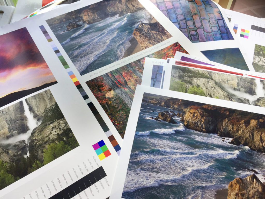
Testing profiles and printers is an important part of ensuring your printer is “in tune” and maintaining a color managed workflow. To make sure my profiles are in tune, I use a reference print that I created that allows me to visually compare color that I find to be the best way to evaluate. This is the process behind the hundreds of thousands of prints I’ve made for customers.

Below are links for 8×10 sections of my reference print that you can print on your own printer and compare them to my validated reference prints. I bring my reference prints to select workshop, and I also sell them so that you can have a copy for reference.

Purchase a copy of my approved and validated color test sheet.

Download files for testing:

Printing Instructions
Color 1
Color 2
Color 3
B&W 1
B&W 2

I suggest you print these files using your normal workflow as a test of your process. I have found that in addition to color, they can uncover other problems in the printing process that you may not even be aware of.

The files are sized to print at 8×10, and should be printed to that exact size to make the most accurate and useful test. 

You SHOULD NOT do any processing on them. That defeats the purpose of trying to see how the same file prints on different printer/profile/paper combinations. The file is our control to test the variables of printer setups.

How to use these test files in conjunction with my approved test prints:

Make a print on the paper you want to test using your normal printing procedures and profile. 

Write the paper name, date, printing profile, and any other useful settings and data that will help you identify how when and where your test print was made. This will make it more valuable in the future when you want to compare new printers, papers, and profiles to it. 

Use the right light to compare prints. I prefer to use SoLux 4700k bulbs, or if not available, actual daylight. Check out my blog post on SoLux for an explanation of why I use it. 

Compare your print to my print. I like to stack the prints on top of each other so that I can view the colors right next to each other. Compare each image as a whole and then look at specific colors. Look at dmax (black density) and also be sure to consider white points. Warmer paper bases will make the image look warmer overall than color papers, and this warmth or coolness can not be added or subtracted in an imaging editing program as it is inherent to each paper. 

If you are happy with the match, then “approve” your print by signing it and writing “approved” on it.  This is now your known reference to use for your printer, and can be used in the future to test your printer against itself. Keep it in a safe place with the other reference prints you will be making.  Why would you test your printer? If you are getting different results, if something significant changes, like settings, head replacement, three year olds, moving the printer, etc. It also becomes a record of what your printer was producing at a given point in time, and allows you to compare it to other printers, profiles, and papers. 

MAKE YOUR OWN REFERENCE PRINT! Once you have a known and approved printing setup that has been validated with my reference print, pick some of your favorite images and make your own reference print so that you can have your own personal reference that you know is printing right because you validated your process with my reference print.  Choosing a range of colors and densities will help, and you’ll learn over time which colors are most sensitive to changing with different ink sets and paper white points. 

If my reference print was helpful to you, take a picture of your print overlapping mine and share it on social media with a few words on how it helped, and tag me in it so I can re-share it too.

Printer Calibration for In-Tune Prints – March 14

I’ll be teaching a Mini-Clinic for Brentwood Photo Groupmembers on March 14. This clinic is a members only even and free to BPG members. 

Musicians expect that middle C will sound the same on any piano in the world. Photographer should have a similar expectation of a properly tuned instrument when they make prints. This is achieved through color management. I’ll talk about what color management is, and how to use it properly. A key part of this clinic will be looking at prints to see what is correct calibration, and learning to see what is in-tune and out-of-tune. We’ll look at how to evaluate canned profiles as well as prints from labs. I’ll have samples of “in-tune” prints, and will encourage participants to print my test file to bring and evaluate their printer or lab. Participants will leave with a new understanding of the level of accuracy and repeatability possible with color management that will make their prints “sound” their best. 

Check out my Blog Post   Will your prints match the next time you print them? 
for a peek at some of what we’ll be covering.