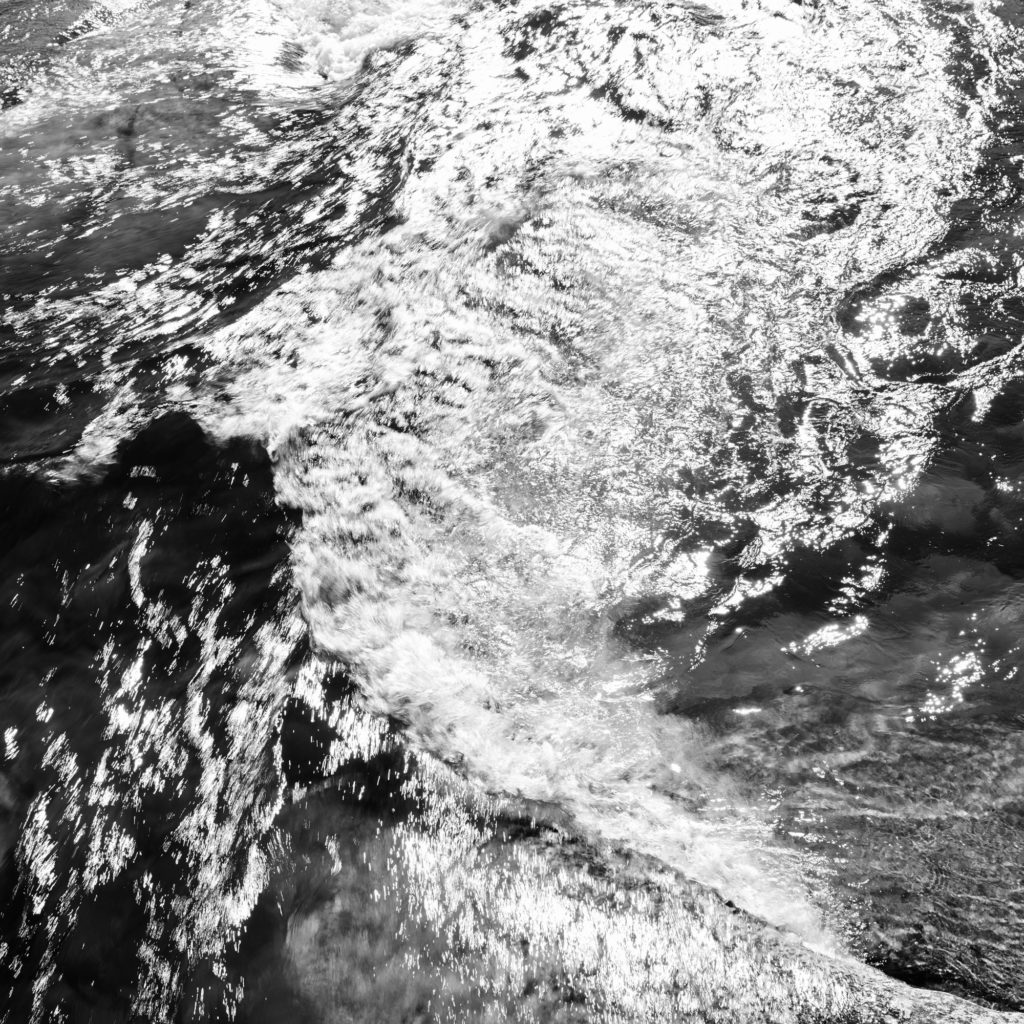
Nikon D810 with Sigma Art 35mm f/1.4
1/45 sec, f/10, ISO 64
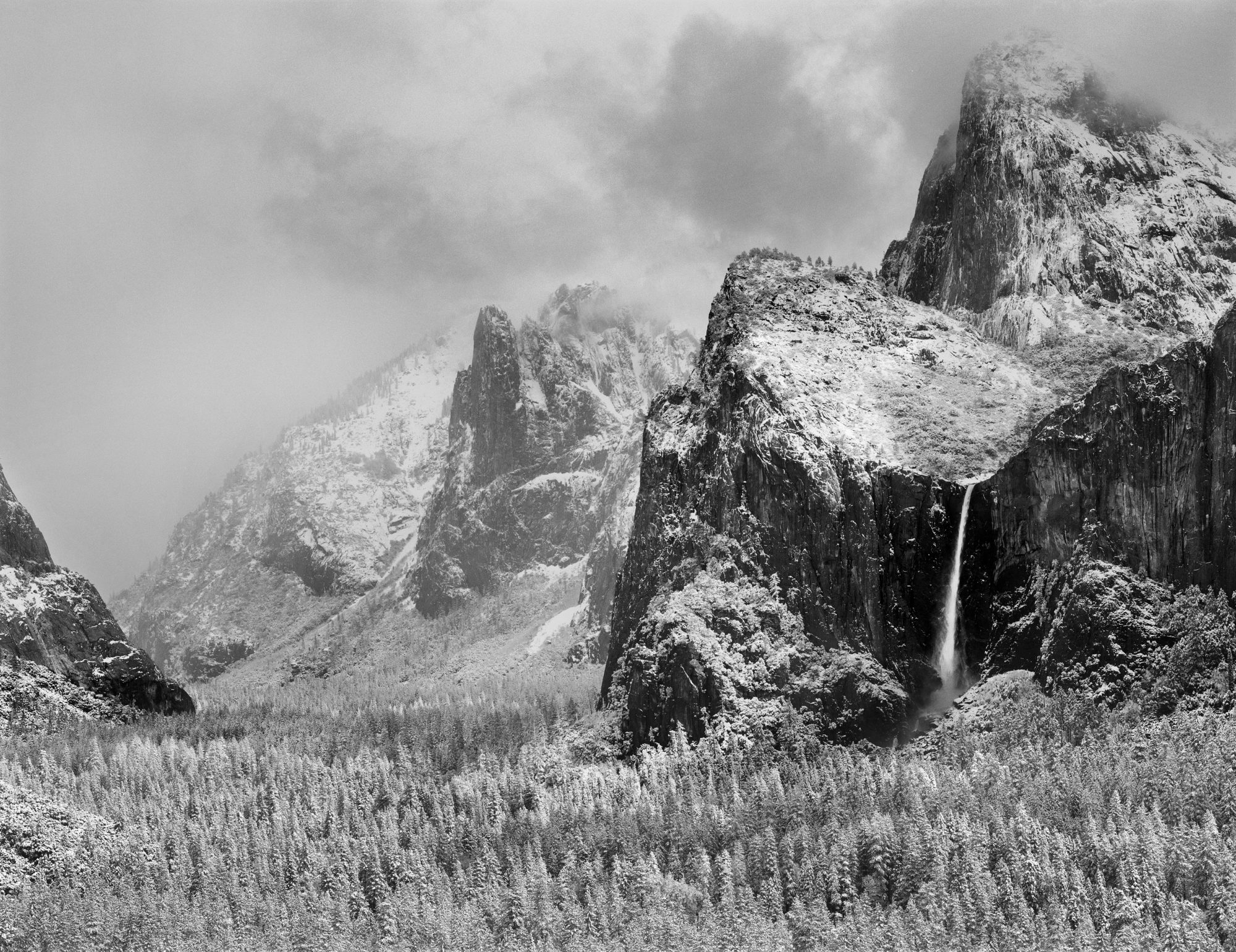
Photographs aren’t just about what we see, but about what we feel, what we believe.
Visualization is one of my most important tools in that lofty goal when I’m trying to “see” and make a photograph. Put simply, before I even take out the camera, I see in my mind’s eye what I want the final image to look like, and I use that visualization to direct all the creative choices in exposing and processing the photo.
This may seem unimportant when a digital camera can give us a instant preview after we click the shutter, but visualization goes beyond that. That little camera LCD screen can’t show us all the possible processing choices we might make, nor can it match the range and depth of a final print. The visualization a skilled photographer makes goes way beyond what the camera can display.
I find this to be particularly true in black and white, and by learning to visualize better, it opens our eyes to new possibilities. It can enable us to “see” better, both what is in front of the camera, and what is in the mind of the photographer.
Take for example the photograph above, Celestial Cascade, Tuolumne River, Yosemite, California.
Since this photograph is in black and white, what you see above is not what my eye saw. To the naked eye, it looked like this:
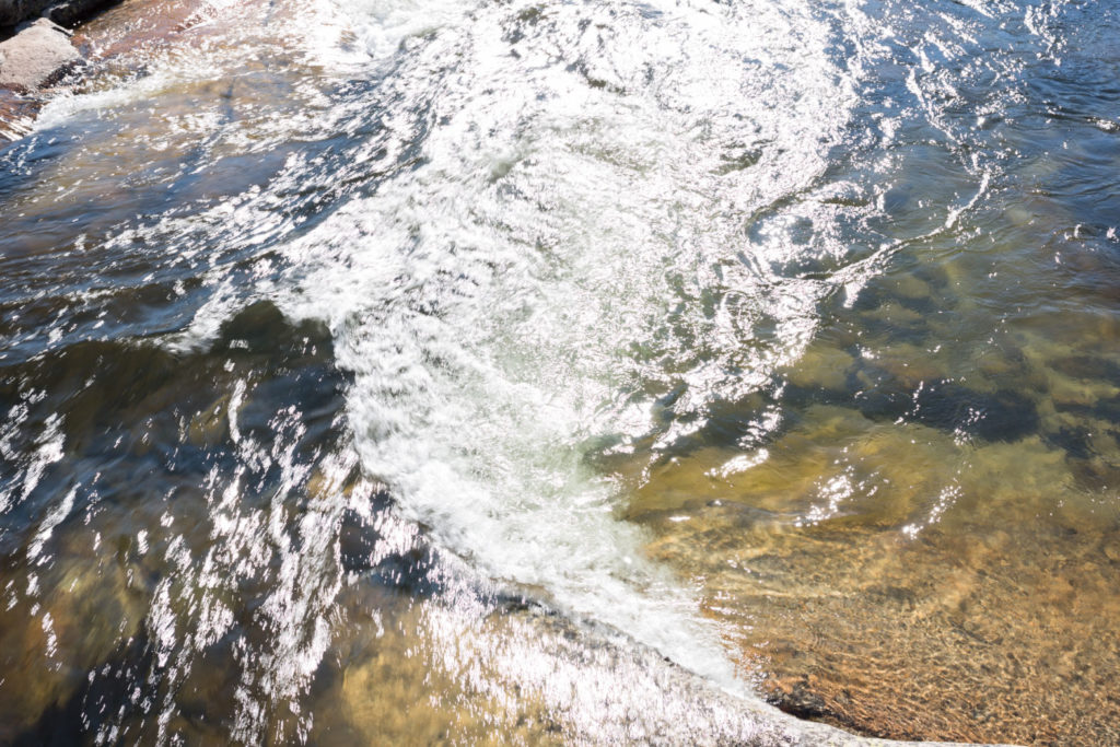
As part of a short hike with my family, we stopped to enjoy a favorite section of river and the coolness of this mountain stream. As my kids played with the rocks and waded, I had a few moments of quiet. The time of day didn’t seem conductive to making photographs, with high sun and contrasty light. But as I watched the water and contemplated the beauty of the scene, I found myself enjoying the patterns made as the water surged under the bridge and built into a wave, with the patterns of white foam it produced, and the play of sunlight reflecting as a million stars on the ever changing surface. The patterns reminded me of my friend David Ashcraft’s photograph “Universe Expanding”, and I knew if I just looked more deeply, I could express what I was seeing and feeling. I wanted to turn this little patch of the Tuolumne river into a proxy for the the infinite sea of stars in the night sky, and into the deeper realities of that infinite nature for which words are hard for me to find.
At this point, my camera is still in the bag, but my mind is fully awake. The color was not interesting to me, so I decided that this should be in black and white. Once I switched that switch in my mind, things started to become clearer. I wanted the photograph to focus on the water and the patterns of sunlight and motion. Contrast would let me do that, and then all of a sudden, I saw in my mind exactly what I wanted the print to look like. It was at that moment that I went for the camera bag, and worked through the settings that I thought would give me what I saw in my minds eye. I was without a tripod and trying to work more freely, so I had to work within the shutter speeds that would let me hand hold the camera. I wanted some blurring of the water, but the light was so bright that even at ISO 64 and f/10 I was still at 1/45 of a second, but that happened to work out well for what I wanted to show.
The thing about visualization is that it makes processing easier to a degree because you already know the look you want before you even open the file. That visualization guides your steps and choices of tools.
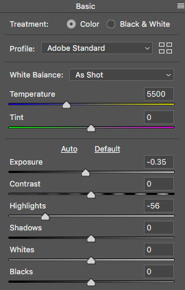
RAW processing was pretty minimal. I just brought down the exposure and the highlights a little to try and hold detail in the foamy water.
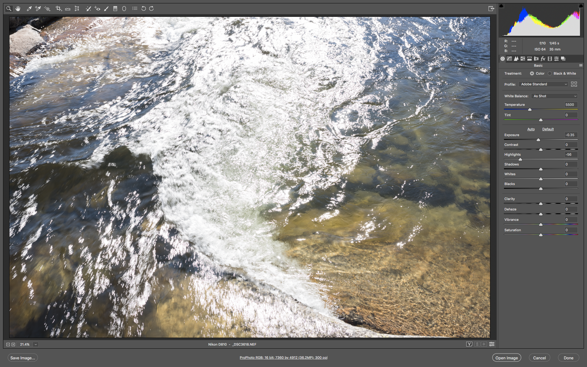
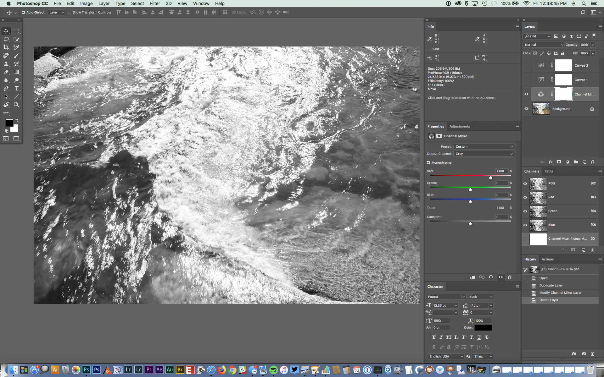
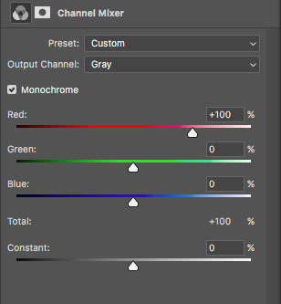
The Photoshop adjustments are all global changes. First I used Channel Mixer to convert the image to black & white using the red channel, as I liked how it allowed some of the shapes of the underlying rocks to come through.
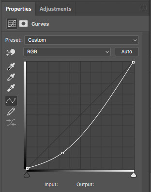
Then I added a simple one point curve that darkened the image overall, but by the placement of the point, biased that darkening to the shadows and midtones. This is one of the reasons I really like curves. They give me the instantaneous ability to exercise very precise control over how and where changes to density and contrast is applied. Instead of the linear “more or less” of a slider, I can move the points in both the x and y dimensions, as well as decide how many points to use. Points create inflection points that change how the curve works up and down slope, and those inflections are where I find the control to achieve what I envision.
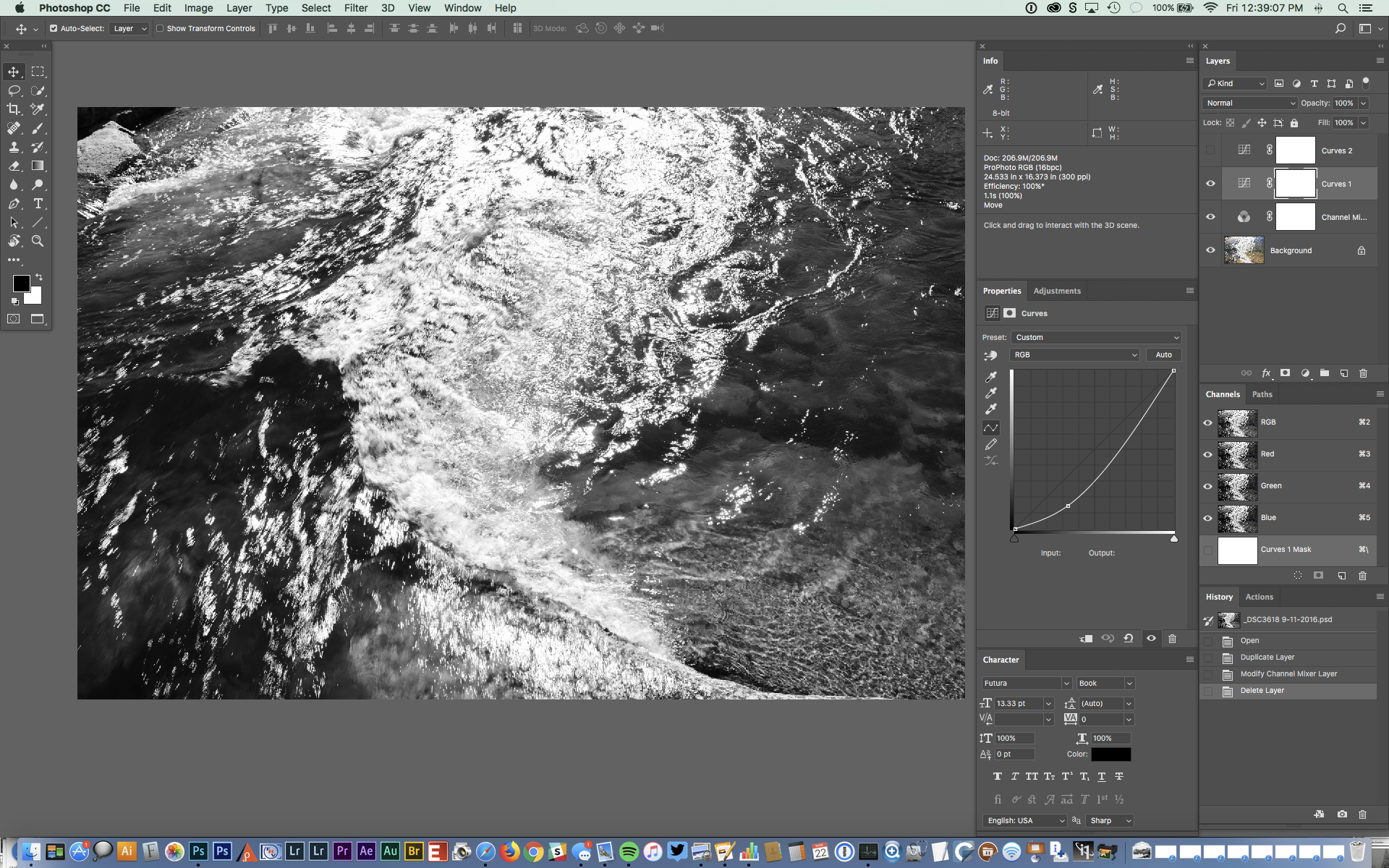
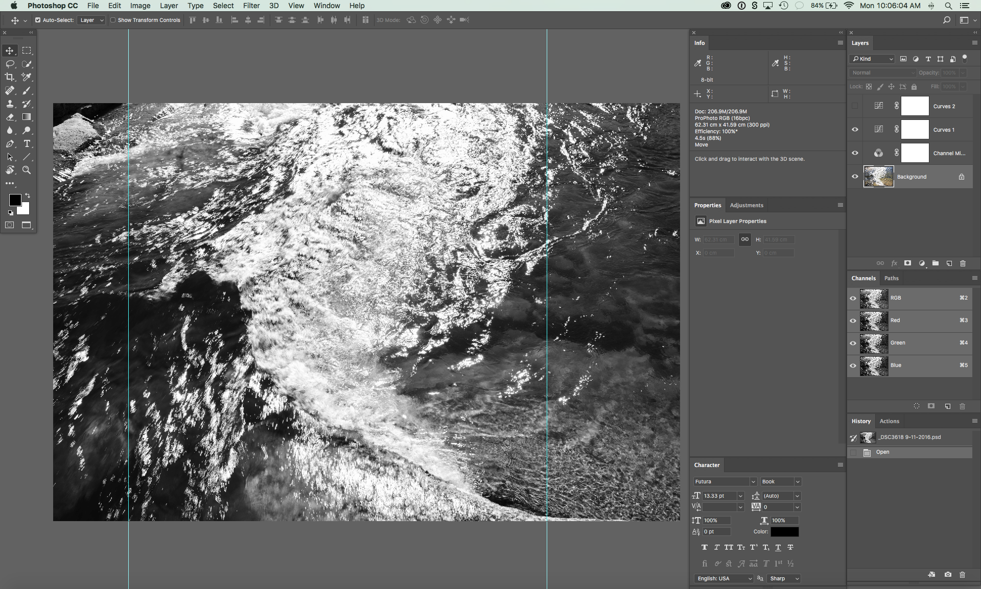
The file shows I played with a second curve as I looked at some alternative tonal relationships, but rejected that for my original curve.
I want to draw attention to how simple this was to process. A single frame camera exposure, two minor moves in RAW, a simple conversion to black and white, and one curve with one point. This is an exercise in working with the materials, and seeing “through” them to how they can work at their most fundamental level. I’m not opposed to greater complexity in processing, but the more you work “with” the process, the easier making a photograph can become and the more you free your vision.
My final step for this photo was cropping. Cropping is a creative decision for me, and I usually play with crops on every photographI make in attempt to find the composition that best draws attention to the subject. The goal is to eliminate as much distracting information as possible. Also, I’m not fond of the 2:3 ration, and I prefer the more squarish 4:5, and as well as the 1:1 square. I often find the 2:3 just includes too much and makes it hard to create the tension I like in a composition.
For this photograph I settled on a 1:1 square crop, which I mark using the cyan “guide” lines, which are saved in the file so I know how to crop the Master File when making targeted files for screen or printing. In many things, Photoshop provides multiple paths to the same solution. I’ve been using this for crops since before Photoshop added a way to preserve crops, so it’s what works for me.
The end result is something I wanted to say, but for which I had no words. Through visualization and applying the craft of photography, I was able to give voice to that vision, and in this case, the result is an expression of something I felt, more than what I saw before the camera.
