Drobo Cost Calculations

UPDATED 2019-10/31 with link to Google Sheet

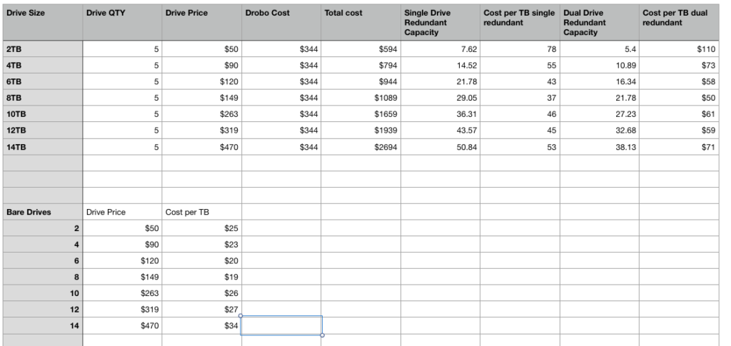
At what point is buying a Drobo worth it compared to using single external drives? And what size drives should you buy for the best value? To help a friend with this question and satisfy my curiosity, I created this spreadsheet that you can access on Google Sheet.

Using 8TB drives gives the best value per TB. If you need more than ~21TB (dual drive redundancy), it’s cheaper to buy a second Drobo than it is to use 10TB, 12TB, or 14TB drives. And “upgrading” the drives in an existing DROBO usually isn’t worth it, unless all your drives are so old that they just need replacing anyway.

PRO TIP: Drobo is NOT a backup. It merely makes your master data more resilient to drive failures. A backup is a separate copy on a separate device, and you need two backups. Keep one backup off site to protect agains fire, flood, theft, tornados, hurricanes.

If you are going to buy a Drobo, use my Amazon Affiliate links and I’ll get a small commission:

Drobo 5C

8TB Internal Hard Drive

New Lightweight Tamron Lenses Perfect for Landscape?

Tamron has announced three new lightweight primes in 20mm, 24mm, and 35mm with a weight of about 220g per lens and an unbelievable price of about $350 per lens. As a landscape photographer, I’ve been hoping someone would offer a truly lightweight lens with excellent MTF scores, and it looks like Tamron was first to the punch.

Why and I making a big deal about weight? When you are on long hikes, particularly in rugged terrain or at high altitude, carrying less weight makes the experience far more enjoyable, and leaves you in a better mindset to photograph. I’ve packed for days in the Sierra with 70-80 pound packs and my 4×5 film view camera, and at the end of most days, I was totally thrashed, even in my mid 20s. When hiking, weight sucks, and is an impediment to making great work.

Weight was a big reason I decided to go Sony, because they offered the best range of lightweight high resolution bodies with a good range of lightweight Zeiss lenses.

The last few years have given us a number of superb f/1.4 primes, but at a cost of weight. My Sigma 35mm f/1.4 is a brick. It feels as heavy as my old Nikon 180mm f/2.8, but is even less well balanced. And while I love being able to play with shallow depth of field, for my primary landscape work I’m almost always stopped down to f/11. I don’t need f/1.4 performance on a hike, and I don’t want to pay the weight penalty.

By making these lenses at f/2.8, Tamron is able to make a much lighter design, as well as offering a lower price. And from the MTF charts, they appear to be top performers…as good or even better than other primes in these focal lengths.

These lenses just made it to the top of my wish list. I can’t wait to try one out! Kudos Tamron for seeing an unfilled niche and filling it.

More info on the Tamron website and in their press release:

http://www.tamron-usa.com/news/2019/3_lenses_prime_oct.html

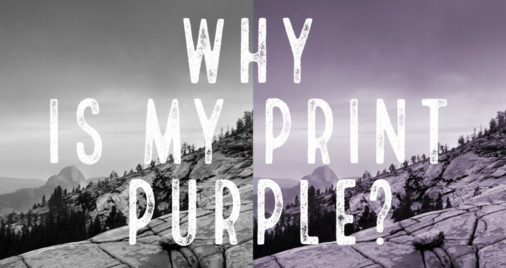
Why are my B&W prints Purple?

That’s the problem one of my workshop participants was having and asked what could be causing it. This is actually a pretty common problem, but it can be easy to miss until you’ve trained your eyes to see it. 

The prints in question were made with the Epson Stylus Photo R1900, which lacks the Light Gray and Light Light Gray found in some other Epson models. That means when it prints a B&W photo, most shades of gray are being made up from the color inks. 

It’s very difficult to make a neutral gray from color inks, hence the color cast. The 24 and 44 inch epson and Canon printers, as well as some smaller printers, use two shades of light gray in addition to black to solve this. 

Yet even with those extra shades of gray, profiles can be to blame.  You need an accurate profile to get neutral color, and canned profiles (the ones that came with your printer or you downloaded from the paper manufacturer) rarely achieve perfect neutrality. 

In the case of the Epson R1900, if the photographer wants a better result, they will have to print on a printer that has gray inks and a decent profile. 

Taming Large File Sizes in Photoshop

Working with high megapixel files in Photoshop can be a pain. It seems I’m routinely working on files that are close to a GB in size when I start adding layers to my 42MP 16 bit captures. New 61MP and larger cameras are just going to make that worse. 

While Photoshop can deal with these files, the disk space taken up by multiple versions of them, as well as for backup, plus save times can get to be a real drag. So how do we make it easier?

Well, this problem is nothing new. In my early days as a printmaker, working on 300 MB scans was a huge challenge. I remember when it took an hour just to do a 90 degree rotation, which gave me plenty of time to roam outside my cabin in Yosemite, but wasn’t very efficient. So I came up with a solution that I think you might find useful today. 

Here’s how it works. When starting with a large source file, like a 1GB scan or high MP capture, I make a copy of it and size it down to a reasonable size, say 8×10 inches @300ppi, which is a good size for proofing. Then I do all my processing on adjustment layers in Photoshop. This keeps the files small and quick to work on. 

When, and if, I need a larger version of the file, there is a simple process to transfer all those layers over to the high resolution original. 

My printmakers and I used this process on thousands upon thousands of files in my days at West Coast Imaging, and I even made a youtube video that demonstrates the process. One of these days I want to re-record these videos in beautiful HD (or 4k!), but I thought it was worth sharing the old videos because the process works the same, even on the ancient version of Photoshop depicted. 

Take a look and see if it’s a trick that can help in your toolbox. 

Printing Re-Imagined

Recent improvements in printing technology should have you reconsidering how you print your photographs.

If you’re printing with a lab, you’ve probably been making C-prints. C-prints are made on Kodak or Fuji paper C-print is the name given to the chemical process used in the paper, an abbreviation of longer name “chromogenic print”. Sometimes they are referred to by their surface, such as E-surface, or Luster, but that is not always a precise identifier. 

What defines a C-print is that it’s made on a light sensitive paper which exposes a negative image with light (LED or laser light for digital prints,) then is processed in RA-4 chemicals. 

C-print papers came from the pre-digital age, and were designed to make prints from color negatives easy and affordable for mass production of color photography. Your family photo albums are likely stuffed with C-prints.

When the first “digital enlargers” came on the scene around 1997, they most commonly used these same C-print papers, which offered great ease of use, quality, and price. Printing on a “negative” paper was no problem for a digital device that could easily convert a digital file into the data needed by the printer. 

I saw my first LightJet digital C-prints around 1996/7 when I was working at The Ansel Adams Gallery. They were nothing short of amazing.  At that time I was trying to perfect my own photographic skills, looking to find the best methods for color printing, so I was constantly studying prints. I was very fortunate that my position as Assistant Curator brought me in contact with some of the world’s best prints daily.  

What those first digital C-prints represented was a paradigm shift. Finally there was a way to turn digital files into a true fine art quality print that was as good as they very best darkroom prints I had seen. This was a huge accomplishment and changed the way we print forever. 

To say the prints were a hit is an understatement. The process was championed early on by several of the gallery’s photographers including Charlie Cramer and William Neill, and all of the Yosemite photo community quickly jumped on board. As a curator, I was able to sell more work than ever from our artists because of the ease of producing duplicate prints in quantity that exactly matched the previous batches, and at any size. Suddenly it was relatively easy to gat a 30×40 print made once a file had been perfected.  I had an incredible run with one photograph in particular by Charlie Cramer, selling somewhere near 100 copies. (I have a copy of that print on my desk that still looks as good as it did when I first saw it. )

Digital C-prints quickly became the dominant form of color printing in museums, galleries, and were also embraced by advanced amateurs and  hobbyists. 

While the technology was readily available, the knowledge to use it to make true fine art quality prints was still quite difficult. To help solve that, I started my first print studio, West Coast Imaging, with a focus on making gallery quality prints using my knowledge to great digital prints that didn’t feel “digital” but retained the inherent qualities of fine art photography.  

 In my time running WCI, I printed the first digital exhibitions for Galen Rowell, Jack Dykinga, Robert Glenn Ketchum, and many others, and used hundreds of thousands feet of Fuji C-print material. So it would be fair to say I know C-prints very well. I’ve been committed to it over the years for my personal as well as my professional work. And alongside it, I’ve used about every generation of Epson inkjet printer since about 1999/2000, as well as several Canon Pro printers. 

For a long time, C-prints were better than inkjet prints when printing on similar surface papers.

But recently that has changed. 

When I started testing my Canon PRO-4000 printer, I noticed something was different, and better. Much better. 

As I compared my calibrated test sheets from the Canon PRO-4000 to my reference digital C-print, something about the Canon print made the C-print look dead and lifeless. Perhaps it’s better explained that the Canon print had a depth, a brilliance, a dimensionality that I could never recall seeing before. 

I was taken off guard because I didn’t recall seeing this big a difference a few years earlier comparing the previous generation Canon or Epson inks to C-prints. So I dug in to my archive of calibrated test prints to try and confirm what I was seeing. What I saw surprised me. 

The wider color gamut and darker blacks (D-Max) of the new Canon printer really did make a difference. The new Canon prints bested every print I had made before. And not only were they “better”, they were magical. I realized I was seeing things in the prints I never thought would be possible. It was the same “ah-ha” moment I had when I saw my first  digital C-print at the Ansel Adams Gallery a few years later. These new print set a high water mark, one that allows photographers to express themselves in ways not possible before.

It became clear that this was the process I wanted to use to print my personal photographs, as well as the work of my clients. While C-prints are still a legitimate medium for fine art, the qualities of these new prints are too exciting to overlook. With this new process, I’m making the best prints of my career, and expressing qualities I never thought were possible in a print. It’s taken a long time to reach this level of quality, but now that we have, I’m excited to switch from C-prints to inkjet and explore all the new possibilities!
Settings That Work

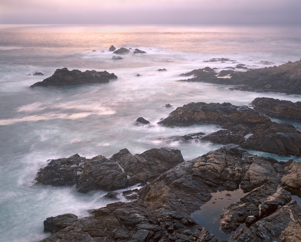
Printed a lovely 24×36 for a client today. I’ve printed the photo before, but not to this large size, so I looked up the settings to build my mental reference library of what settings produce what result. I though it would be valuable to share a real world example of what I think worked to make a gallery quality wildlife photography print.

Camera was a Nikon D850 with a 80-200 lens used at 150mm. Exposure was at f/5 at ISO 640. The results are what I’d expect from a medium format camera using 100 ISO film. Print was made from a ~223 ppi file at the output size. It’s a perfect example of how large prints still look fantastic below 300 dpi. I was also surprised with how much the lens resolved with the high resolution sensor of the D850. It’s exciting to see how the D850 is helping photographers raise the bar on wildlife photography.

I can’t say enough how striking it was, and the effect it had on me. Most important to the photo was the subject, the light, and the moment captured, but when you throw in a high res capture, the effect is a stunning piece.

Sony A7RII Miscellaneous Information

I made the switch to mirrorless in late 2018 with the Sony A7RII. Sony had given me a loner camera a year earlier that let me know that the quality was at least equal to my previous Nikon D810. I had also spent over a year with an a5000 as a every day carry camera that has gone everywhere with me, and made me very comfortable with the Sony image quality. The ability to put together a very light 42mp camera kit with high quality lenses for hiking and backpacking is what tipped me over to Sony.

I am really happy with my choice, which came down to image quality first, high quality light-weight lenses, and overall compact form.

This page is not meant to be a complete review, but a place to hold important reference information and some miscellaneous info for A7RII users or perspective users.

Manuals
In true quirky Sony fashion, the most detailed “manual” is not the manual but a separate document called the “Help Guide” which is available as a website or a downloadable PDF.

E-Mount Lenses
Spreadsheet of select E-mount lenses assembled to find lightest weight options. Really good lenses tend to be heavy, but for backpacking some quality sacrifices are acceptable. The question is, do I carry three average lenses that are light, or just one decent zoom? Sigma has teased Art quality lenses in a lighter form factor which would be my preference. My landscape work is mostly at f/11 anyway, and a f/4 or f/5.6 might be a good fit for street photography too.

Wikipedia article on E-Mount lenses – list of lenses, adapters, other interesting stuff.

Annoyances
-No intervalometer
-Batteries not keyed to prevent wrong way insertion
-Lens release on opposite side of Nikon/Canon
-Lens index mark location on flat instead of outside of lens mount
-Direction of lens rotation opposite of Nikon
(This lens stuff really annoys me as a 30+ year Nikon user. It’s hard to overcome that muscle memory, but even then, the Sony way just seems awkward. Fair or not, it’s my gripe)
-Large RAW file size – Nikon uncompressed NEF are much smaller. Takes up more memory card space, longer transfers, etc
-9 frame RAW buffer – older body with a lower costs comes with trade offs – works for landscape photography, but is still noticeable when doing brackets
– small grip size, feature and bug, works great for my normal landscape/fine art stuff, but shooting a multi hour event with heavy glass really begs for the extended size battery grip.

Updated 4/5/2019

Buying A Printer

Buying a printer can be a big decision and a significant investment. I’m posting these quick thoughts from an email with a client today to start your brain thinking about some of the decision points, and I hope to expand this into a full article in the future.

To buy a printer or not is a big question. It comes down to a couple things:

1. will it make you money?

2. will it really save you money?

3. Is the cost inconsequential compared to the convenience? 

4. Will it give you control you can’t get with a lab?

5. Do you need the faster turnaround times. 

A printer is like getting a dog, it has needs (ink, paper, maintenance, profile making/testing) that cost money and will always be there, and you need to take care of it. Unless you print a lot, the total cost of ownership is going to be close to just sending out, but if you want to print a lot, it makes those individual prints less expensive.

At the $400 price point, a printer can be more easily justified. Once you get to the $1,000 17×22 printers, you have to be printing enough to make it work out.

Printers should be viewed as consumable/disposable items, as painful as that sounds. They are made to work for a couple years, not forever, and the manufacturers expect you to upgrade. Do not look at it as a long term investment. It’s not like buying a car, it’s like buying tires, you expect them to wear out. 

Thoughts or experiences? Share them in the comments!

Inkjet Printing Through Photoshop – Macintosh

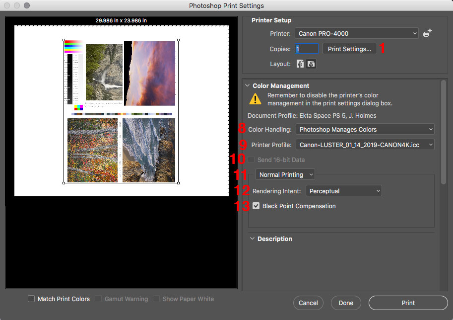
Using printer profiles correctly when printing is essential to getting accurate color from your printer. The challenge is that you have a bunch of settings that have to be set up exactly right, every time, for it to work. That is further complicated because every editing software, OS, and printer driver has it’s own settings and names for those settings.

You’d think that there should be some good information out there on how do do all this, but even the paper manufacturers don’t have good guides. One of my favorite companies has German language screenshots in their English language document, and they note that their instructions don’t work for every setup. Uggg!!!! It makes you want to pull your hair out.

I’m going to make my attempt to solve this problem by sharing the settings I use with Photoshop on the Mac. These settings have been tested and verified to print my Color Test Sheets correctly.

The settings for Lightroom on the Mac are quite similar to these, so you should be able to translate them over. Understanding what each setting does may also help you translate this for other editing programs and setups. As time allows, I plan to make more of these, but the easiest place to start was with the software I print through.

download the PDF here:
Inkjet Printing Through Photoshop – Macintosh.pdf