Reader question:
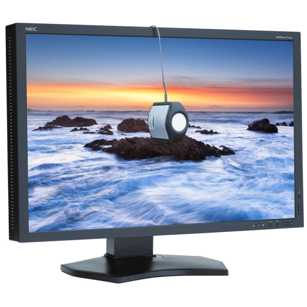
I use a SpiderMunki to calibrate my monitors. The software recommends that the luminescence value be 120. I watched a video on printing and the presenter stated that the monitor should be no brighter than 80. I wanted to get your thoughts about the appropriate settings.
Great question! Here are my thoughts:
First let’s answer why we are turning the brightens on our monitor down so far. These standards are driven by creating a good screen to print match. There are industry standard viewing lights for printed materials that cost about $1,000, and are used in the prepress and lab industry to match color to professional standards. A accurate screen to print match requires a similar illumination of both screen and print.
Dynamic range also has to be considered. Anytime you can make the highlights “brighter” you increase dynamic range and contrast. Normally we want that, but in the case of screen to print matching, it hinders matching the transmissive light monitor to the reflective light print. Lowering the brightness of the monitor makes a better match, and also makes it easier to see subtle tones and detail in the monitor that would be hidden with higher dynamic range/contrast.
So now that we’ve explored a little of the why, let’s answer is 80, 120 or some other number correct. Traditionally 100 c/m2 has been the accepted value. I’ve been on calibrated monitors since the ~1994 and that was the value recommended with my first x-rite calibrator. It’s the brightness I’ve used for countless files, prints, and CMYK book/press reproductions for pro photographers. It’s also what my team of printermakers and scanning masters used at West Coast Imaging, so it is a rock solid, tested, proven number.
The reality is there is a range of numbers that can work. The difference between 80 and 120 c/m2 is not that large. About a 20% variance from the 100 value I consider standard. In my early years I would work with CRT monitors, and as these aged, they dimmed, so that you could no longer achieve 100 c/m2, so I’ve worked with lower ranges too. It worked to a point, but for my taste once you get around 80, things start to get a little murky.
At some point IIRC, x-rite started recommending 120 c/m2 in their software. No idea why, they just did. So people started using that. I tried 120 it and decided I still liked 100 cd/m2 better.
You also have to take into account that there is some mental translation in screen to print match. So some people may feel they get a better match with their lights and their monitor at one setting over another.
So which value is right? I think you could make it work with a range of values from 80-120, but I know 100 c/m2 works so I stick with that if my monitor can achieve it.


In my experience 100 or 120 doesn’t make a noticeable difference.
What I noticed – and would like your thoughts on – is that my prints were always too light until I switched the viewing bkgd of the monitor in PS from white to light gray when I evaluate the image for printing.
Just some quick thoughts. I think there is a range of tones that could work for the background, but I think white will probably cause you problems as you discovered. The color and brightness of the background or area around a photo certainly affects our perception of the image and its brightness. I used to work on a roughly middle gray background, but at some point long ago switched to working on a black background and it works well for me.